In a month we will (finally!) say goodbye to the not-so-cool year 2020. Since my previous article about trends was quite successful, I took some time and did some industry research, to create a 2021 Design Trend Guide.
Let’s take a look at what 2021 will bring!
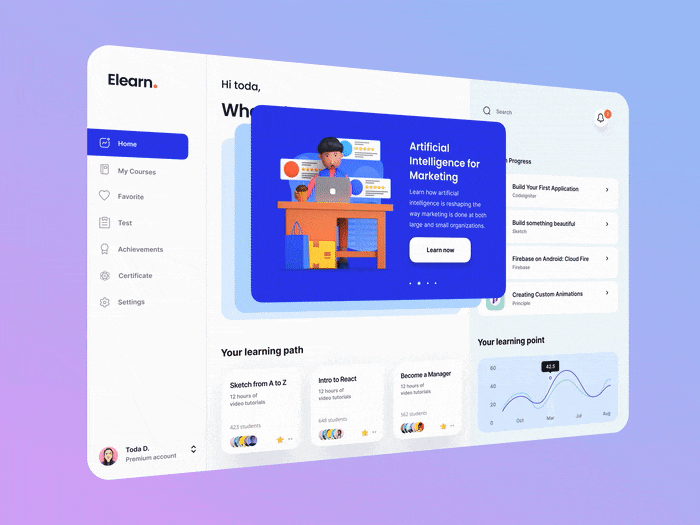
1. 3D Illustrations (yeah, still!)
3D imagery is here to stay — especially when it’s getting easier and easier for regular UI designers to actually create something in 3D! (try the 3D tool called Spline — currently in beta, but so amazing and easy to use!).
3D is also being widely used in full screen animations, as main key visuals — take a look at Superlist or see an amazing 3D tutorial by Minh Pham on how to create a stunning 3D background for your website.
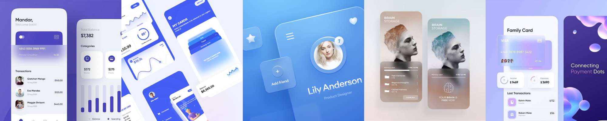
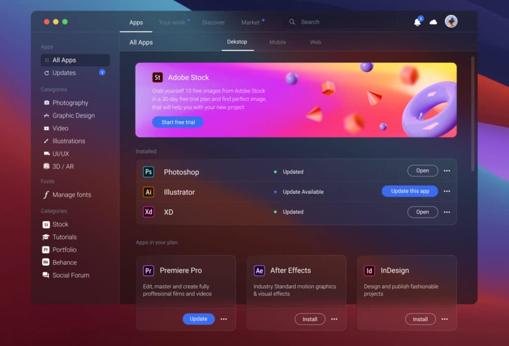
2. Glassmorphism
Have you heard about the newest craze called glassmorphism? (that’s right, neuomorphism is no longer cool). It’s the newest trend in UI, which is mostly based on a effect called background blur, and it basically creates that “through the glass” look and feel on elements.
It was introduced in Windows Vista, then later in iOS7, but it seems it’s here to stay for a bit in the new, refreshed form! If you want to take a closer look at glassmorphism, try this Glassmorphism Generator online tool and see Mike’s article about it:
Glassmorphism in user interfaces
Another year, another UI trend is becoming increasingly popular among designers. Do you know it yet?
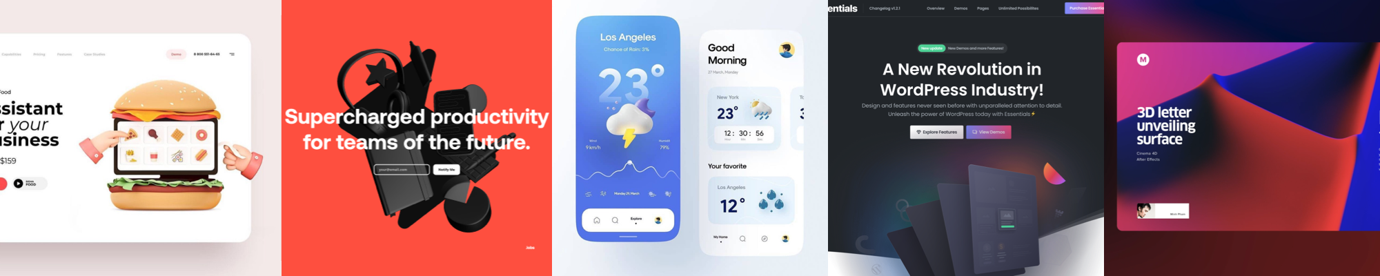
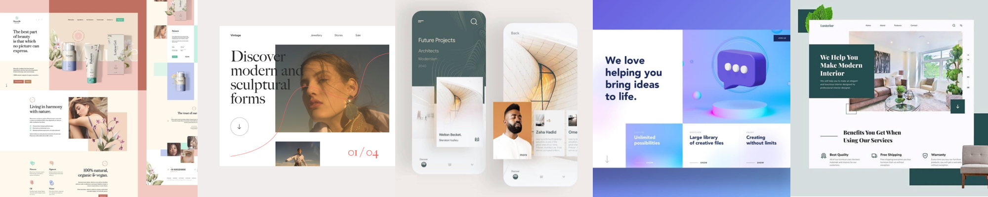
3. Real-life pictures
I strongly predict that soon everybody will be tired of illustrations and 3D graphics in product design, so real-life photos will make a huge comeback.
As I wrote in one of my previous articles, illustrations might not be for everybody. And sometimes real people and real items can make a bigger impact on users. Ekokubki’s website is based on a real-life photography and it looks great!

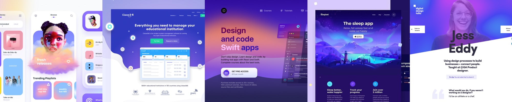
4. Vivid colors
Everywhere I look, I can see colorful splashes on websites and mobile designs.
Take a look at Designcode.io, Sleepiest and Design Talks! I love how colors create a magical, ethereal vibe there. And when we use vivid colors, it’s easier for us to differentiate and remember a product. Instagram knew that a long time ago (and that’s why the unforgettable change of their icon took place).
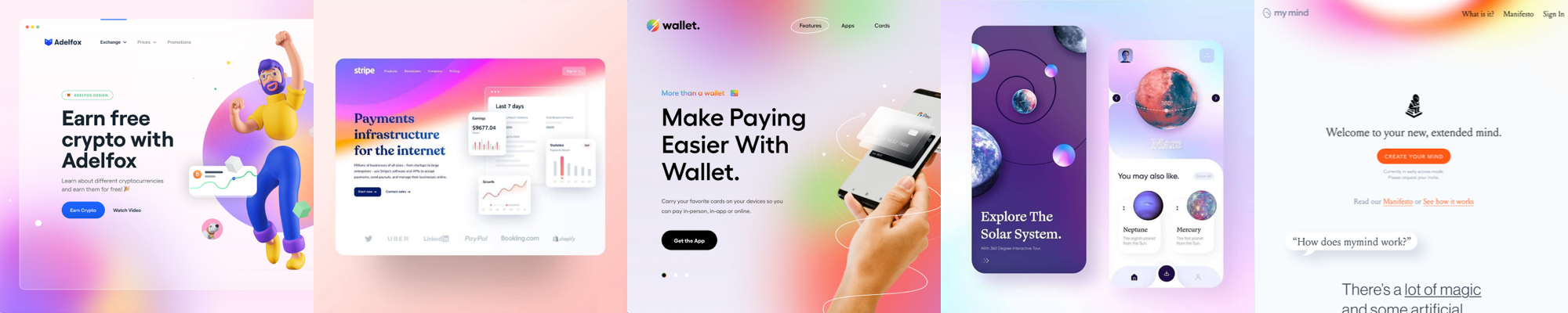
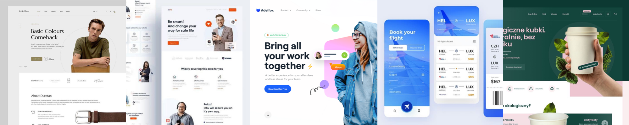
5. Blurred, colorful backgrounds
Similar to the one above, but mixed with glassmorphism a bit… Thanks to the delicacy of this effect, I think it makes the UI look just pleasurable to look at. The designs that use blurred backgrounds look incredibly organic, warm and welcoming.
Take a look at Stripe (also some glassmorphism there) and My Mind (an amazing, simple tool for self-organization).

6. Aesthetic minimalism
Probably a trend I personally love the most. There’s nothing more aesthetically pleasing, than a simple, minimal and readable UI.
Websites like Revolut (also simple 3D), Sketch and Qoals (also blurred background) are the perfect example that you don’t need a fancy UI, or “wow effects” for your product to look absolutely astounding (sadly, not many clients understand that).
7. Geometric structure
I’m seeing more and more designs that have a very tidy, conservative visual structure. It makes the information looks really sorted out!
One of the most beautiful examples of geometric structure of the interface is Rituals website. Such a pleasure to use and look at (also, love the simple but enjoyable animations).
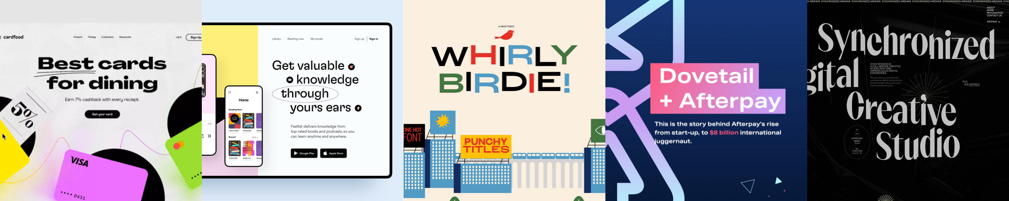
8. Big, sophisticated typography
There’s a lot of examples of a big, sophisticated typography playing the main role in a design of a product. Some of them are even entirely based on a typography — and the result is often interesting. The choice of a typeface is often quite extravagant.
Take a look at Whirly Birdie, Dovetail+Afterpay (also vivid colors) and Synchronized (also brutalism).
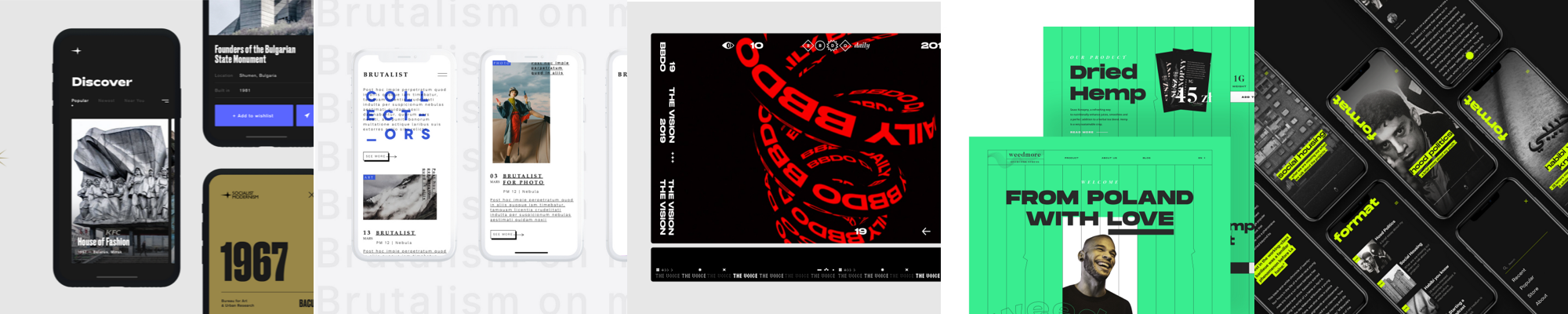
9. Brutalism
This is a trend that I have the most problem with (maybe not so much as with neuomorphism, to be honest). It’s called brutalism and it looks quite as the name suggests — strong contrasts, often unpleasant typography and many problems with the accessibility and readability. But I get the overall vibe — the main idea behind it is basically a deconstruction of what we perceive as beautiful and useful.
Surprisingly, I’m seeing many websites and apps actually pursuing this trend! (one of it being a polish radio station called Newonce).
I really tried but I am not a fan of it when it comes to UI. I would prefer it to stay on posters and in magazines.
10. Simplification of the UX/UI processes
A trend different than the others — not visual in any way.
I’m seeing that more and more people in the industry are realizing that many processes behind product design has become extremely overcomplicated. It’s here and it’s bad — for product designers, for clients, and mostly — for the digital products itself.
There’s a huge need for a change. And, I believe it’s slowly starting to change. I strongly think that it’s time to take a few steps back, or to look at the whole industry with a fresh eye. It’s time to rethink the confusing concepts and names, rebuild the difficult and time consuming processes and make it easier for the aspiring designers to learn product design.

1 Comment