BY Nick Babich
Let’s explore the key animation tactics that improve the functionality and emotional power of your mobile interface.
1. System Status
There are always a number of processes happening backstage in your app, such as data are being downloaded from the server, calculations are taking place. Such process always take some time. You should let a user know that the app isn’t frozen and to indicate the status of ongoing processed. Visual signs of progress give users a sense of control over the app.
Loading Indicators
Loading time is an unavoidable situation for most digital products. While animations won’t solve the problem, they certainly make waiting less of a problem.
When we can’t shorten the line, we can certainly make the wait more pleasant.
Creative progress indicators can reduce a user’s perception of time. The animation influences your users’ perception of your product, making it seem better than it actually is.
Pull to refresh
A well-known animation in this group is “pull down to refresh,” which initiates a process of content updates on mobile devices.
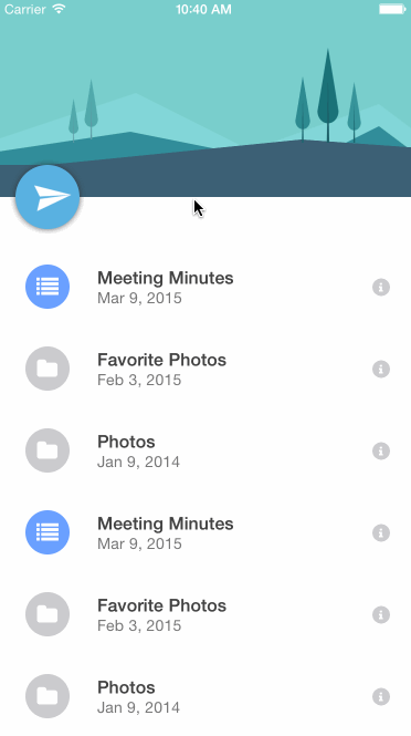
Tip: Pull-to-refresh animation should match the design outline of the app — if the app is minimal, the animation should be as well.
Notifications
Because movement naturally draws attention, animating your notifications is a pleasant way to notify users about something without intruding too much upon the experience.

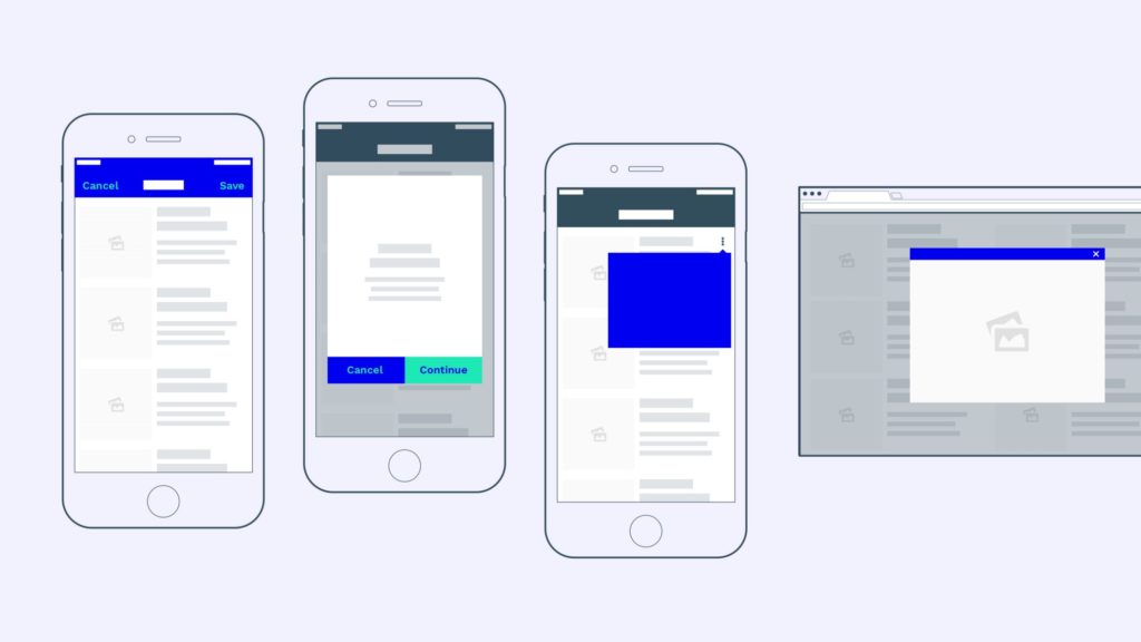
2. Navigation and Transitions
The most basic use of animation is in transitions. The logic behind this type of animation is to help the user comprehend the change that has just happened in the page’s layout, what has triggered the change and how to initiate the change again later on. A classic example is a hamburger button that toggles hidden content.
While hamburger animation might be the most expected option here, there are plenty of other ways that animation complements navigation.
Transport between navigational context
Designers use animation to smoothly transport users between navigational contexts and explain changes in the arrangement of elements on a screen.
Visual hierarchy and connection between elements
Animation is perfect for describing objects of the interface and illustrating how they interact with each other.
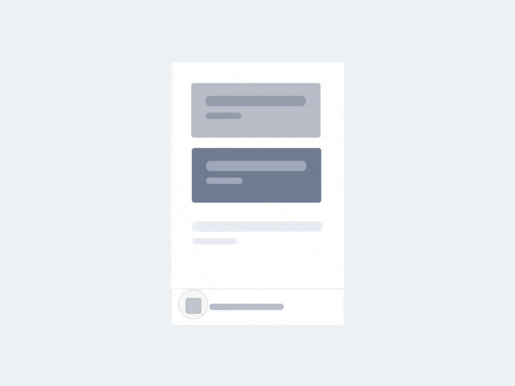
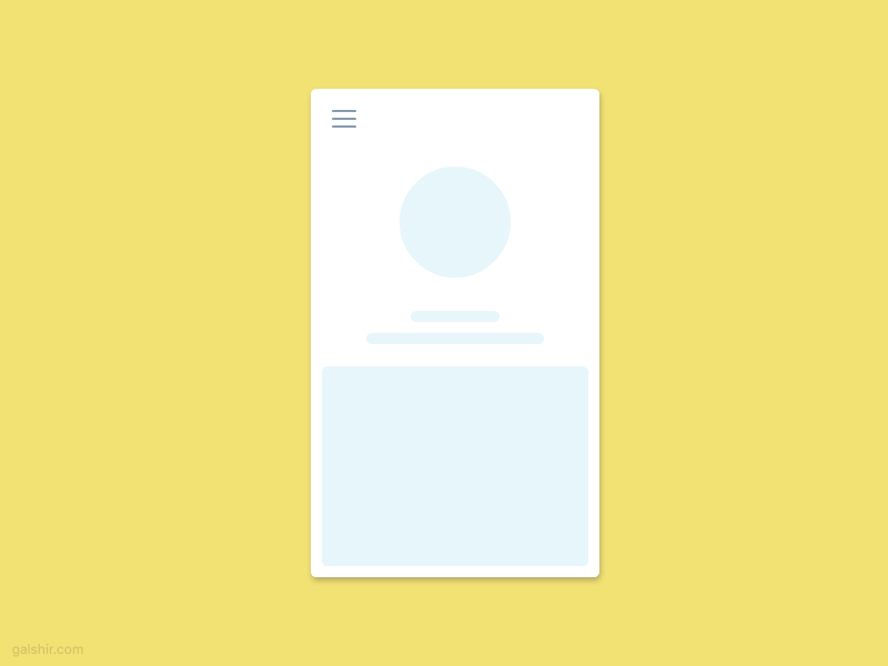
Function change
In certain cases, designers are forced to design an action button whose functionality changes under certain conditions. We often see this in mobile designs where overall space is limited.

This type of animation shows how an element changes when a user interacts with it. In example below, when user press floating action button, the plus sign transforms into a pencil. This indicates that the pencil is the primary creation method. Such a small detail means the difference between having to guess what will happen next and knowing what the icon means in either state.

3. Visual Feedback
Visual feedback is crucial for any user interface. It makes users feel in control and for the user, control means knowing and understanding their current context in the system at any given time.
Acknowledgement
User interface elements like buttons and controls should appear tangible, even though they are behind a layer of glass.
In the physical world, buttons, controls and other objects respond to our interactions with them. People expect a similar level of responsiveness from the user interface controls.
To bridge that gap, visual and motion cues acknowledge input immediately and animate in ways that look and feel like direct manipulation.
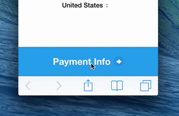
Visualize the results of the actions
Animations can enhance every point of interaction and reinforce the actions a user is preforming.
In Stripe’s example below, when the user clicks “Pay”, a spinner briefly appears before the app shows the success state. Checkmark animation makes user feel like they easily did the payment and users do appreciate such important details.