BY Avinash Kaur
As a UX designer, it is important to build empathy and celebrate accessibility requirements as a set of design constraints to build a better product.
Accessibility is a vast subject. This article focuses mainly on guidelines specific to designers and content writers (to some extent) that would help to build a more accessible product.
Understanding Accessibility
Accessibility allows users of all abilities to understand, use and enjoy the web. As designers, it is our responsibility to make sure we design in a way that is usable to all users irrespective of their situation, abilities or context.
The first and foremost step to build an accessible product is to build empathy and install an inclusive design mentality.
Accessibility is not confined to a group of users with some different abilities, for example, visual, motor, auditory, speech, or cognitive disabilities, rather it extends to anyone who is experiencing any permanent, temporary or situational disability, e.g., having only one arm is a permanent condition, having an injured arm is temporary, and holding a baby in one arm is situational — in each case the user is able to complete tasks with only one hand.
Therefore, the aim is to make web content more usable to users in general.

Guidelines
After reading the WCAG guidelines and some really knowledgable articles on accessibility (I’ll share a few links in the end), I wanted to build a set of guidelines which I could follow as a UX designer — guidelines which I can refer again and again while creating designs for products — guidelines which can become a part of my design down the lane.
The following are guidelines which were chalked down for our UXD team while working on a project in Springer Nature. These suggestions aims at targeting WCAG 2.1 conformance level AA (as recommended by W3C).
1. Content and Structure
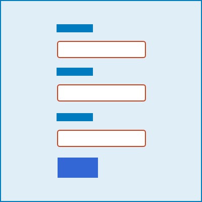
Meaningful links
Avoid links that says ‘Click here’ or content-free text like ‘More details’ applied to a list of links
Source: WCAG 2.1: Link Purpose (in context)
Use of colour
Don’t specify important information by colour alone. Use a combination of text, colour or graphical objects.
Source: WCAG 2.1: Use of color
Consistent Navigation
Ensure that repeated components occur in the same order on each page of a site.
Source: WCAG 2.1: Consistent Navigation
Consistent Components
Components having same functionality should be consistent. Maintaining a design system, pattern library or style guide is encouraged to keep consistency in team. Here are some examples of amazing design systems — Shopify’s Polaris , Atlassian’s design library , BBC’s GEL .
If icons or other non-text content have the same functionality, then their text alternatives should be consistent as well.
Source: WCAG 2.1: Consistent Identification
Use of headings
Use descriptive and informative page title. Page headings and labels for form and interactive controls should be informative.
Source: WCAG 2.1: Headings and labels , WCAG 2.1: Section headings, WCAG 2.1: Page titled
Multiple Ways
There should be more than one way available to locate a web page within a set of web pages. Exceptions: when the web page is a part of process like a checkout page.
Source: WCAG 2.1: Multiple Ways
2. Device independent design
Make it easier for users to operate functionality through various inputs.
Interactions
Don’t rely on device-dependent interactions (e.g. hover) to convey information or to complete tasks. If the design on hover or focus is really necessary, then design the interaction in such a way that users can perceive the additional content and dismiss it without disrupting their page experience.
Source: WCAG 2.1: Content on Hover or Focus
Sensory characteristics
Don’t provide instructions which rely solely on sensory characteristics of components such as shape, colour, size, visual location, orientation or sound. for example — use a combination of positioning, colour, and labelling to identify content.
Source: WCAG 2.1: Sensory characteristics
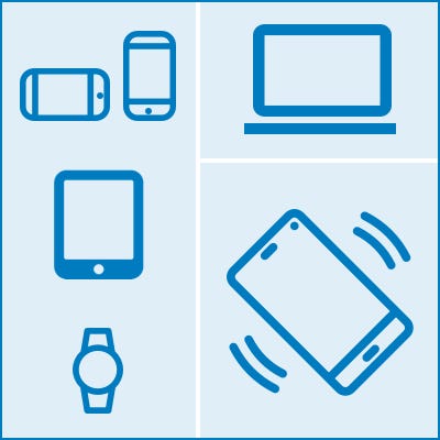
Alternative to device motion
If you use device motion to activate a feature then provide an alternative user interface for the feature or allow the user to disable the motion activation of the feature
Source: WCAG 2.1: Motion Actuation
Complex pointer gestures
If you use complex gestures, then provide single pointer alternative as well. e.g. — A map view that supports the pinch gesture to zoom and drag gestures to move the visible area. Keyboard buttons offer the operation via [ + ] and [-] buttons to zoom in and out, and arrow buttons to pan stepwise in all directions.
Source: WCAG 2.1: Pointer Gestures
Orientation of content
Don’t restrict your design to only portrait or landscape, unless a specific orientation is necessary.
Source: WCAG 2.1: Orientation
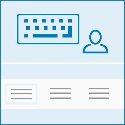
3. For Keyboard-only users
Make sure users can interact with your page using the keyboard alone.
Focus visible
Clearly define and design the focus state of input elements. Change of content, like text, should not take place on focus.
Source: WCAG 2.1: On focus , WCAG 2.1: Focus visible
Keyboard shortcuts
Define shortcuts that can be easily used with one hand for common operations. Make use of some common keyboard shortcuts, don’t conflict with existing browser and screen reader shortcuts.
Source: WCAG 2.1: Character key shortcuts
Logical Tab order
Use a logical keyboard navigation order. When navigating around a window with the Tab key, keyboard focus should move between controls in a predictable order.
Source: WCAG 2.1: Focus order , WCAG 2.1: Meaningful sequence
Option to skip section
Include a “Skip to main content” link before the header for keyboard users which is visible only when it has focus.
Source: WCAG 2.1: Bypass blocks
4. For touch targets
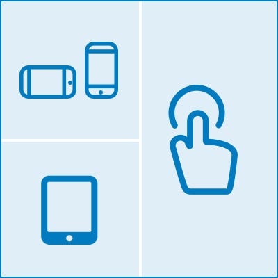
Ensure that touch targets are at least 9 mm high by 9mm wide, independent of the screen size, device or resolution.
Leave enough inactive space around controls so that they don’t overlap with other touch targets.
Source: WCAG Mobile accessibility mapping: Touch target size and spacing , WCAG 2.1 Target Size
5. Opening links in new windows with advanced notice
This can be disorientating to screen reader users or users with cognitive disabilities.
If you must do it, warn the user before they click on the link that it’ll open in a new window.
You can use text like “opens in a new window” or a visual icon. If you choose to use an icon, make sure it’s accessible to screen reader users.
Source: WCAG technique: Giving users advanced notice before opening a new window
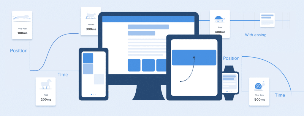
6. Animation
Do not design content in a way that is known to cause seizures. No content on page should flash for more than 3 times per second unless that flashing content is sufficiently small and the flashes are of low contrast and do not contain too much red.
Source: WCAG 2.1: Seizures and physical reactions , WCAG 2.1: Three flashes or below threshold , WCAG 2.1: Three flashes
7. Layout
Linear and consistent
Create content that can be presented in different ways (for example simpler layout) without losing information or structure.
Be clear in writing; avoid jargon and idioms
Use of non-linear user interfaces can be disorienting.
Source: WCAG Mobile accessibility mapping: Consistent layout , WCAG 2.1: Info and relationships
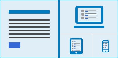
Responsive Design
Consider mobile when initially designing the layout and relevancy of content. (Mobile-first design)
Allow your content to zoom and respond to various screen sizes without loss of information or functionality and without scrolling in two dimensions.
Source: WCAG 2.1: Reflow
8. Media
Alternate text for images
This text is read by screen reader users. Images that don’t convey any content and are used for decorative purpose should not be announced by the screen reader.
Make sure there is enough description for images provided for the screen reader.
Source: WCAG 2.1: Non-text content
Enough time to read and use content
Let the user pause, stop, or hide content that moves, blinks, scrolls, or automatically updates, for example, a dynamically-updating news ticker, chat messages, etc.
Source: WCAG 2.1: Pause, stop, hide , WCAG 2.1: Time Adjustable
Accessible audio or video elements
Make sure you provide an alternative for pre-recorded audio-only, for example, text transcripts. Provide captions for pre-recorded audio content.
An alternative for time-based media or an audio track and an audio description is provided for pre-recorded video-only
Source: WCAG 2.1: Audio only video only — Prerecorded , WCAG 2.1: Captions prerecorded , WCAG 2.1: Audio description — Prerecorded
9. Visual Design
Typography
Line height (line spacing) should be at least 1.5 times the font size. Spacing following paragraphs to at least 2 times the font size.
Letter spacing (tracking) to at least 0.12 times the font size. Word spacing to at least 0.16 times the font size
Font sizes should not be smaller than 10 points.
Source: WCAG2.1: Text spacing
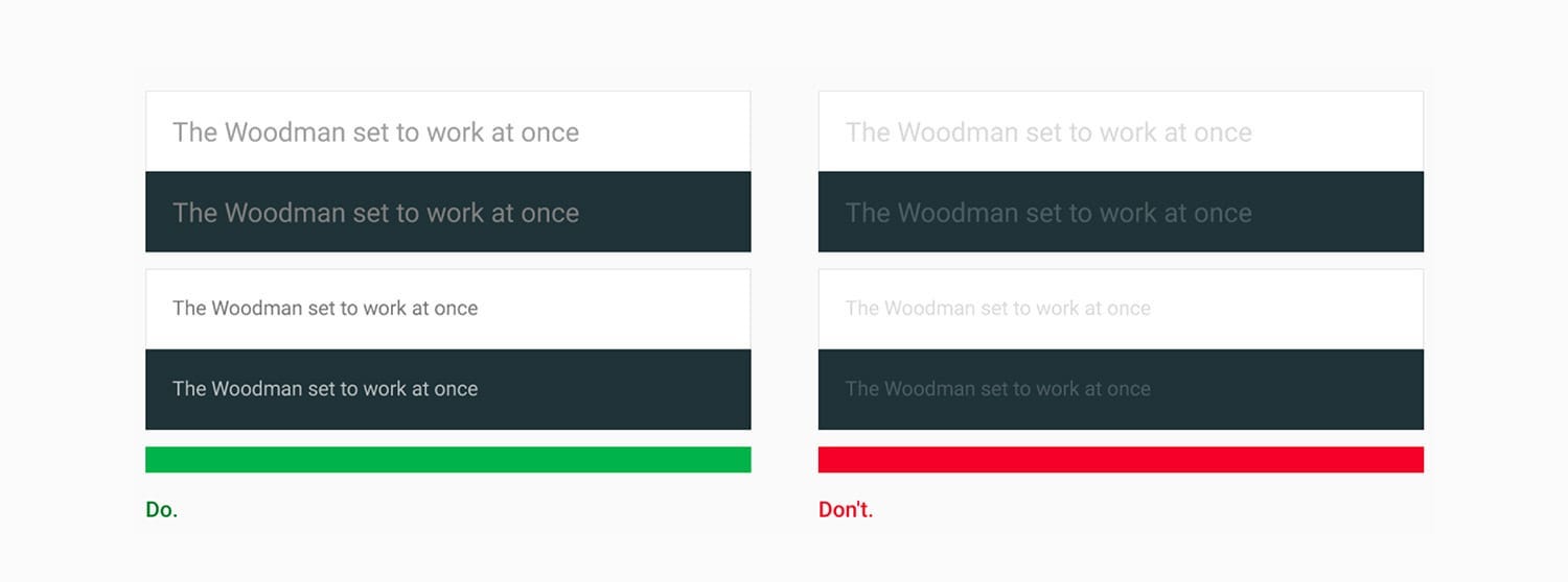
Use adequate colour contrast
Text should have a colour contrast ratio of at least 4.5:1 against its background.
The contrast of icons and graphical objects should be at least 3:1 against adjacent colour(s).
Large-scale text should have a contrast ratio of at least 3:1
If text is part of a logo or brand name, then there is no minimum contrast requirement.
Source: WCAG 2.1: Contrast Minimum , WCAG 2.1: Non-text contrast
Tools: WebAIM: Colour Contrast Tool , Mac App: Contrast
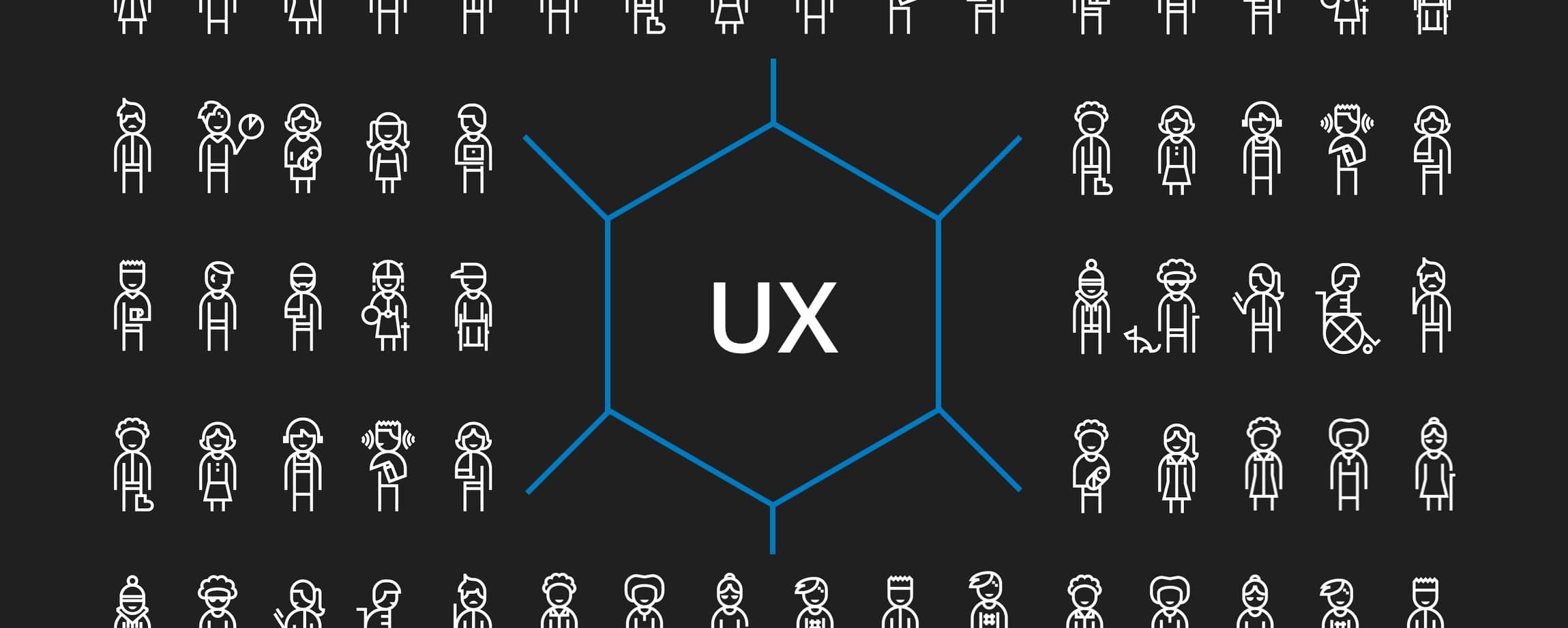
10. User Research & Testing
Research
- Cover accessibility and inclusive design issues when conducting user research. Consider potential visual, hearing, motor, and cognitive disabilities.
- Incorporate accessibility considerations in your personas, or user stories.
- When possible, include users with disabilities in user research.
References: Personas for accessible UX

Testing
- Carry out manual testing on your designs using assistive technology tools like — screen reader, screen reader of native apps, etc.
- Learn how to navigate a webpage using only your keyboard.
- Observe people using assistive technology (AT) on your product or others.
- Adopt an inclusive user testing. When possible, include users with disabilities in user testing and make sure to allow them to use their own equipment
- Use an audit service to find out how accessible is your design. Many tools are available to check your product’s accessibility, for example, WebAIM’s Contrast checker , Chrome extension: Funkify. Google’s Lighthouse tool also gives an overview of accessibility issues.
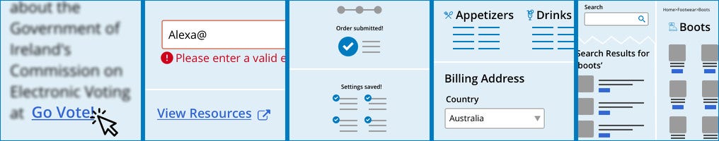
Design for forms
Apart from the above guidelines, there are some key points to be kept in mind while designing a form:
- Form labels and placeholder inputs: Use a label instead of a placeholder to give important information about the field.
- Help text and groups: Add appropriate instructions and help text, if necessary. Common or related elements should be grouped correctly.
- Error messages should not be in colour alone. An informative text should be provided that helps the user to rectify the error.
- Captcha: Captchas are highly controversial in the accessibility world. If you still want to use it, provide text alternatives that identify and describe its purpose.
- Users should be allowed to review, confirm and rectify information before finalising submission.
Source: WCAG 2.1: On Input , WCAG 2.1: Non-text content
At the end I would like to say that, accessibility is a team responsibility — the role of a UX designer is to serve a glue between different departments and ensure accessible design is celebrated and not enforced. Since every user is different, a 100% accessible product is difficult to guarantee, but if we consciously make an effort to design in a way that can make lives of so many users easier, I think that would be a great achievement!
Useful Resources:
Web Content Accessibility Guidelines 2.1 by W3C
Google’s Accessibility for Teams