Digital product design is a very fast-growing industry that requires a very high focus and constant improvement from the designers. We decided to come up with a series of articles/feeds that feature some of the best examples of UI/UX design works that inspired our team. We hope they will be helpful for digital product designers while hey look for new navigational patterns, micro-animations, transitions and just simple UI solution.
Here is a series of the design works created by agencies and individual designers around the globe. We hope that one of these works will inspire for some cool new UI solutions that will solve some real business problems beyond just making your product look and work stunning.
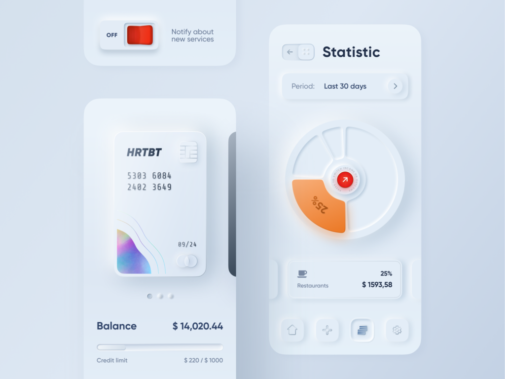
AUGMENTED CREDIT CARD
👨🎨 Volodymyr Kurbatov
By author:
There are plenty of demos that show some finance info on a card. I wanted to make it one step further and explore interactions in context.
Takeaways:
+ Less UI is always better
+ Nice when augmented UI is on something physical
+ I’m not happy with some aspects of dummy UI, but it’s ok as my goal was to explore interactions
– I got used to swiping on the phone so much that this fake Apple Card felt way to light. I think it’s a question of habit and expectations.
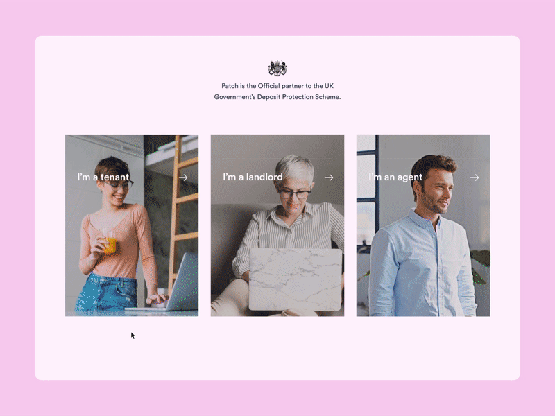
🏠 PATCH — HOME ANIMATION
👨🎨 Filip Justić (Filip Justic)
👥 Balkan Brothers (Balkan Brothers)
Very interesting layout and the color palette. The Balkan Brothers team helped Patch tell their story in this friendly manner. We especially like the micro-interactions that make the experience very delightful.

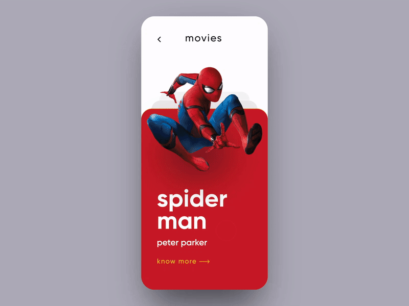
📽 MARVEL MOVIES INTERACTION
👨🎨 vijay verma (vijay verma)
👥 Orizon
Interesting transitions from card-based UI with almost zero elements on the screen. It is definitely worth exploring in your app. But remember, each custom UI control take forever for the development team to implement in code.
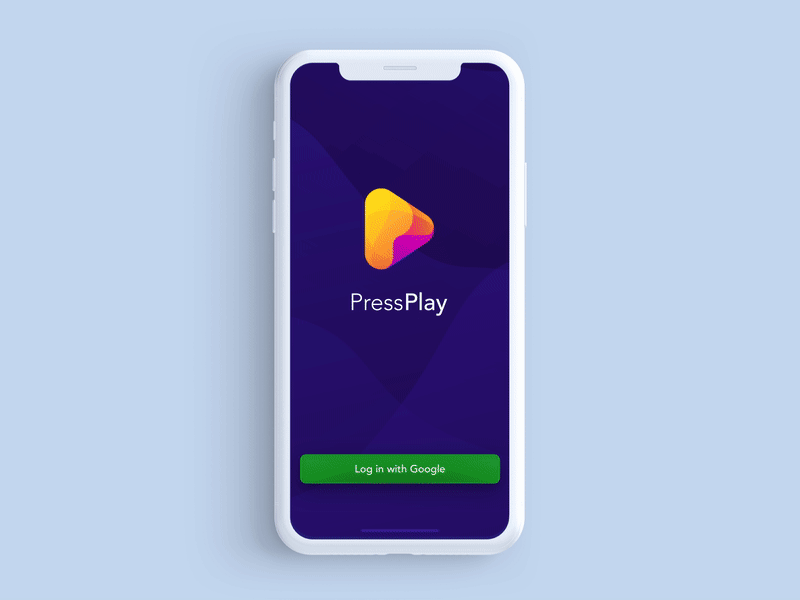
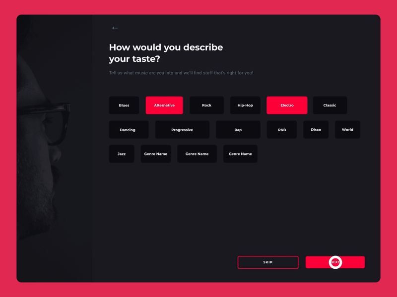
🎮 PRESSPLAY — GAMING NEWS APP
👨🎨 Tomasz Nadratowski
👥 EL Passion (EL Passion)
Interesting way to interact with cells inspired by native iOS elements.

📊 ONLINE POLLS IOS APP
👨🎨 Kostia Varhatiuk
👥 Fireart Studio (Fireart Studio)
Most of the popular apps like Instagram or Airbnb set a very logical direction toward simplification of visual interfaces. This interface in no exception. The team kept the color pallet to 3 colors – black, white and green-ish. This type of UI sets very high expectations for the typeface that you are going to use. Make sure to use the one that will make sense.

✳️ MOZILLA LABS WEBSITE — HEADER ILLUSTRATION
👨🎨 Ramotion (Ramotion)
Some much love to the details from the branded identity illustration to the elements on the webpage that btw look very familiar (Protocol design system by Mozilla).
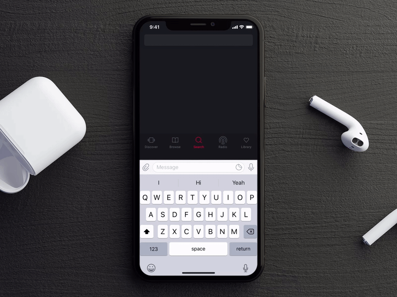
🔎 SEARCH INTERACTION APP
👨🎨 Anton Tkachev
👥 UI8
Proactive search is not just a sign of a good UX design, but a must-have these days.
🚘 MAPBOX CAR NAVIGATION
👨🎨 George Kvasnikov (George Kvasnikov)
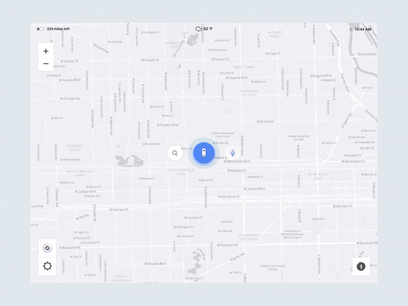
We imagine this UI being a part of a car dashboard navigation system. Very nice use of the circle elements and a simple transition with just a swipe gesture.
⏰ ALARM CLOCK
👨🎨 Renat Muratshin ♣
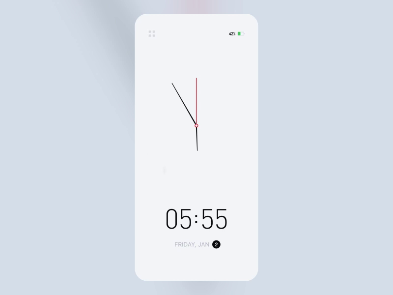
This clean UI is a reminder for all designers to keep things as simple as possible and subtract until there is nothing to delete.
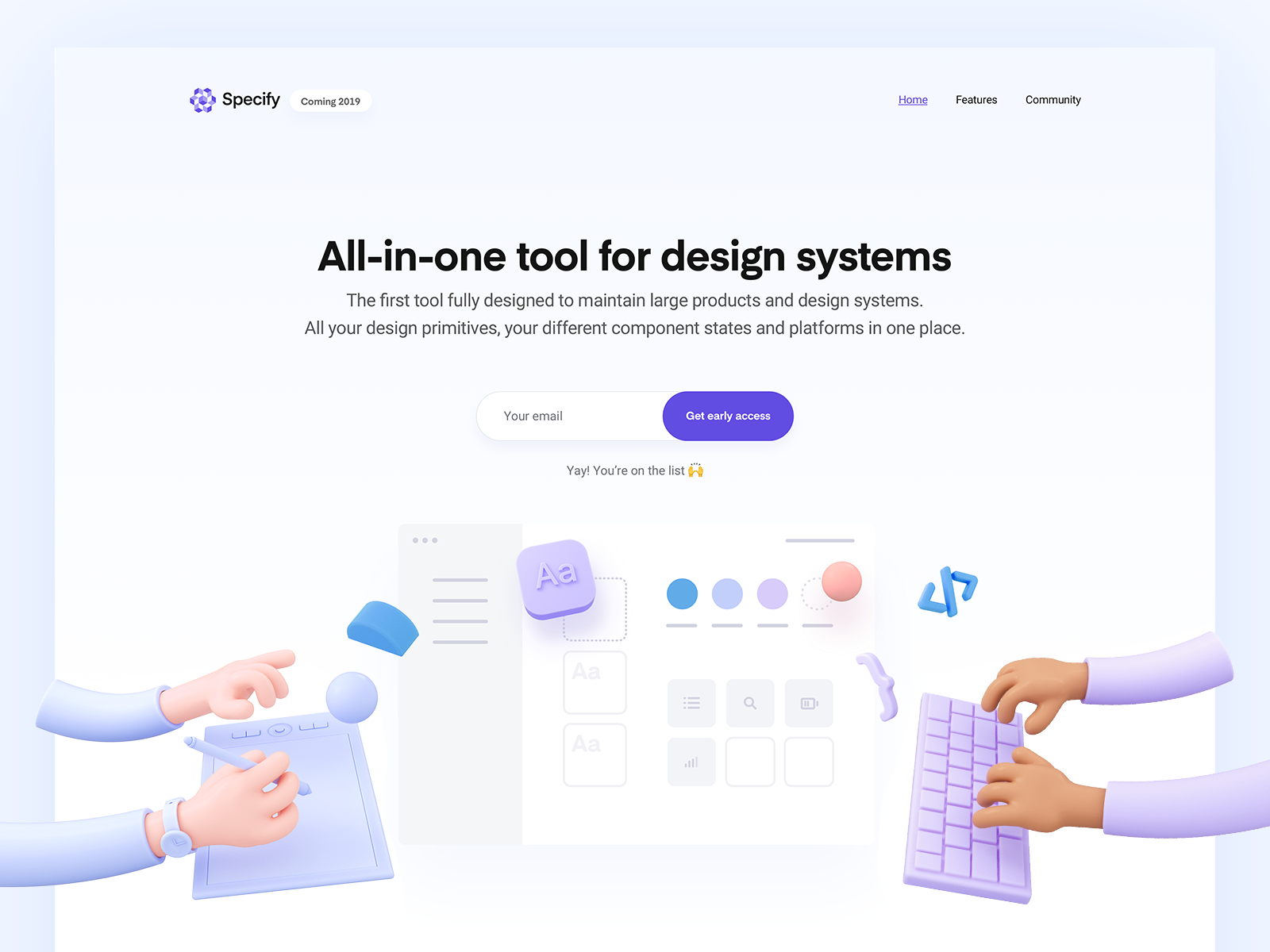
🧬 SPECIFY WEBSITE
👨🎨 Romain Briaux (Romain Briaux)
👥 Specify
The very stylish 3d illustration on a hero section of Specify website. It sets the right mood for the visitors and make them feel like home. This style definitely helps the product stand out.
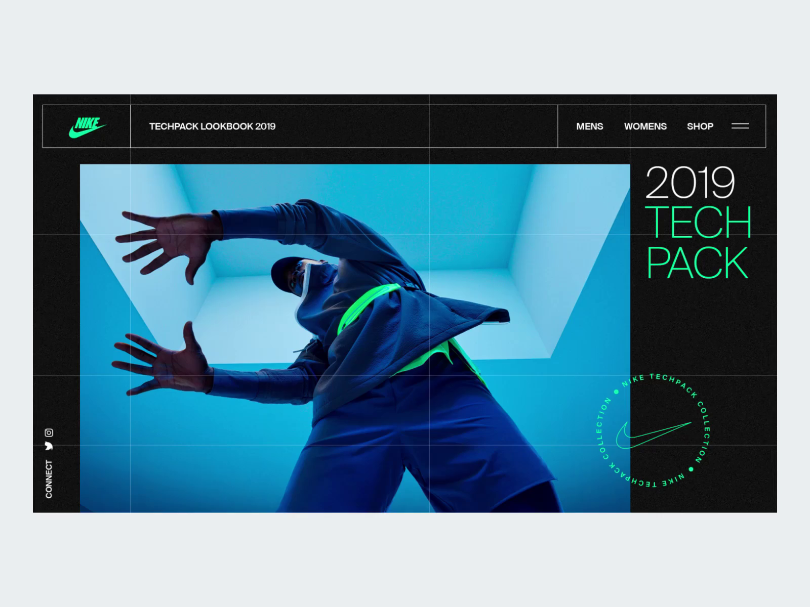
🎽 TECHPACK GRID TRANSITION
👨🎨 Nathan Riley
👥 green chameleon
Experimental work by the designer highlights a very simple visual style.
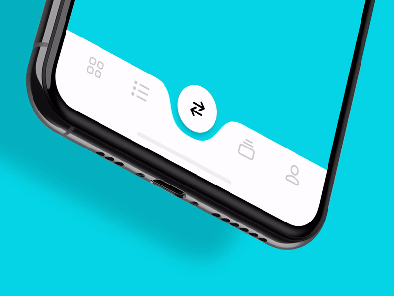
📲 TAP BAR ANIMATION
👨🎨 Lukáš Straňák (Lukáš Straňák)
👥 PLATFORM (PLATFORM)
Another take on a standard element of native iOS element called Tab Bar. This time it is full of smooth animations that clearly show which section is currently active. And it make the UI feel very slick and definitely beyond just custom.
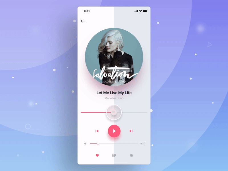
👩🎤 MUSIC PLAYER PROGRESS ANIMATION
👨🎨 ALEX BENDER (Alex Bender-Designer)
A very interesting way to visualize playback mode. We don’t fully agree on the particles. But it might look cute for a music app for kid 🙂

🧬 ZAVA STUDIO CONCEPT
👨🎨 Kyle McDowell 🤘🏼 (Kyle McDowell)
👥 Clay
We chose this concept solely because of the color palette. These visual look and feel makes it very engaging.

🗻 MAKE TRIP
👨🎨 Sahil Bajaj
👥 Master Creationz
Very interesting way to show new elements on a web page. However we’d reduce the sizing effect a bit to keep it more subtle.
🎸 MUSIC PLATFORM WALKTHROUGHS
👨🎨 Anton Tkachev
👥 UI8
This concept features a number of components available in a UI kit created by Anton Tkachev.
Finding Inspiration for Your UX and UI Design
It happens to all of us, you get stuck. Here are some ideas for getting unstuck with your UX/UI design project.
Do the Thing
When we approach a UX/UI design, it’s tempting to go right to an existing product or process and pick it apart. This has value, and our own heuristic evaluations can inform our designs. But it can also limit our vision and viewpoint to just what is already there. Interviewing users is another great option. It can help us see other viewpoints. To really get inspired though, sometimes you have to get out of the office and try it yourself.
One Design Thinking coach uses her first project to illustrate the importance of immersing yourself into an experience. She was hired to redo the web site for Michigan’s public aid program. When she arrived on her first day, they handed her a stack of paperwork and told her to apply for aid. She was dressed in business attire; heels and a silk blouse. It was the hottest day of the summer. She spent 3 hours wandering around downtown Detroit attempting to find not just the location of the building where applications are submitted, but also transportation to get there. She had no cell phone, no car. By the time she finally found the right location, she was frustrated, sweat-soaked silk stuck to her, and got to face an application that was half an inch thick. While she could have easily reviewed the current web site and forms in an air-conditioned office, she learned much more about the full experience by actually attempting it. If you want to test this out, Stanford’s d.school resources and exercises are a great place to start.
Go to the Web
Chances are your design checklist has a step for conducting competitive research. You probably also visit the usual places online for ideas and trends, places like Behance and Dribble. While these are great, you can go further.
Don’t just visit the competition’s web page. Get hold of their product and fully test it out. For example, if you are working on an in-vehicle infotainment system, drive several different cars to get a feel for not just how the UI works, but also how it is integrated into the driving experience. Do strange sounds, vibrations, or lights distract you? Can you reach the controls you need? Again, you are looking for the entire experience, not just how it looks or even how it behaves in a controlled environment.
During your competitive review check out social media and review sites as well. What are customers saying? If you only visit your competitors’ sites you’ll only see the most glowing reviews. You can find professional reviews at places like Consumer Reports and CNET. Depending on the type of experience, Amazon or Yelp offer real user feedback. Social media sites like Twitter and Facebook can also give you direct access to a pool of users that could be hard to access on your own through interviews or user testing.
Step Away
Sometimes the best thing to do is just stop trying to design and take a break. Shifting focus lets your mind continue working on your challenges in the background while you get a much needed mental break. Some pretty famous creative people, Steve Jobs for example, used walks to break up their day, get exercise, increase creativity and productivity.
Whether your UI design relates to navigating your city or not, taking in your surroundings gives you ideas about how things are done and how people behave. From visual inspiration in architecture or ads to people watching, our worlds are full of ideas. Observing people helps us to understand how they behave and think, as well as increasing our empathy. Often we can get stuck not just in at-the-moment inspiration, but also in doing things the way they’ve always been done or how we think about a process or product personally. No matter how often we remind ourselves and our teams that we are not the user, we are still human.
Practice this even when you aren’t currently stuck. Keeping a file of things you find online, jotting notes when inspiration strikes, or taking pictures with a smartphone can help you build this mental muscle as well as be a resource for the next time you get stuck.

1 Comment