Last week we explored some potential new trends in UI design, with one particular trend gaining a lot of attention on both Dribbble and Instagram lately. This “New skeuomorphism” has been called by Jason KelleyNeuomorphism in the comments. I decided to skip the “o” and the name Neuomorphism came alive.
(Also thanks for all the great comments — I understand that Skeuomorphism was always “just behind the corner” but it’s all about the designers perceived trends vs reality here)
🔥 Also check out why I don’t think this will be “huge in 2020”.
Skeuomorphism anyone?
While various forms of Skeuomorphism still exist in UI’s (your desktop OS trash bin for example) the trend towards a particular part of this style is more apparent.
As Kamil Falana pointed out the switch from lifeless “representations” to something mid-way to realism started happening.
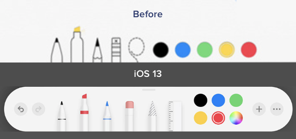
We also noticed a while back, that this change started happening all around us — Apple being a good example. The push towards “super flat and minimal” got a pushback and ended up with a bit more of that textureless 3d feel. People seem to like it.
Halfway back, but better?
The entire hype started with one Dribbble shot that quickly went viral.
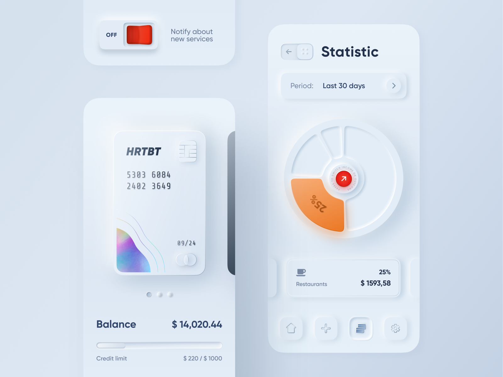
This shot started a trend and while parts of it don’t make a whole lot of sense (a slide-to-go back arrow?) it was precisely what we needed to get excited with UI’s again. Thanks Alex!
What’s the difference?
Since the buttons didn’t change as much, let’s focus on the actual cards concept that makes this such a nice visual style.
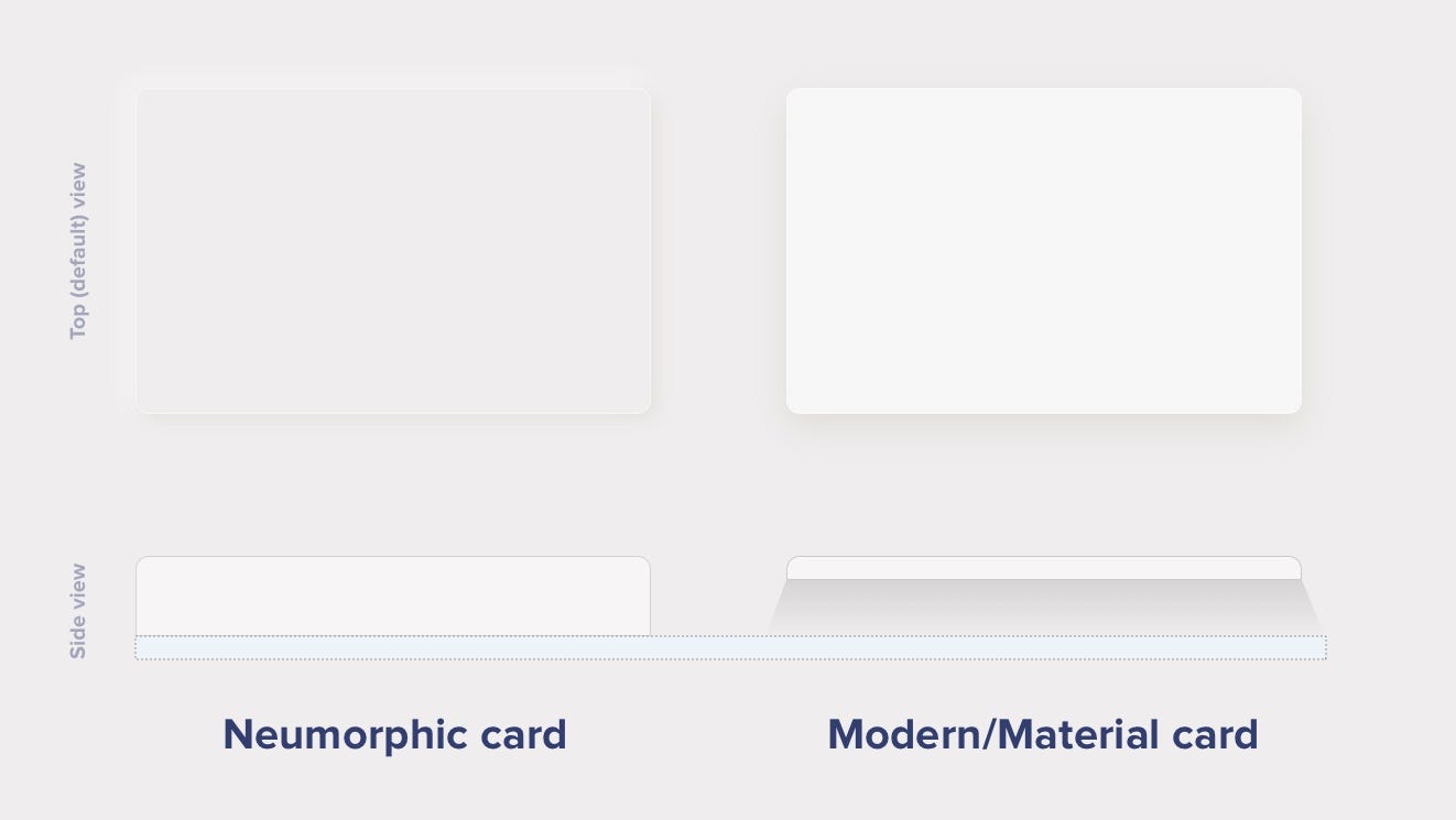
Modern / Material Cards
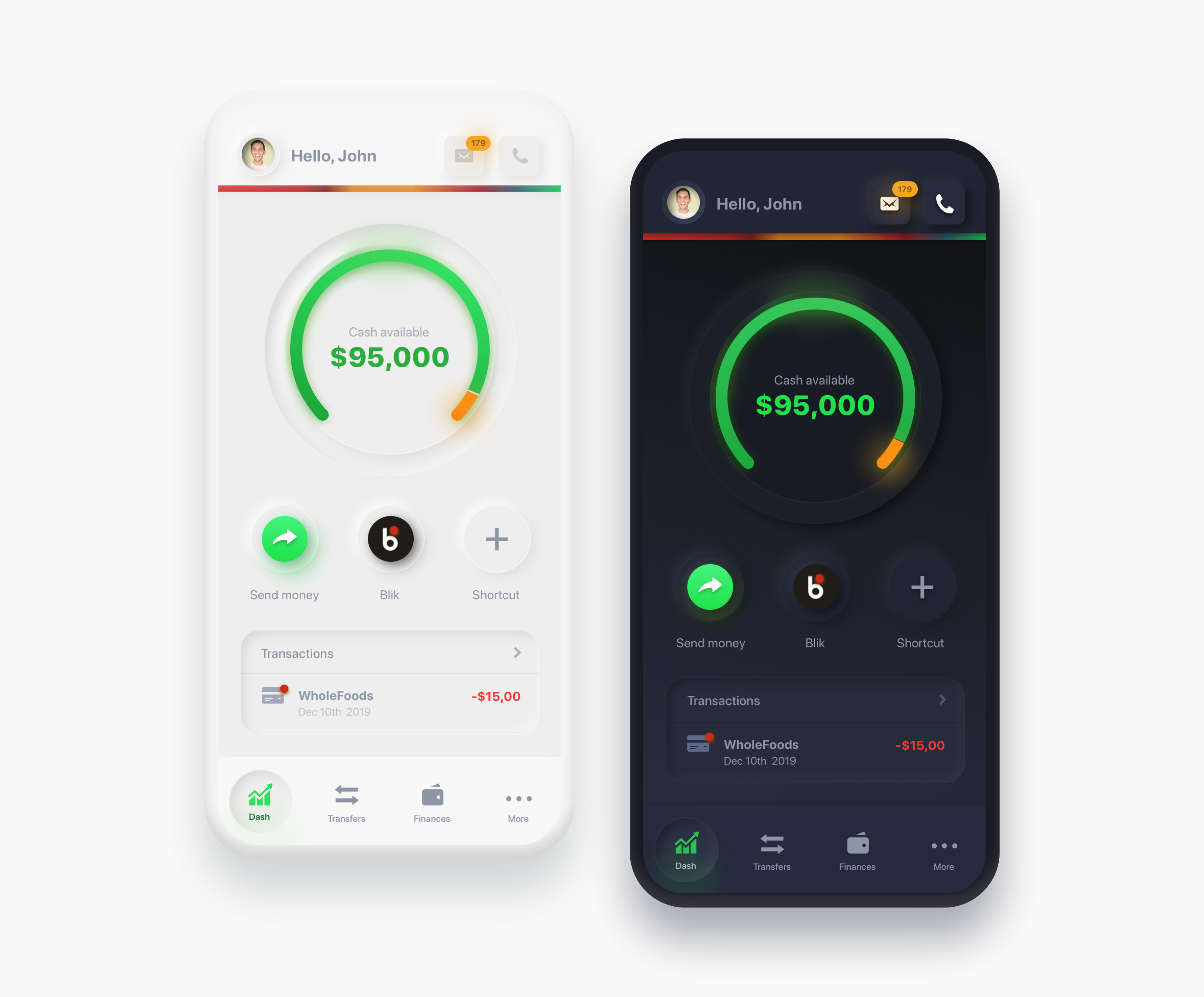
A Modern / Material (upgraded) card usually is a surface floating on top of our perceived background and casting a shadow onto it. The shadow both gives it depth and also in many cases defines the shape itself — as it’s quite often borderless.
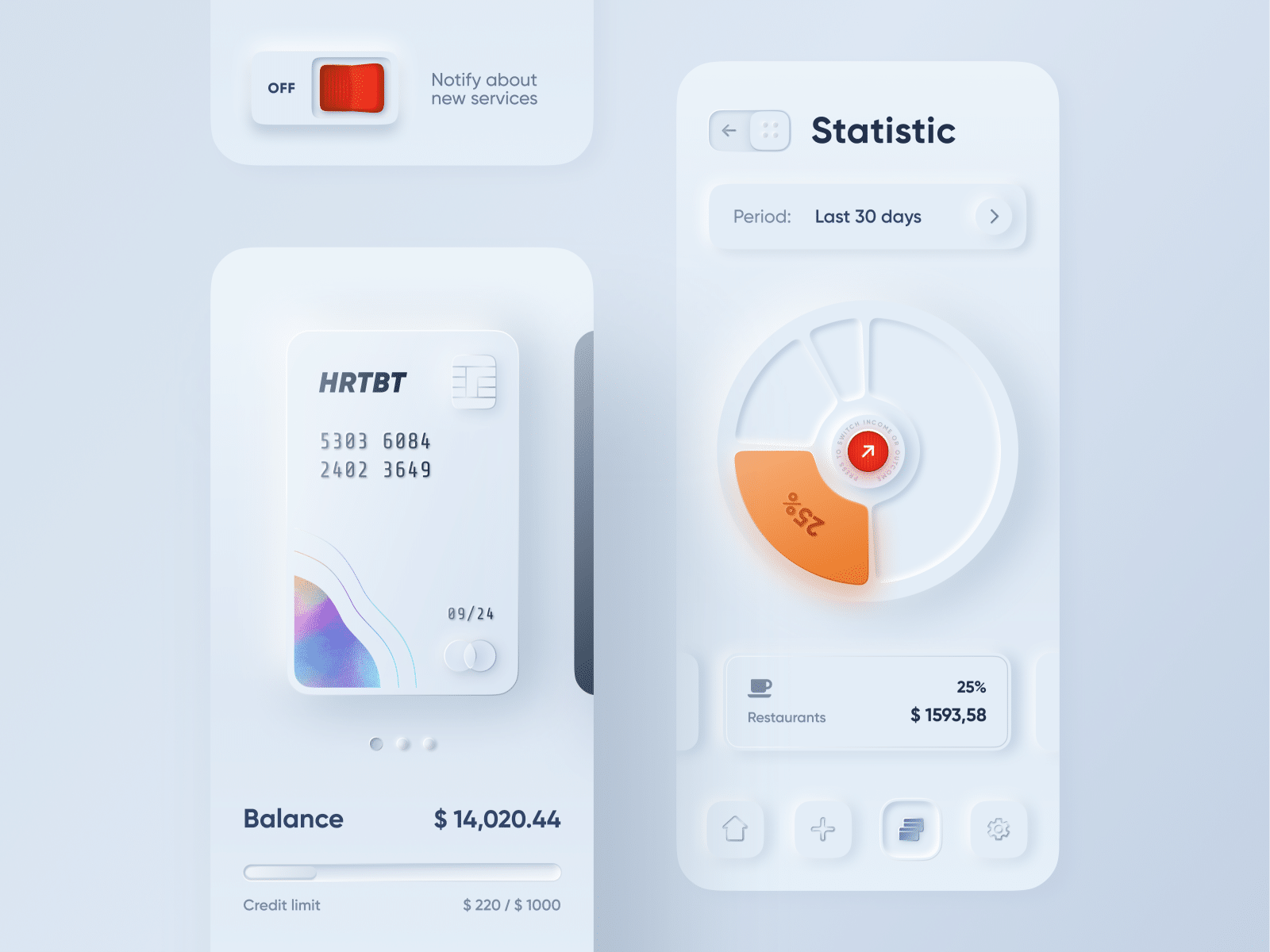
Neumorphic cards
Neumorphic card however pretends to extrude from the background. It’s a raised shape made from the exact same material as the background. When we look at it from the side we see that it doesn’t “float”.
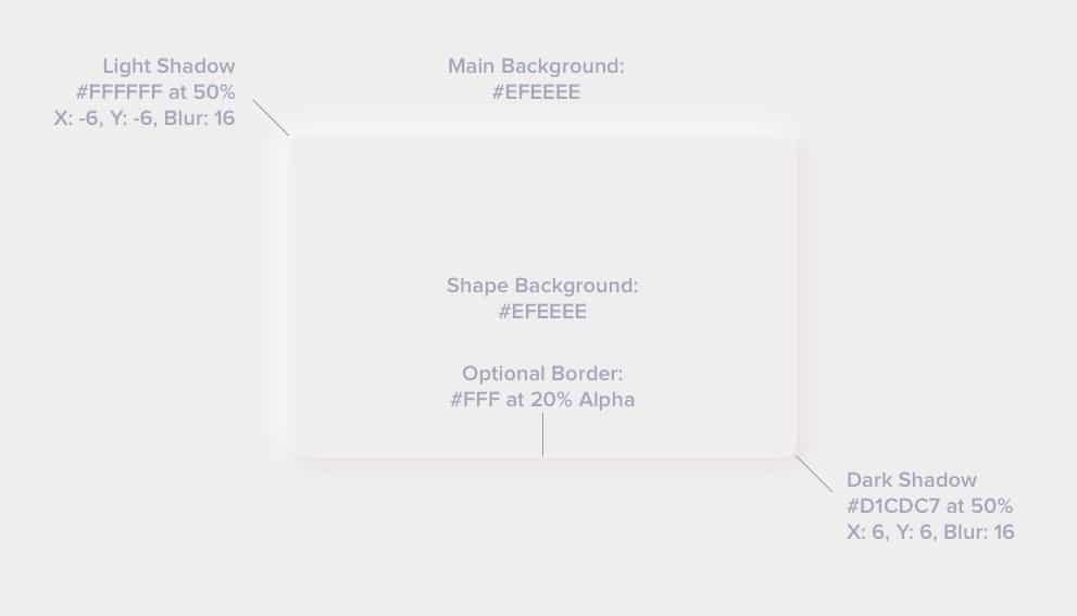
This effect is pretty easy to achieve by playing with two shadows, one at negative values while the other at positive. But for it to work our background cannot be fully black or fully white. It needs at least a tiny bit of tint so both dark and “light” shadows will be visible. You can use any hue for the background so it can be warmer or colder depending on your choice. But white and dark shadows have to be visible on it, if slightly.
Here’s the recipe — tweak it to your liking:
Neumorphic card however pretends to extrude from the background. It’s a raised shape made from the exact same material as the background. When we look at it from the side we see that it doesn’t “float”.
This effect is pretty easy to achieve by playing with two shadows, one at negative values while the other at positive. But for it to work our background cannot be fully black or fully white. It needs at least a tiny bit of tint so both dark and “light” shadows will be visible. You can use any hue for the background so it can be warmer or colder depending on your choice. But white and dark shadows have to be visible on it, if slightly.
Here’s the recipe — tweak it to your liking:
The pros and cons
The main benefit of this style is the “freshness” (at least for as long as it lasts). It brings that “new feel” to the interface and make it stand out. It can also be mixed with other styles, so it’s not overwhelmingly “soft extruded plastic” everywhere.
There are however some problems with it that need addressing. Two main problems we found so far (but we’re still looking) are:
- Accessibility
- Ways to efficiently code this
Visibility — Accessibility
The main problem with figure to background contrast ratio is that when they’re both the same color there’s no contrast to measure 😉 Objectively there’s a shadow so we could approximate and try to measure the first pixel outside of it. In the case of our example above we end up with these contrast values.
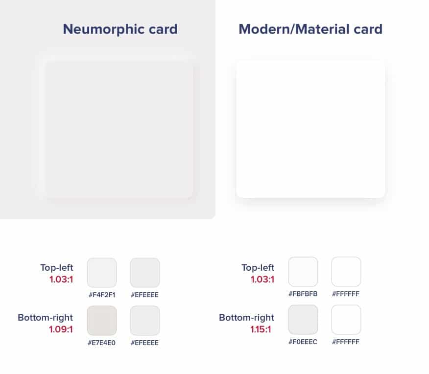
As you can see both the modern and neuomorphic cards are pretty low on contrast. Of course that’s partially their appeal and the cards themselves are not used for active elements — so as long as we keep the buttons prominent and with high enough contrast we should be fine.
And since almost nobody does the shadows that strong it means the rest of the UI elements have to be accessible. This assumption leads to a conclusion that those cards / extruded plastic cards are not really that important if we do the right hierarchy through typography, proximity and contrast with the important elements.
This has yet to be tested (and I will try to find the time to do it) but for now we’re assuming that both “versions” of the element below are “OK”. Even if some people don’t see the soft shadows on it, there’s still enough contrast for them to see the icon and “use it”.

Accessibility
While a “button” should look like a button, if the icon itself is contrasted well enough with the background it will still work. So the main thing to remember here is that if you’re going with this style keep all the important elements on it with high enough contrast.
After all most of the “modern” card views also don’t pass the contrast test with their shadows anyway.
Cards only?
The main problem with accessibility appears however if we decide to use our components as buttons and not cards.
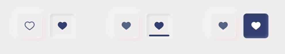
We can easily create a pressed state with inverted-inner shadows like in the example below.

The problem here is actually big.
This pressed state has too little contrast to signify a difference. When it was OK for cards to “disappear” if the rest of the interface delivers, active elements need to communicate their state at all times.
There are a couple of ideas here like using an outline and filled icon, an underline or even filling the pressed state with a color.
Keep that in mind when designing. We all love the “pretty” but we also need to remember for it to be usable by everyone.
Coding
Let’s treat coding as a bonus round here, as it’s actually easier than we think to achieve that “soft plastic” look in CSS. We have yet to look into Swift and Kotlin, but I don’t think it should be a problem.
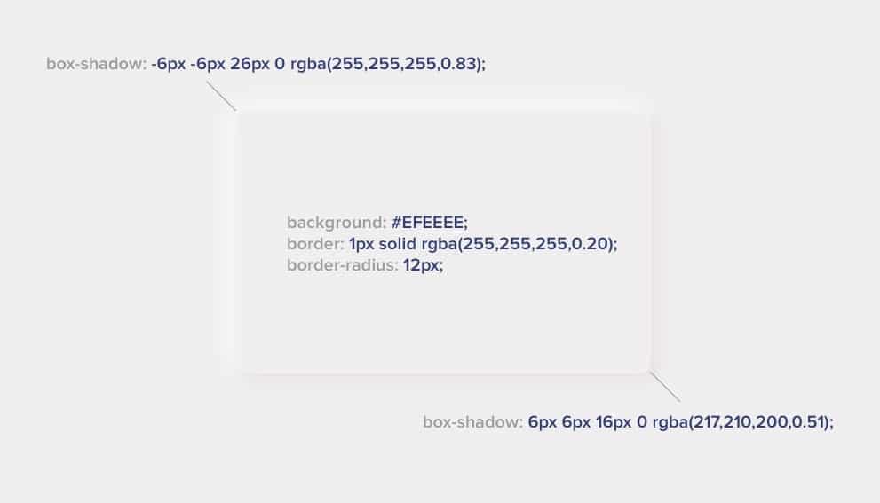
Of course you can merge the two box-shadows together with a comma between them.
If you want a handy generator, one creative web developer made one at https://neumorphism.io
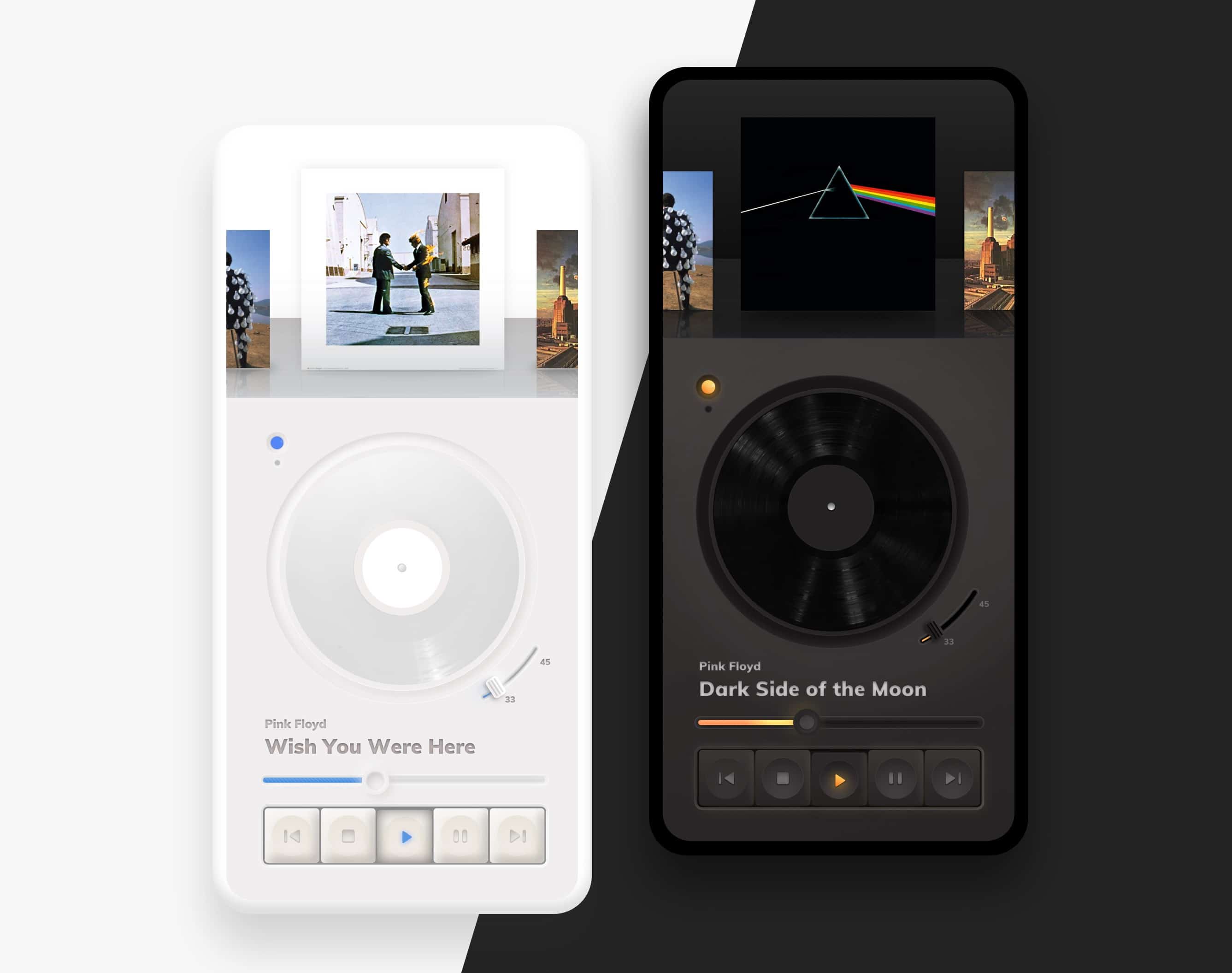
Other effects
However the background shapes are one thing. This new style also comes with more “graphic intense” buttons and switches. In many cases we simply need to go back to “good old days” and use bitmaps. That seems like a regression but fret not — it’s not necessary. You can easily combine modern, fully code’able buttons with those card shapes with great results.
Do we really need all that?
While this new trend has surely inspired a lot of designers, it’s problems are not that great compared to the accessibility issues with previously used card components.
So go wild! Play around with this trend and tweak it to make it yours. The UI designer’s job is moving rectangles around, so every time the rectangles turn out a bit “different” and “new” it’s bringing a bit of that joy back. Without that constant exploration all products will start to look the same again.