I’m a sucker for a card component. It takes me back nostalgically to my adolescence when baseball cards introduced me to information design. I collected and organized thousands, each exhibiting a hero’s photo, team as theme, positions as identity. My brain engaged with the design, data, and in-depth inquiry they fostered.
Today’s digital card serves the same purpose. More than just a generic container, a card is a scannable snapshot of an object’s vitals. It previews enough to identify. It invites us to learn more and interact, in that order.
A card is a sheet of material that serves as an entry point to more detailed information. Cards may contain a photo, text, and a link about a single subject. — Google Material Design’s Card
Often, the card also signals a pivot in the growth of a component library. Unlike primitives like button and input, a card requires composition. It relates many elements (some already in our library) and as content flows into each. Also, cards are almost always shown as a set, siblings side by side. Composition triggers higher-order thinking critical to system design.
Hardening a composition like card forces a system to mature. Sometimes, a system solves the challenges, increasing library complexity. Other times, a system’s burgeoning maturity steers away from complexity, keeping things simple. These challenges take the form of structure, content, style and behavior. May the lessons here inspire your system compositions to come.
Composing Structure
Libraries start with primitives—input, heading, checkbox, radio-button, label, icon—to serve as building blocks. A button’s composability is fairly mundane: an icon to the left or right of a label, maybe a split bar or animation. Thenbutton-group combines button, forcing sibling relationships. These are low-level challenges. Things get more interesting when composing components like card with many elements.
Identify Core Elements
A composable component starts with essential core of required elements, so you’ll want to ask:
What elements are required of each and every display?
What happens if a required element is missing?
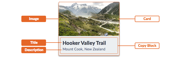
card often requires:
- image, paired with a…
- title (usually a styled
heading), maybe supplemented with a… - description (or “deck” or other elaborating content).
Identify All Possible Elements & Cases
Cast the discovery net wide across many products. Inventory each example. Analysis should yield a growing diversity of cases and elements should inform a design and guidance useful for later documentation.
What is a complete possible elements included?
What element combinations discouraged or forbidden? For example, acardmay includebuttons oricons for actions, but never both.
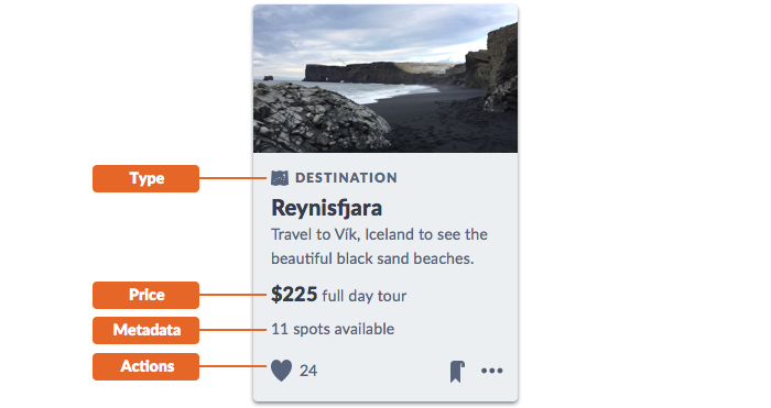
cards serve varying needs across many moments of an experiences, and can include a range of other content types:
- label or type, often signaling a group to which the object belongs and possibly displayed as a
tagor anicon/label pair. - action(s) offered as
button(s),icon(s), or both. - price and ratings for products
- metadata, distinct from a description to highlight key properties
- related list(s) as a set of items related to the object
Solidify Element Relationships
A composable component’s many elements raise questions of order, combinations, groups, and more:
Are there named zones, such as actions?
Are there element subgroups? Can subgroups reordered or hidden?
What logic is needed to sort, combine, or separate combinations?
How many alternative arrangements should we test?
How many variations should be revealed and described in doc?
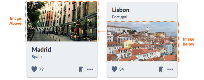
For many cards, the stacked order is fixed: image then title then actions. In other systems, more flexible needs may suggest reordering elements. For example, Morningstar Design System’s card enables users to place an image above or below a title.
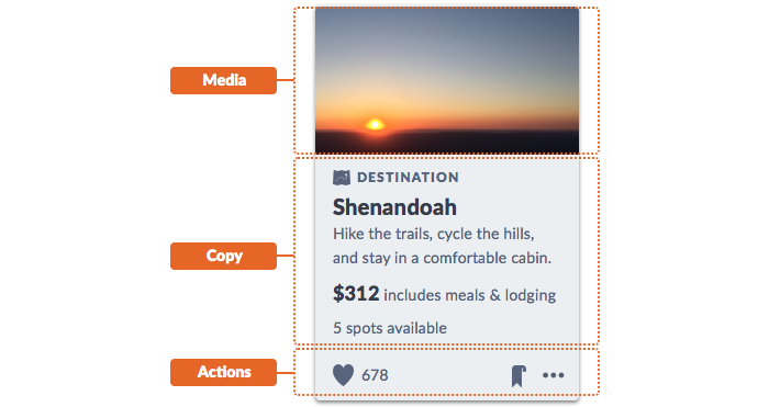
Like a modal and dialog, card could identify zones for a header, main and footer or media, copy, and actions to firmly identify content relationships.
Cope with Regions Allowing Flexible Input
The bigger the component, the more likely it offers a region that welcomes, well, whatever an system user wants to put there. The region’s content can be as innocuous as a paragraph or bulleted list.
Are there generic regions into which you can place flexible markup?
How do regions zones impact fluid and/or fixed displays?
Do you expect or recommend certain content types for such containers?
But that region opens a dangerous door. Maybe an adopter adds a legend… under a chart… with an adjoining four column data table… in the content portion of a card. Hint: that’s not what a card is for.
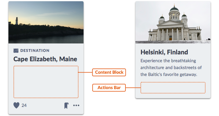
Regions offer flexibility but invite abuse. Nobody argues opening up a modal’s main content area to uncertain markup. For a card, an action bar zone could include button, icon, and menu. However, it’s not up to card to hard wire every case. Some components may need to offer regions and relinquish control of and responsibility for what’s goes inside.
Takeaway: With great container power comes great responsibility of adopting teams. Don’t fool yourself to believe you can predict, build, test, or doc every possible case. If a region is intended for a few expected variants, do adopters a favor and create examples exhibiting each one.
Composing Content
Titles, prose, metadata, pricing. An image that packs a powerful punch. No matter the elements you include, a card requires thoughtful consideration of media and copy. Unlike primitives you handled yourself, composable components require collaboration with those that know content best.
Content Varies. Form Conventions Based on Real Content.
An image above text. It’s simple, right? Not always. The image’s aspect ratio is pivotal not just for visual harmony, but content production too.
At one client, we analyzed existing inconsistent cards across products. It was a treasure trove of real content. Except: yikes, the aspect ratios of images varied wildly! Some products rocked a 16×9 or 3×2 ratio. Others only squared images. Search presented the gamut, including exceedingly tall portraits.
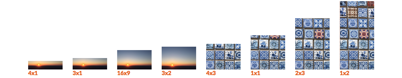
Content experts were understandably fatigued by years of design flip flop. To them, the system was an opportunity to end image size conversation. A standard aspect ratio would not just improve display consistency, but also vastly simplify their vendor requirements and image delivery.
As a result, card settled on a 16×9 landscape ratio, augmented by a square alternative. This process also yielded code to solve ratio-specific display on the front-end. As a result, composability led to a thumbnail component useful for other components too.
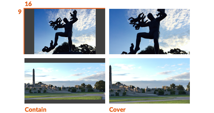
To address legacy content, card offered a prop to contain images (using the background-size CSS property) within the 16×9 space. Designers achieved visual grid harmony in search results, while producers adjusted displays per card to address undesirable photograph crops.
Takeaway: The more composable a component, the more vital that you incorporate content considerations. Stress test design and builds with real content. Engage those that cope with the content that flows into your components every day. You may become their new best friend.
Too Much Content? Address Wrapping & Truncation
While images dominate a display, copy also plays a critical role in headings, descriptions, and metadata. But it’s a card, not an opus, so copy can’t go wild.
Longer titles and descriptions are bound to wrap once or — if you can stomach it — twice. So design for margins and line height. But if copy lengthens, cardeffectiveness diminishes fast.
What’s the max length of each copy element?
What’s the max and min character count we’re comfortable width?

Truncation provides an escape hatch, protecting against copy length that we can’t predict. Truncation divides opinion: some clients loathe truncation, while others release a truncate utility in a first component batch. Truncate a card title or even subtitle or description, and you risk damaging context and understanding. In composable components, defer to priorities: truncate a description before title, or after three lines instead of two, amid an appearance that sufficiently flexes.

It’s not just copy wrapping, either. Consider rows of actions like a horizontal button and icon list that could collide when settings get narrow.

Takeaway: Copy length maximums and truncation appeal to our sense of control overflowed content. As components, complexity grows, strengthen editorial opinion and code control on copy length, line measure, and impacts of fluid card width. If you offer utilities, do so as moderation, not a crutch.