BY Paul Shaw
The Univers of Helvetica: A Tale of Two Typefaces
Speculative historical thinking, or counterfactual history, whether by historians or novelists, tries to imagine what might have happened if the outcome of a key moment in the past had been different. It has usually been applied to momentous events such as the expulsion of the Moors from Spain, the American Civil War, the two World Wars or the assassination of John F. Kennedy. But suppose we apply such thinking to something more mundane: the popularity of a typeface.

In 1957 three typefaces, all designed in the same neo-grotesque manner, were released: Neue Haas Grotesk by Eduard Hoffmann and Max Miedinger, Univers by Adrian Frutiger, and Folio by Konrad F. Bauer and Walter Baum. The first of them, eventually under the name Helvetica, emerged as the most popular.
But contrary to the implications of the eponymous 2007 movie by Gary Hustwit, this success was neither immediate nor pre-ordained. There were a handful of moments in Helvetica’s history that have proved to be crucial.
Neue Haas Grotesk was developed by the Haas foundry in Münchenstein, Switzerland, to counteract the preference of the leading modernist Swiss designers of the postwar period for Akzidenz Grotesk—a typeface sold by H. Berthold AG, a German type foundry. This was both a matter of sales and national pride… but the attempt failed. The great majority of Swiss designers continued to use Akzidenz Grotesk (commonly known as AG).

Akzidenz Grotesk in a Volkswagen Ad (1961) | Source
The notable exception was the small coterie led by Emil Ruder, a teacher at the Allgemeine Gewerbeschule Basel, who was devoted to Univers as the best—and only—typeface to use. [1]

1961 Typografische Monatsblätter design by Emil Ruder | Typeface: Univers
Given this domestic reception, how did Neue Haas Grotesk, under the name Helvetica, become the celebrity typeface of today? Why did it triumph over Univers?
The first key moment happened years before Neue Haas Grotesk was even conceived.
In 1927 the German foundry D. Stempel GmbH acquired a partial interest in the Haas Type Foundry. This is one of two reasons that Eduard Hoffmann turned to Stempel in 1959 to broaden the sales of his new sans serif. More importantly, Stempel made the first matrices for Mergenthaler-Setzmaschinen-Fabrik GmbH (the German Linotype company) [2] in 1900 and subsequently became half-owned by the latter. It was this relationship that Hoffmann had in mind, because adapting Neue Haas Grotesk for the linotype was the best way to spread the design.

Neue Haas Grotesk (as Helvetica) in a Coca-Cola Ad (1969–74) | Source
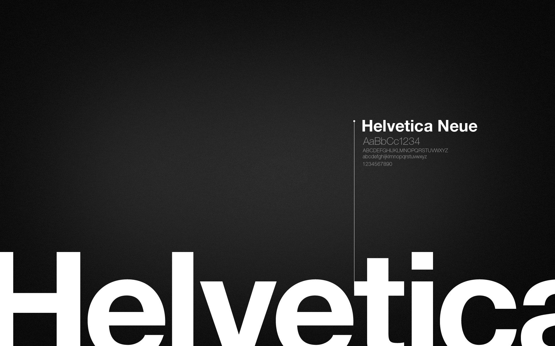
The arrangement between Haas and Stempel had other consequences besides the adaptation of Neue Haas Grotesk for composing machines. It also led to the fateful—and ultimately brilliant—decision to jettison the dull “Neue Haas Grotesk” name in favor of one with more international appeal. To capitalize on the popularity of “Swiss Design,” Stempel’s manager Heinz Eul suggested “Helvetia,” the Latin name for Switzerland. Hoffmann nixed it and countered with “Helvetica.”
The subtle addition of the ‘c’ not only avoided a possible trademark fight with a Swiss sewing machine manufacturer, but it made for a more pronounceable and hence memorable name for non-German (and non-Latin) speakers.