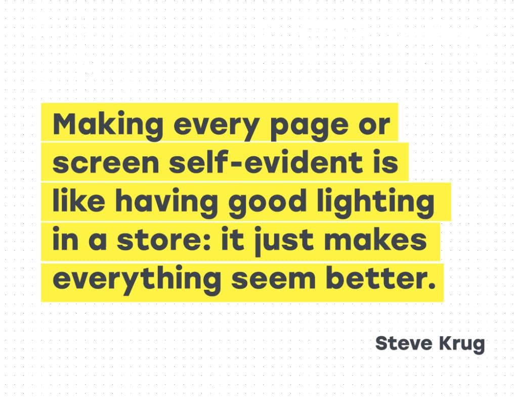
Creating Usability with Motion: The UX in Motion Manifesto
The following manifesto represents my answer to the question — “As a UX or UI, designer, how do I know when and where to implement motion to support usability?”
Over the last 5 years, it has been my privilege to coach and mentor UX & UI designers in over 40 countries, and at hundreds of the top brands and design consultancies through my workshops and tutorials on UI Animation.
After over fifteen years studying motion in user interfaces, I have come to the conclusion that there are 12 specific opportunities to support usability in your UX projects using motion.
I call these opportunities ‘The 12 Principles of UX in Motion,’ and they can be stacked and combined synergistically in a myriad of innovative ways.
I’ve broken the manifesto into 5 parts:
- Addressing the topic of UI Animation — it’s not what you think
- Realtime vs non-realtime interactions
- Four ways that motion supports usability
- Principles, Techniques, Properties and Values
- The 12 Principles of UX in Motion
It’s not about UI Animation
Because the topic of motion in user interfaces is mostly understood by designers to be ‘UI Animation’—which it is not — I feel like I need to create a bit of context before we jump into the 12 Principles.
‘UI Animation’ is typically thought of by designers as something that makes the user experience more delightful, but overall doesn’t add much value. Thus, UI Animation is often treated like the red-headed stepchild of UX (apologies to red-headed stepchildren everywhere). If at all, it usually comes at the end, as a final lipstick pass.
Additionally, motion in the context of user interfaces has understandably been held to be under the domain of Disney’s 12 Principles of Animation, something I argue against in my article ‘UI Animation Principles — Disney is Dead.’
In my manifesto, I will be making the case that UI Animation is to the ‘12 UX in Motion Principles’ as construction is to architecture.
By this I mean, that while a structure needs to be physically built to exist (requiring construction), the guiding hand which determines what gets built comes from the domain of Principles.
Animation is all about tools. Principles are the practical application of ideas that guide the usage of tools and as such, Principles provide high leverage opportunities for designers.
What most designers think of as ‘UI Animation’ is in fact the execution of a higher modality of design: the temporal behavior of interface objects during realtime and non-realtime events.
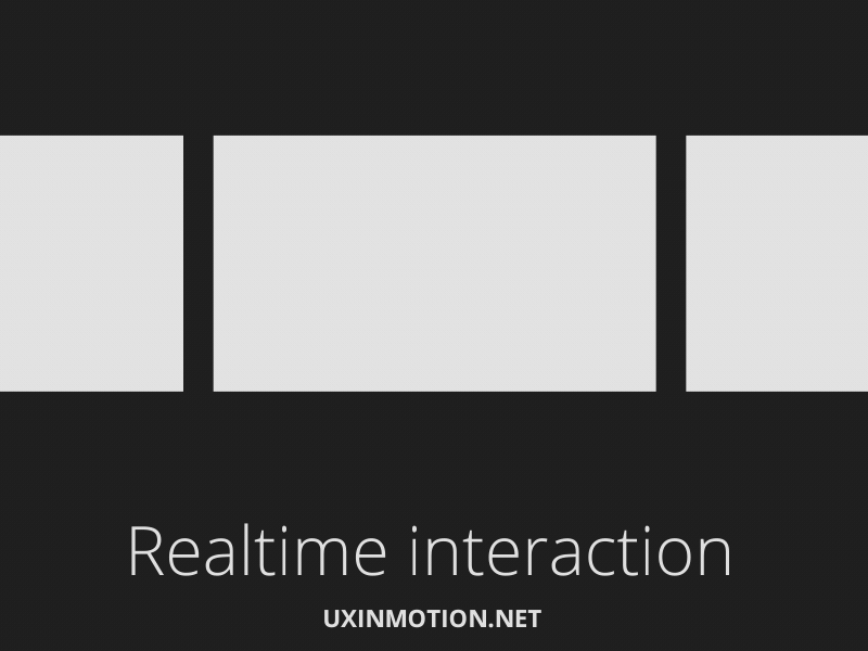
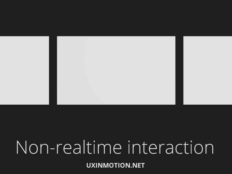
Realtime vs non-realtime interactions
At this juncture, it is important to distinguish between ‘state’ and ‘act.’ The state of something in UX is fundamentally static, like a design comp. The act of something in UX is fundamentally temporal, and motion based. An object can be in the state of being masked or it can be in the act of being masked. If it is the latter, we know that motion is involved and in a way that could support usability.
Additionally, all temporal aspects of interaction can be thought of as happening in realtime or non-realtime. Realtime means that the user is directly interacting with the objects in the user interface. Non-realtime means that the object behavior is post-interactive: it occurs after a user action, and is transitional.
This is an important distinction.
Realtime interactions can also be thought of as ‘direct manipulation,’ in that the user is interacting with the interface objects directly and immediately. The behavior of the interface is happening as the user is using it.
Non-realtime interactions happen only after input from the user and have the effect of briefly locking the user out of the user experience until the transition completes.
These distinctions will give us leverage as we continue our journey into the world of the 12 Principles of UX in Motion.
Motion supports usability in four ways
These four pillars represent the four ways where the temporal behavior of user experiences supports usability.
Expectation
Expectation fall into two areas — how users perceive what an object is, and how it behaves. Another way of saying this is that as designers, we want to minimize the gap between what the user expects, and what they experience.
Continuity
Continuity speaks both to the user flow and to the ‘consistency’ of the user experience. Continuity can be thought of in terms of ‘intra-continuity’ — the continuity within a scene, and ‘inter-continuity’ — the continuity within a series of scenes that make up the total user experience.
Narrative
Narrative is the linear progression of events in the user experience that results in a temporal/spatial framework. This can be thought of as the series of discreet moments and events that connect together throughout the user experience.
Relationship
Relationship refers to the spatial, temporal, and hierarchal representations between interface objects that guide user understanding and decision making.
Principles, Techniques, Properties, and Values
Tyler Waye says it as good as any when he writes, “Principles… are the underlying premises and rules of function giving rise to any number of techniques. These elements remain consistent, no matter what is happening.” It bears repeating that Principles are agnostic of design.
From there, we can imagine a hierarchy with Principles at the top, Techniques further down, Properties below that, and Values at the bottom.
Techniques can be thought of as the various and unlimited executions of Principles and/or combination of Principles. I think of technique as akin to ‘style.’
Properties are the specific object parameters that are being animated to create the technique. These include (and are not limited to) position, opacity, scale, rotation, anchor point, color, stroke-width, shape, etc.
Values are the actual numeric property values that vary over time to create what we call ‘animation.’
So to land the plane here (and jumping ahead a bit), we could say that a hypothetical UI animation reference is using the Obscuration Principle with a ‘blurred glass’ Technique that affects the Blur and Opacity Properties at a Value of 25px and 70% respectively.
Now we have some tools to work with. And more importantly, these linguistic tools are agnostic of any specific prototyping tool.
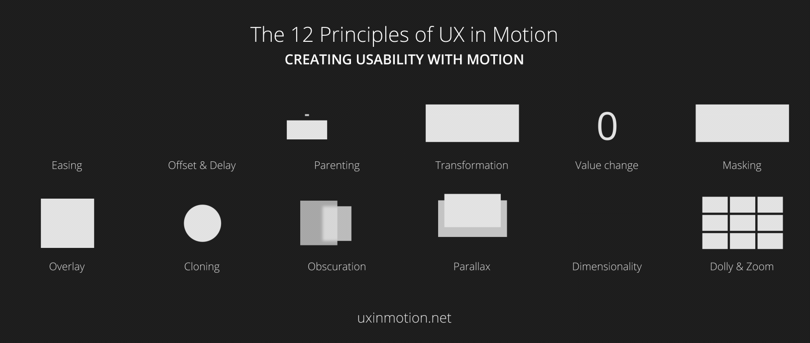
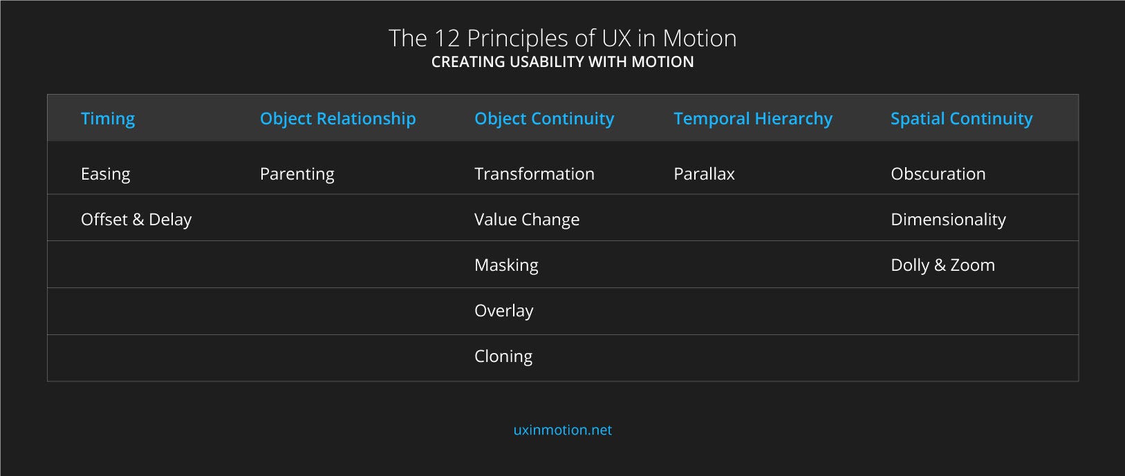
The 12 Principles of UX in Motion
Easing and Offset & Delay relate to timing. Parenting relates to object relationship. Transformation, Value Change, Masking, Overlay, and Cloning all relate to object continuity. Parallax relate to temporal hierarchy. Obscuration, Dimensionality and Dolly & Zoom both relate to spatial continuity.
Principle 1: Easing
Object behavior aligns with user expectations when temporal events occur.
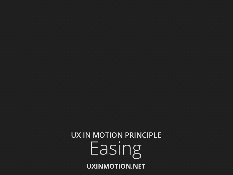
All interface objects exhibiting temporal behavior (whether realtime or non-realtime), ease. Easing creates and reinforces the ‘naturalism’ inherent in the seamlessness of user experiences, and creates a sense of continuity when objects behave as users expect them to. Incidentally, Disney refers to this as ‘Slow In and Slow Out.’
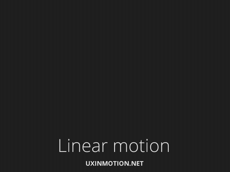
The example on the left has linear motion and looks ‘bad.’ The first example up top has eased motion and looks ‘good.’ All three above examples have the exact number of frames and take place over the exact same amount of time. The only difference is in their easing.
As designers concerned with usability, we need to require of ourselves rigor and inquire, aside from aesthetics, which example supports usability more?
The case I am presenting here is that a certain degree of skeuomorphism is inherent in easing. You can imagine an ‘easing gradient’ wherein behaviors that fall outside user expectations result in less usable interactions. In the case of properly eased motion, users experience the motion itself as seamless and largely invisible — which is a good thing in that it is non-distracting. Linear motion is visibly obvious and feels somehow off, unfinished, and jarring, and distracting.
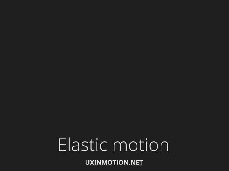
Now I’m going to completely contradict myself here and talk about the example on the right. The motion isn’t seamless. In fact, it has a ‘designed’ feel to it. We notice how the object lands. It feels different, yet it still feels more ‘correct’ than the example with linear motion.
Can you employ easing and still have it not support (or worse case undermine) usability? The answer is yes, and there are several ways. One way is timing. If your timing is too slow (mushy to borrow from Pasquele), or too fast, you can break expectation and distract user attention. Similarly, if your easing is misaligned with the brand or overall experience, this can also negatively impact expectation and seamlessness.
What I want to open you to is a world of opportunity when it comes to eased motion. There are literally an infinite number of ‘easings’ that you as a designer can create and implement in your projects. All of these easings have their own expectation response they trigger in users.
To summarize: when to use easing? Always.
You can learn more on my easing hypothesis in my article, ‘The irony of usability and linear motion.’