BY KC Karnes
If beauty is in the eye of the beholder, how important is mobile app design in the eye of the phone-holder?
A great product requires more than building features and functionality. Users expect the interface to enhance the overall experience, while still functioning perfectly and fulfilling their every need — is that too much to ask for?
Implementing new buttons, forms, and animations can make an app design feel unique and state of the art.
But there is an upper limit to the pace of innovation, which means you should not innovate too far beyond what is widely accepted. While these new app designs feel different, they must be familiar enough to be intuitive.
Mobile App Design Tips
There are generally accepted standards and principles when it comes to designing mobile apps. The UX tips below span the onboarding, engagement, and retention processes of simple yet functional design.
Check out these tips for developing a product or jump to our animated infographic for a visual guide to mobile app design.
Prompt the Mobile Onboarding Process
The “final mile” of building a product is often spent on the “first mile” of the customer’s onboarding experience.
The founder and former CEO of Behance and currently the Chief Product Officer at Adobe, Scott Belsky, argues that teams do not spend enough time crafting that “first-mile” onboarding experience for users.

While the default onboarding flow might adequately inform early adopters who understand the solution and vision for the product, as more users are acquired the standards become higher for onboarding.
Dave Morin, legendary Silicon Valley founder and investor, has said, “the devil is in the defaults” – meaning whatever the customer is defaulted to will be their lasting impression.1
What lessons should we take from these product development experts?
Do not underestimate the importance of designing an amazing onboarding experience.This will immediately set the stage for your product and create a memorable first scene, hypothetically speaking.
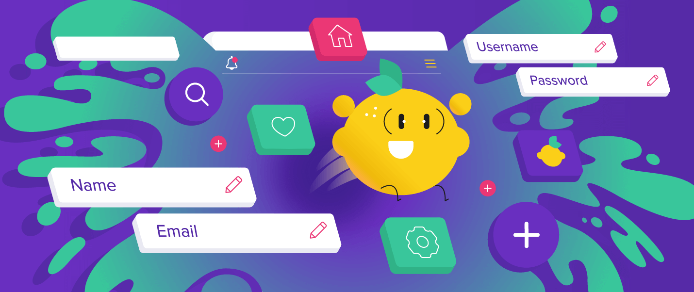
Include Interactive Loading Screens or Skeleton Screens
The computational power of our mobile phones outperform the most expensive computers in the world from only a few decades ago, yet we still see loading screens.
Although future innovations may eliminate loading screens entirely, for now, we must handle them with poise. The loading screen debacle is perhaps best solved by the common proverb, “when life gives you lemons, make lemonade.”
In other words, when faced with a loading screen, provide entertainment in the form of subtle animations.

While data is loading, you can also display skeleton screen wireframes of how the data will ultimately be formatted. Skeleton screens, which again, provide a blank mockup of how the content will be rendered, instill a sense that the data is loading faster.
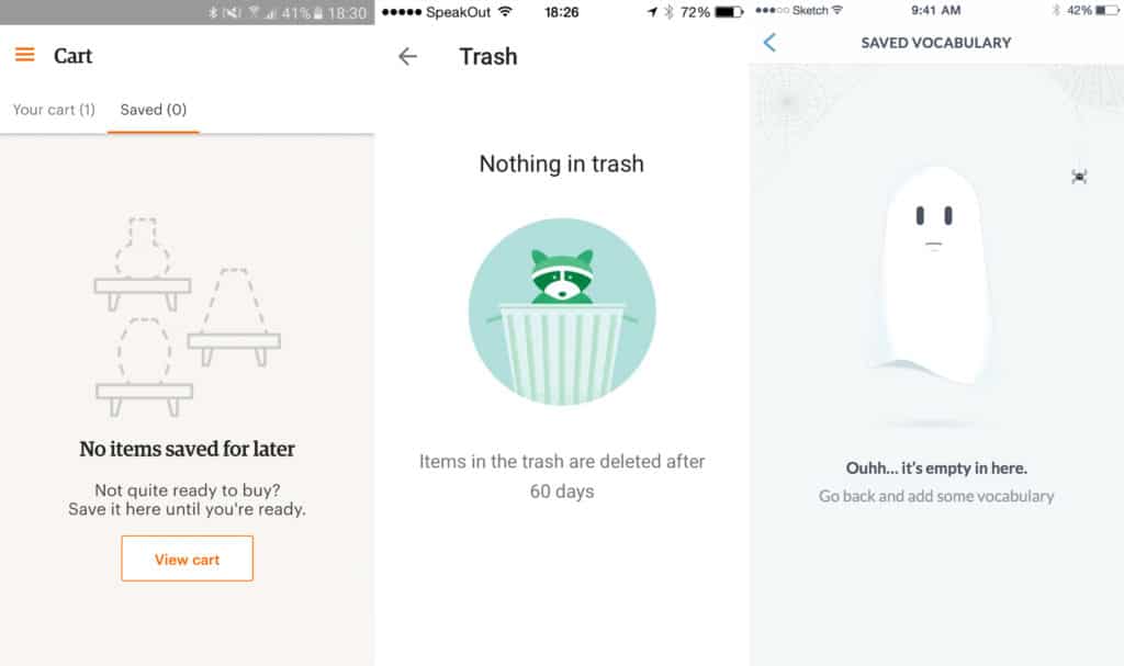
Simplify the Mobile User Experience
Intricate UX design can create an environment of feature creep, otherwise known as featuritis. Feature creep occurs when the product offers more features than customers need, complicating and confusing users.

Functional design advocates for clean and simple design elements, making it clear what the product or feature does. Although functional design is often associated with hardware, it can equally apply to software architecture. For example, creating a mobile app that can be navigated successfully almost subconsciously.
Appeal to Intuition
Although it is important to create an onboarding process that educates users about how to use the app, there is no substitute for learning by doing.
Many users simply opt out of the onboarding flow, choosing impatience over practicality.
It’s essential interfaces are built to account for these users who will not bother with the onboarding tour. This means designing intuitive elements that can be “self taught” on first use.

Product managers build products on a set of assumptions. Often these assumptions rely too heavily on confidence that users will understand how the product works. This is known as the curse of knowledge, a cognitive bias that assumes one’s audience has a complete understanding of the topic.
Getting past the curse of knowledge and creating an intuitive UI is possible through user testing and customer interviews. Understanding the customer journey, or how users navigate the product and engage with the company, can guide product development.
Design Mobile Forms for Apps
Long forms on mobile devices can be particularly burdensome. Some devices have autocomplete capabilities that make completing forms a breeze, but this cannot be the expectation when designing forms.
Chunking, a term used in psychology, is a technique sometimes used for memorization that compartmentalizes information into bite-sized “chunks.”2
Phone numbers, for example, are much easier to remember when broken into combinations of three and four digits, instead of ten. Applying this strategy to simplifying the process of filling out mobile forms is to break the forms into digestible chunks.

Size Elements for Mobile
The average finger pad, according to a study by MIT, is 16-20 mm wide.3 When considering how large to make buttons, text, and other elements within the design of mobile apps, finger pad size should be considered.
You should also keep visual acuity in mind. Graphics, text, and color palettes should be clearly viewable from a reasonable distance. The standard of visual acuity is 20/20, which means the average person should have visual clarity from 20 feet.
It is unlikely your app will be viewed from a distance of 20 feet, but it should be clearly viewable from an arm’s length away. On average, this is about 36 inches.4
Mobile app design elements should be large enough to be viewed from a reasonable distance and accurately touched with an average-sized finger pad.

Consider Reachable Thumb Zones
When designing an app, don’t forget to consider the positions in which users hold their devices. For example, it’s possible users are lying down in bed or walking to work, which can put different levels of strain on finger positioning.
Sometimes users will be comfortably consuming content scrolling with a single thumb, other times they will actively type messages with both hands. The way most people hold their device in one hand puts constraints on the reachable zones of the screen. This means that the already limited size of the screen becomes even more constricted.
Mobile apps must be designed with reachable zones in mind for the best possible user experience in every physical position. Placing important features and frequently used elements in the bottom three-quarters of the screen will increase engagement and user satisfaction.

Mobile app design is as important to user experience as the technical functionality of the product. While the business logic of mobile apps appeals to our rational senses, app design appeals to our emotions and creativity.
Aristotle wrote about the importance of logos, the appeal to logic, and pathos, the appeal to emotion, in the 3rd century BC. Today, when we design mobile apps that impart both a sense of emotion and rationality, we have created mobile apps that even Aristotle may have used.

