BY Dana Kachan
Color psychology hints have been uncovered in different design articles many times. Color matters — that’s obviously true. Various shapes, accents, and shades trigger certain human behaviors. We subconsciously associate colors with certain feelings and emotional responses. Designers often use these color psychology tricks in their design to intentionally evoke needed emotions. But, did you know that the same effect can be also created by the fonts?
Font psychology is one more design science that you should thoroughly investigate to become a well-educated designer with a wide outlook. Every font has its own personality, so you should get acquainted with it. Each font influences the way we perceive a brand and product, so you should know these hidden influences on the user’s decision-making process. Each font impacts the emotions we associate with a product and bridges a certain emotional connection to a brand. So you should be able to identify a font personality and match it with the brand personality.
In this article, we consider different stages of the font cognition and will help you identify how various fonts affect our psyche.
1. Serif font psychology
Serif is as traditional as the Bourbon Whiskey. It feels quite predictable, elegant and rationale. Sans Serif is the obvious manifestation of class and heritage. It’s often used in the designs for well-established brands that are on the market for decades and have already built the whole “empire” in the industry. Serif font impacts the human psyche motivating us to feel a certain level of trust and respectability, it associates a brand with the authority and grandeur. This font style is often used in formal and scientific contexts.
This font has the peculiarity every designer should be aware of. San-Serifs are less readable on the computer screens since they display information in a pixelated grid. This means that Serif may be less identifiable due to a box-like structure of the pixelated grid.
2. Light vs Bold fonts
Light fonts are most often associated with Femininity and Beauty. Just remind the ever-most recognizable logo of AVON, cosmetics brand. Its tall and thin font style is obviously associated with modern women’s beauty etalons. These perceptual traits conveyed in AVON’s logo typeface trigger the extra-wave of women’s beauty admiration.
That might seem almost invisible, but actually, even the slightest hints in the logo typeface can cause the different customer’s attitude to a brand and associations. Does it seem to be unnecessary detail? Maybe. But, details especially matter when it comes to marketing and building customer loyalty.
3. Rounded vs Angular
According to Bar and Neta, humans prefer curved or rounded shapes rather than sharp ones. Why? This is caused by the inherited instincts of the self-protection. Try to find out your first feeling evoked right at the moment when you’ve seen a big and sharp knife. Right… That’s a feeling of the threat. The same we subconsciously experience when interacting with the sharp forms and angular fonts in the design. They can evoke the feelings of danger, masculinity, and durability what can be useful for a designer who wants to add a pinch of adrenaline and danger to a design.
However, be careful when using “dangerous” fonts. Apply them in the right place. Imagine, a “dangerous” logo design for an infant nutrition brand. Nah, it will not work here. You should match the brand personality and the traits conveyed by a font.
You can use rounded typefaces for the brand associated with the concepts of softness, comfort, femininity, beauty, or even sweet foods.
4. Lowercase vs Uppercase
Lowercase is usually associated with the concepts of compassion or innovation. Therefore, lowercase can be effectively used in the design created for ‘caregiver’ companies or for ‘product creator’ brands.
Uppercase is most often associated with the concept of power. The world’s famous commercial giant such as BMW, Nike, and Sony have the uppercase in their logos to emphasize the power of their social influence, energy, and success.
The lowercase and uppercase can be easily combined in one text making it more readable for users. When you mix these to typefaces you unintentionally create a so-called expectation congruence effect. It means that people more easily perceive the text format if it’s congruent with their expectations. Mixed case letters have different heights what allows users to perceive more distinction between letters.
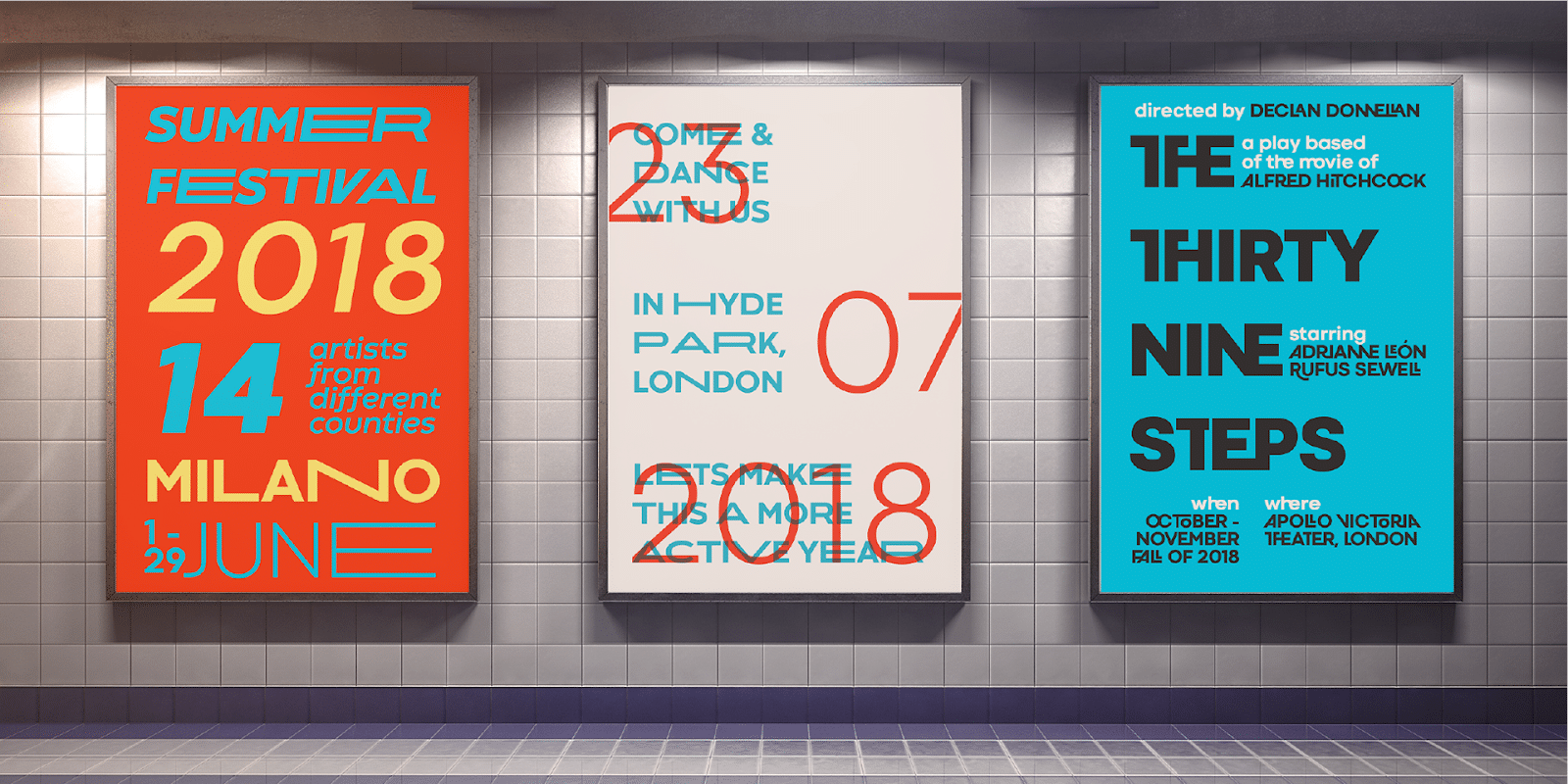
5. Condensed vs Extended
Condensed and extended fonts are two design extremes. Usually, we perceive condensed fonts as something related to the concept of tightness. This typeface creates a feeling of limited space, tension, and precision. It can be perceived as something ramped, overcrowded, restrictive in movement. However, playing a game with the user’s feelings and emotions caused by a strict condensed font personality, you can add a specific note of extravagance and boldness to your design.
On the contrary, extended fonts convey the concepts of spaciousness and relaxation. Wide typefaces make the design breathing and light-weighted. They are usually applied in the designs for brands that aim to look positive and light for their target audience.
6. Short vs Tall
Short fonts usually convey the feeling of heaviness and stability, while tall fonts convey the idea of lightness and luxury. We subconsciously associate the font height with the metaphorical concepts of gravity. For example, the horizontal orientation emphasized in the short fonts suggests heaviness and solidity. It embodies the concepts of durability, stability and something immovable.
Tall fonts portray lightness and quickness. It can also be metaphorically associated with aspiration and ambition. On the other hand, many people associate the verticality emphasized in tall fonts with the concept of growth, success, and luxury. This is why many designers often use tall fonts in the designs for luxury brands.
Find your font
Font psychology is a very logical and intuitive science that can be perfectly applied in the creative design process. Each typeface has its own personality, its hidden traits, and influences on the user’s psyche. The designer’s main task is to discover that personality and match it with the mood of the brand. Create a perfect pairing of the brand and its native typeface that will become a logical continuation of the company culture and style.