BY Code Art
Yet another year is coming to a close. Many of the 2022 trends we anticipated, did find their use in digital products across our devices this year. As we are about to welcome 2023, we are taking a more careful look at both UI and UX trends that continue to evolve, take new shape and find novel uses to the user’s benefit and delight. In this article, we highlight some of the trends we think will persist and perhaps gain even more traction in the next year.
UI Trends
1. Motion Design
Motion design is becoming an integral part of interface design. The continual evolution of animation and video compression, paired with the increasing capacities of the internet, browsers and devices, has allowed more complex and nuanced motion in interfaces without sacrificing speed or efficiency.
With the presence of intuitive animation programs and animation libraries, designers are feeling more confident to experiment with motion for a more dynamic and visually appealing experience. Mimicking the momentum and physics of physical products, designers will be able to create ever-so-immersive modes of digital interactivity.
Moving forward, motion will continue growing its presence through video content as well. Curated video snippets, dynamic backgrounds and quirky video popups will become even more integral — if not essential — in creating captivating brand experiences.
2. Scrollytelling
One subset of motion design that deserves close attention is scrollytelling or immersive scrolling. In a similar fashion to other animation and micro-interactions, scrollytelling is becoming increasingly prominent in enriching the interaction between users and products.
Scroll trigger animation has perhaps less to do with the product’s utility than other types of animation, but when done right, it adds unmatched visual appeal and effective transitions between different sets of information. The storytelling capabilities of immersive scrolling, allow products and particularly landing page designs to come to life, despite more limited content and functionality. In short, scrollytelling provides a type of narration that elevates the content, delights users, improves brand perception and drives desirability. It is a new way of storytelling that is only just beginning to evolve through the countless explorations we see on the internet.
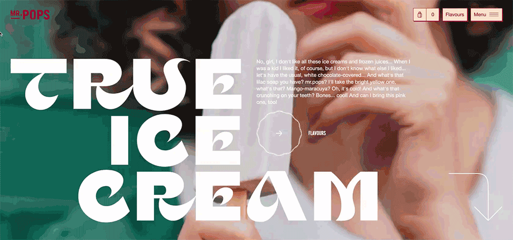
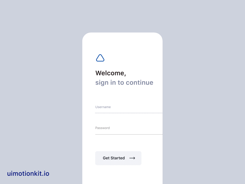
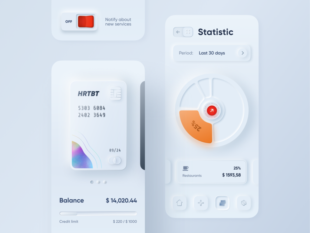
3. New Bolder Minimalism

Very little is novel about the direction in which minimalism is going next — at least at first glance. All the essential elements of minimalism are there: focus on functional objects without un-functional decor, unobstructed negative space, flat elements and patterns, easy navigation and limited color palettes. What makes the upcoming minimalism trend different is more nuanced and evolved take on the existing concept.
Carefully curated monochromatic palettes will be key to creating a modern minimal look. Combined with large flat color shapes, substantial padding and rounded edges, they result in decluttered but overall ‘rich’ interfaces. Elements will maintain a rounded and soft look, combined with flat graphics and contrasting types. Going into next year, minimalist interfaces will certainly enable more personalized and expressive experiences without sacrificing clarity, readability and easy navigation.

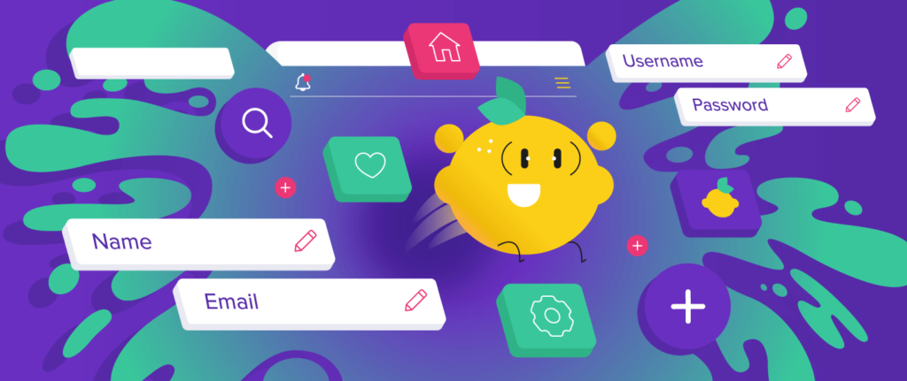
4. Happy Colors / Dopamine inducing palettes

What is becoming known as ‘dopamine dressing’ predominantly in fashion, builds off of the retro comeback of recent years and centers around the symbolic qualities of bold and happy hues. Interfaces are not immune to this trend, as it continues to evolve and redefine the ground rules for personal and brand expression. Color blocking, mild textures and therapeutic hues combined with retro elements and superimposed on brutalist and even anti-design layouts will make bold statements to users from the 70s all the way to gen Z.
These bursts of dopamine are proliferating so much that even huge brands are taking notice. Despite otherwise more toned-down brand aesthetics, consumer goods giants choose to dress (digital) campaigns in dopamine colors as standalone initiatives without having to revamp their core brand.
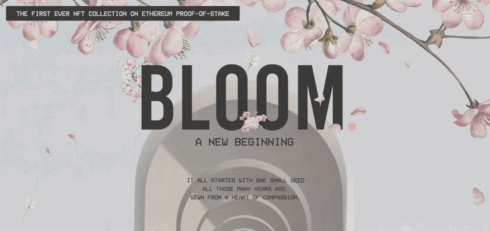
5. Aurora Gradients

If you thought that after the Instagram redesign the gradient trend would slowly come to an end, you were wrong. Gradients are not going anywhere, they are just changing the vibe.
Dopamine-inducing palettes can come in color blocks and as increasingly popularized in recent years, they can blend to create eye-catching gradients. Also known as aurora gradients, these bold color schemes pair light complementaries to offer ethereal and contemporary moods that subtly continue to reference the 80s and 90s. This is by no means a new trend, but certainly, one that keeps expanding and finding itself in brand and web assets across a range of industries beyond just tech.
The name comes from their resemblance to the Aurora Borealis, also known as Northern Lights. Mixing compatible colors into an aurora gradient for web and app design projects, makes the whole design look elevated, mystical, expressive and smooth.
UX Trends
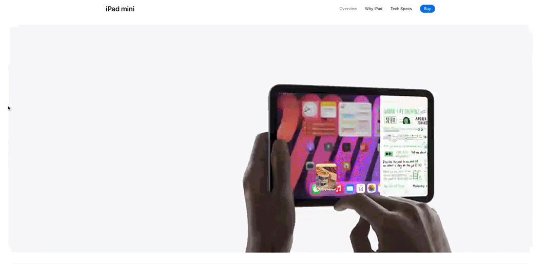
1. Cross-device experience

Customers have grown accustomed to the cross-device operability offered by today’s applications. With Apple’s product offering paving the way for immersive product ecosystems, users have made evident their expectations for seamless cross-device activity. Many products will continue taking the cue throughout the coming year in making their digital products as device agnostic as possible, while also providing a consistent and reliable experience in real-time.
Beyond just being a habit-turned-expectation, users certainly have new and valuable uses for this kind of flexibility. UX researchers and engineers alike will be tasked with improving the seamlessness of existing cross-device experiences by considering edge cases and unusual maneuvers along the user journey of specific products and across various devices. More importantly, they will face the harder challenge of closely looking for new opportunities that answer legitimate user needs and pain points in this context.
2. Emotional design

Emotional design has existed for as long as UX research has altogether. The term highlights the fact that humans base their decisions on emotions rather than logic. With the maturation of digital experiences, we are witnessing a digital product saturation where novelty and usability won’t be enough to stand out. In turn, a renewed focus on emotional design will continue to play an instrumental role in creating valuable product differentiators and giving a competitive edge.
To practice and achieve new advances in emotional design, UX researchers will have to employ deeper research into the emotional needs and expectations of users in day-to-day interactions. Explorations will hope to point to types of interaction that elicit strong and positively affirming, as well as visceral and behavioral responses before more highly cognitive impressions are made. Specific areas such as micro-gestures, tolerability, relatable micro-copy and personalization will go hand in hand with the research in order to make way for outstanding products.
3. (Hyper) Personalization

Within emotional design, we expect to see a greater focus on personalization as a way to maintain and solidify the relationship between users and products. Whether it is a personal health app, a smart home system, or a personal task manager (to name a very few), researching new ways to provide personalised system feedback will be essential.
This will likely depend on new types of data collection that can then feed into daily user-to-system interactions. For this to be possible, UX researchers and engineers will have to expand their considerations about what kinds of contextual data can be (consensually) collected to establish deeper and of course more beneficial relationships. Such research might also delve into the capabilities of IoT systems, to be able to achieve more seamless and personalized digital experiences.
4. Micro-interactions

Micro-interactions will continue to be the focus of UX research in an effort to increase the fidelity of human-computer interaction, for purposes beyond emotional design and UI delight. Although they pertain to UI decisions in later stages of a project, core micro-interaction concepts will continue to depend on an intimate understanding of the process flow as well as how user — and system-triggered micro-interactions result in system feedback. Moreover, looking into user psychology, mental mapping and physical product precedents will potentially reveal new opportunities for well-designed and intuitive system feedback.
*Honourable mention
Sustainability in tech

Sustainability at its core means meeting our current needs without compromising the ability of future generations to meet their own. Achieving sustainability is essential in not only preventing future environmental degradation but also in maintaining (and in fact improving) the quality of life in environmental, social and economic terms.
We recognize the fact that the industry we are in perpetuates in part unsustainable habits. We also recognize our shared responsibility as architects of the digital space to advocate for and integrate sustainability into the everyday user experience. This includes disseminating contextual and actionable information thru clear language and interface elements, in order to elicit environmentally and socially conscious decisions from users and consumers.
Since misinformation (greenwashing) leads to skeptical and dissuaded customers, it is essential that we present green efforts in a transparent and honest manner, even when that includes the shortcomings our product offering faces along the way.
Besides facilitating conversations around sustainable user choices, there are other ways we UI/UX designers can contribute to the complex challenge of sustainability. There is an increasing number of ambitious tech spaces out there tackling issues such as climate change, food scarcity, waste and overconsumption to name a few. Designing intuitive user experiences for these technologies will be crucial for their success and a great way to partake in the sustainability movement. Even more directly than that, we can always participate by starting conversations about sustainability practices at our place of work. Be it the IT infrastructure and its environmental footprint, the choice of hosting services, or as little as the office’s green efforts, opportunities for positive impact exist at every level and scale.

1 Comment