Most articles regarding UI and UX design offer best practices and advocate design strategies; this article will not. Instead, it will highlight common design flaws and propose practical solutions.
Sin #1: Misuse of Color
New designers neglect the importance of color in their applications when, in fact, color contributes significantly to a first impression. These same designers often jump to bright primary colors which require too much attention, hurt the eye, and inaccurately reflect their applications. The following tips will help you avoid any abuse of color and pick the right color scheme for your application.
- Use white backgrounds — White backgrounds keep applications clean and simple. They allow for better use of other colors and do not detract from a application’s primary functionality by drawing constant attention.
- When in doubt, go blue — Take a moment to consider every company which uses blue in their color scheme: Facebook, Twitter, PayPal, Chase, etc. There is a reason for this. Blue is a gender neutral color loved by both males and females. It is a great pick for almost any application.
- Coolors.co —This is an especially useful website designed to generate color schemes for applications. If you are really stuck and cannot determine colors which reflect your application, head over to Coolors.coand let it do the work for you.
Sin #2: Random Review Prompts
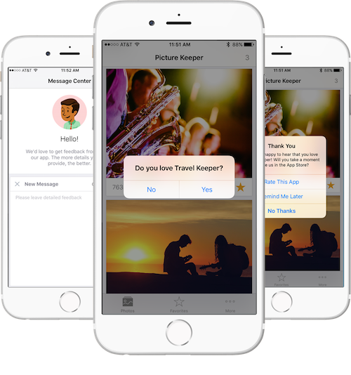
Randomly displayed review prompts, which ask the user to rate an application if she or he has enjoyed it, are seriously ineffective. Not only can they annoy users, but they also provide little to no value if displayed at random intervals. Platforms like the App Store and Google Play Store rank their applications based on their reviews and downloads.Therefore, it is most productive to prompt the user to review an application right after he or she does something which results in great satisfaction. For example, let us consider an application which involves users splitting bills and settling up with PayPal and Venmo. Rather than periodically presenting a prompt to review the app, it would be more productive to prompt the user to review it after receiving money from another user.
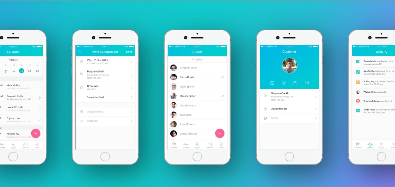
Sin #3: Design Inconsistencies
Though what I am about to say may seem trivial, trust me when I say it is not. When I first started as a developer, I too believed that small UI inconsistencies would go undetected. They did not, and I am here to tell you how to avoid the mistakes I made. The following are some of the UI inconsistencies which were widely noticed in my first application.
- The use of both sharp and rounded corners
- Different fonts (especially in headers)
- Different color schemes
- Different popup styles
Sin #4: Vague Error Messages
The first priority in UX design is to make your application easy to use. In other words, it is critical that the user does minimal work in order to accomplish his or her goals. Displaying vague error messages contradicts this very principle. Messages like “Your request could not be performed at this time. Please try again later” and “An error occurred. Please try again.” force the user to both identify the problem and the solution; they should rather provide an explanation to why the error occurred and explain how the user might fix it. I once remember using an app in which I encountered this very problem. I typed in a password, and it gave an error: “This password is invalid”. I typed in a different password and again: “This password is invalid”. Three passwords later, and the same message appeared. Well, if the password was invalid, why didn’t the application tell me why?
Sin #5: Unattractive Advertisements
Ads objectively ruin applications. Thus, it is critical to not make them stand out. I recognize that they are often essential to monetizing applications, but that does not mean that they have to draw attention. Ads need to blend with an application. For a better understanding, go ahead and open Facebook and Instagram; they properly integrate ads. Their ads are not the first thing users see, and they certainly do blend in with the application’s environment. As a side note, if you really do need to display ads, make the content related to the user. For example, it would be approriate to show an ad for a shirt when a user is searching for clothes, but not a chainsaw (and yes I know I am exaggerating).
Sin #6: No Animations
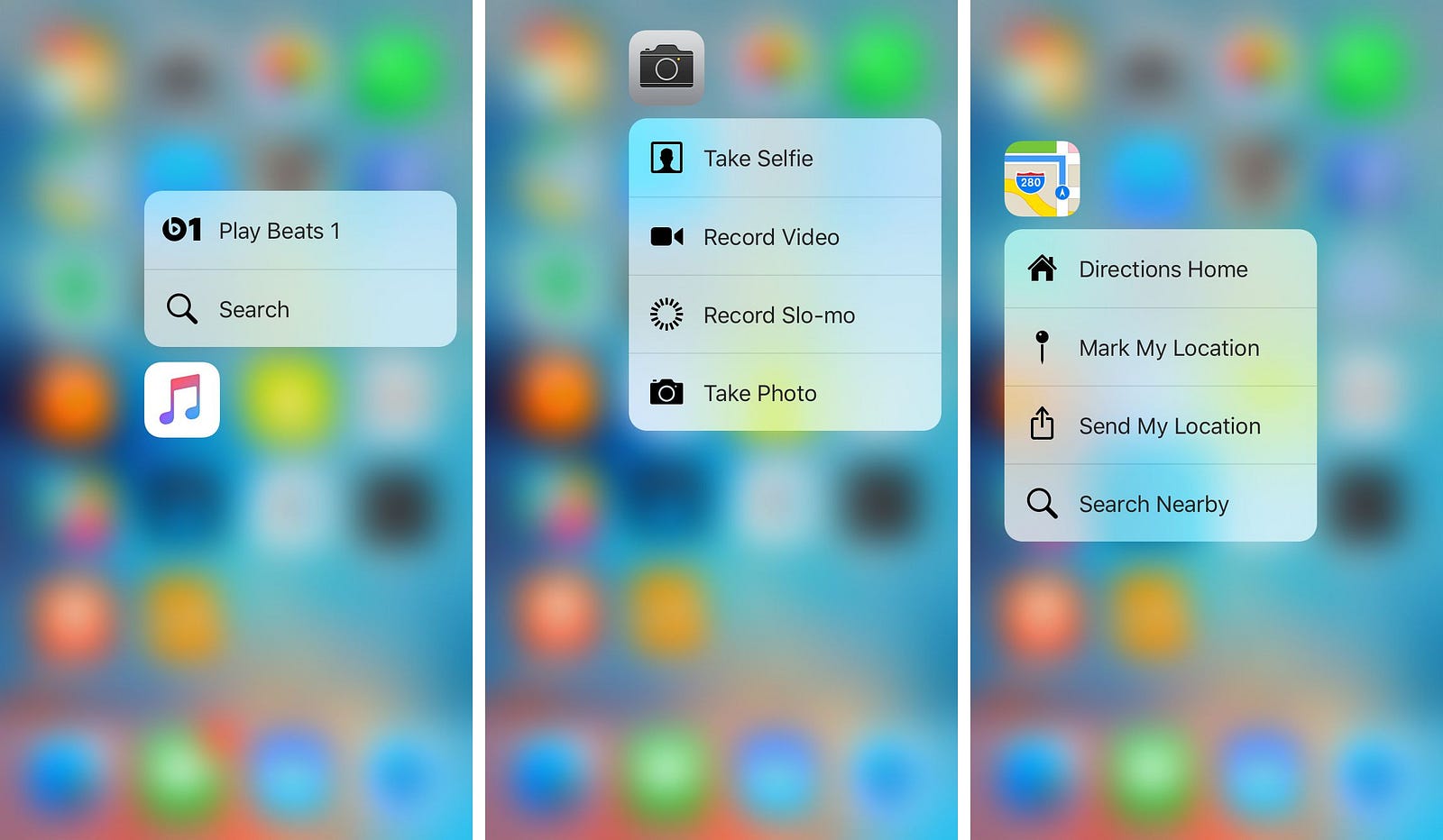
As a developer, I know from first hand experience that animations are a hassle. They seem to add no functionality and so we leave them out. But animations play a substantial role in a positive user experience. Perhaps the most important animation is the swipe left / swipe right gesture, allowing the user to navigate back and forth between screens with just the swipe of a finger. This simple gesture has been shown to incease user satisfaction by 5%, and it does not take much time to implement with the availability of preexisting libraries. If you are developing for any iOS device, it is also in your best interest to consider implementing force touch in your application. Force touch is a simple way of sharing data with friends and linking other apps.
Sin #7: Infinite Loading Screens
Infinite loading screens, or those which seem to never end, can be the most frustrating parts of applications for users. Some websites estimate that 10 seconds after an activity indicator is displayed, a typical user will quit the application, probably ruin the process, and never open the app again. This situation, however, can be easily prevented through the use of a progress indicator. Progress indicators allow the user to gauge how much longer he or she needs to wait. What is more is that progress indicators require almost no time to implemenmt. Simply displaying a percentage of the task done (even if it is fake) has been proven to significantly increase user satification.