Color has more to say than meets the eye. As a building block of visual language, color highlights, guides attention, and unifies elements. In UX, color reinforces the functional and aesthetic qualities of a product.
Color wears many hats. Branding sees color as mood and perception. Development sees color in terms of SASS and LESS functions. UX design sees color as a consistent system across platforms. Overall, color is a versatile tool in conveying different types of information.
To improve color decisions, let’s cover how to: pick a palette, prioritize colors, consider data visualization, and test accessibility.
Pick palette using color theory
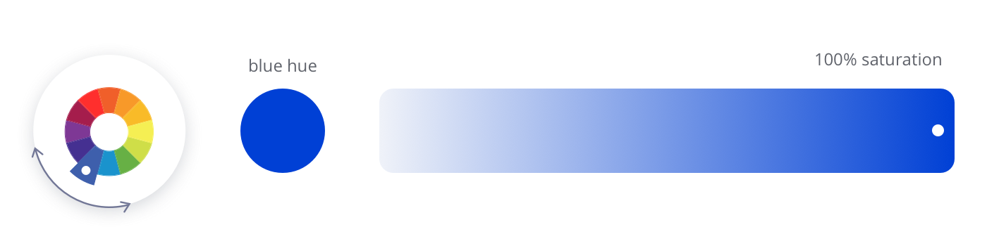
Understanding a few color elements will help you pick the right colors for your palette. The color wheel, a derivative of Newton’s experiments with light, will help you.
Hue & Saturation
Hue is a specific color or degree on the color wheel.
Saturation means the intensity of a color. At 100% saturation, color is at its purest.
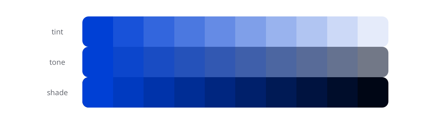
Tint, tone, & shade
Mixing pure color with neutrals creates lighter and darker variations.
Tint — color mixed with white
Tone — color mixed with grey
Shade — color mixed with black
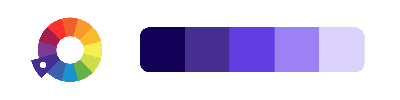
Harmonious palettes
“All colors are the friends of their neighbors and the lovers of their opposites.” — Marc Chagall
Based on the color wheel, these palettes consist of colors that work harmoniously together.
We’ll go over monochromatic, analogous, complementary, split-complementary, and triadic palettes.
Monochromatic consists of tints, tones, and shades of one hue.
Create an analogous palette from three colors sitting next to each other.
Complementary contains two opposite colors, which creates high contrast.
Split-complementary consists of three colors, with two next to the opposite of one.
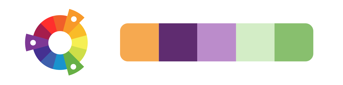
A triadic palette has three hues equally spaced around the wheel.
Get inspired
Here’s a few ways to get started on your own color palette.
Create gradients: play with creating gradients from an harmonious palette.

Use photographs: choose a photograph that moves you and pick colors from it.
Try Coolors: it’s a color tool that easily generates different palettes and lets you fine-tune choices.
Prioritize primary & secondary
Prioritize and define the colors in your design system. Like an intuitive library, organized colors help your internal team find what they’re looking for. They also help your team create visual consistency for your users. Aim for precise primary colors, sufficient secondary colors, and clear names for each (Treder, 2017).
Primary
Primary colors are used frequently in your interfaces. They include colors in branding, interaction elements, layouts, and text. Add a simple name along with its HEX number: violet: #8322DD.
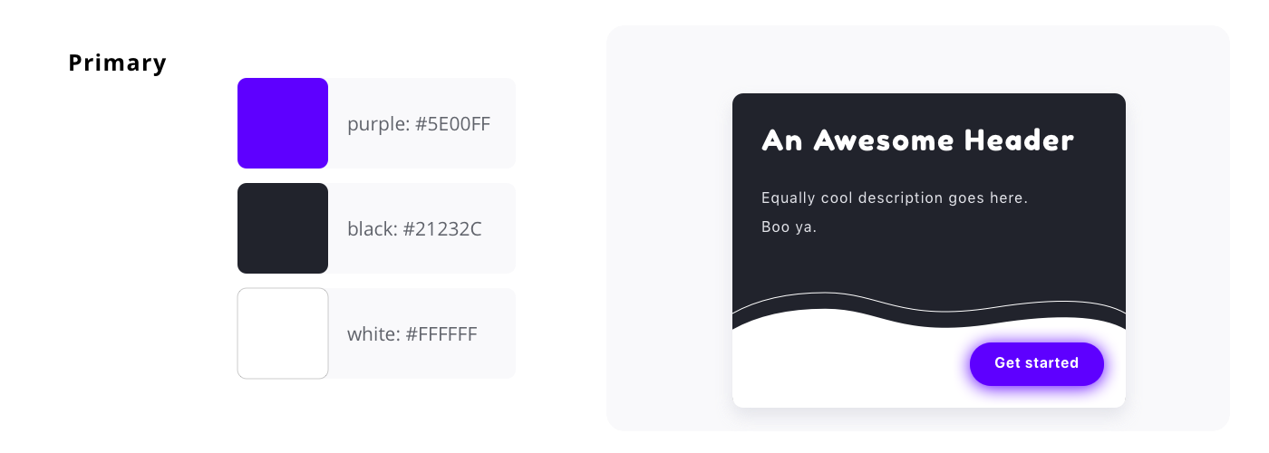
Secondary
Secondary colors are used occasionally, and consists of accents based on primary. Create by hand-picking, CSS functions (darken, lighten by HSL %), or both (Curtis, 2016). Secondary colors can be used to express system feedback such as task success, error, or warning.

Tint stack
Tint stacks provide flexible choices. Try to empower your team with enough choice (3–4 steps) but not so many that it compromises consistency.
You can create stacks using HSL percentages to easily implement with CSS functions. Include the color name, HSL lightness (0 -100), and HEX number: violet-lighter-20: #B47AEA.

Get started
Eva Colors: this AI tool helps you find secondary colors for notifications, based on a primary.
Coolors for tint stacks: start with one color and change HSL lightness by increments.

Design Systems Repo: for inspiration, look through design systems of other companies to see how they organize colors (everyone does it a little differently).
Consider data visualization
For data visualization, use color to emphasize the story of your data (Yi, 2019). You may need 6–12 colors to cover all use cases, depending on data complexity. Create a flexible tint stack with a wide range in hue and brightness.
Types of data and recommended color palette:
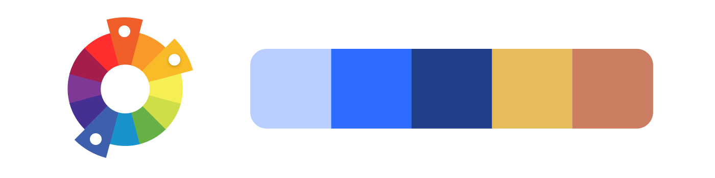
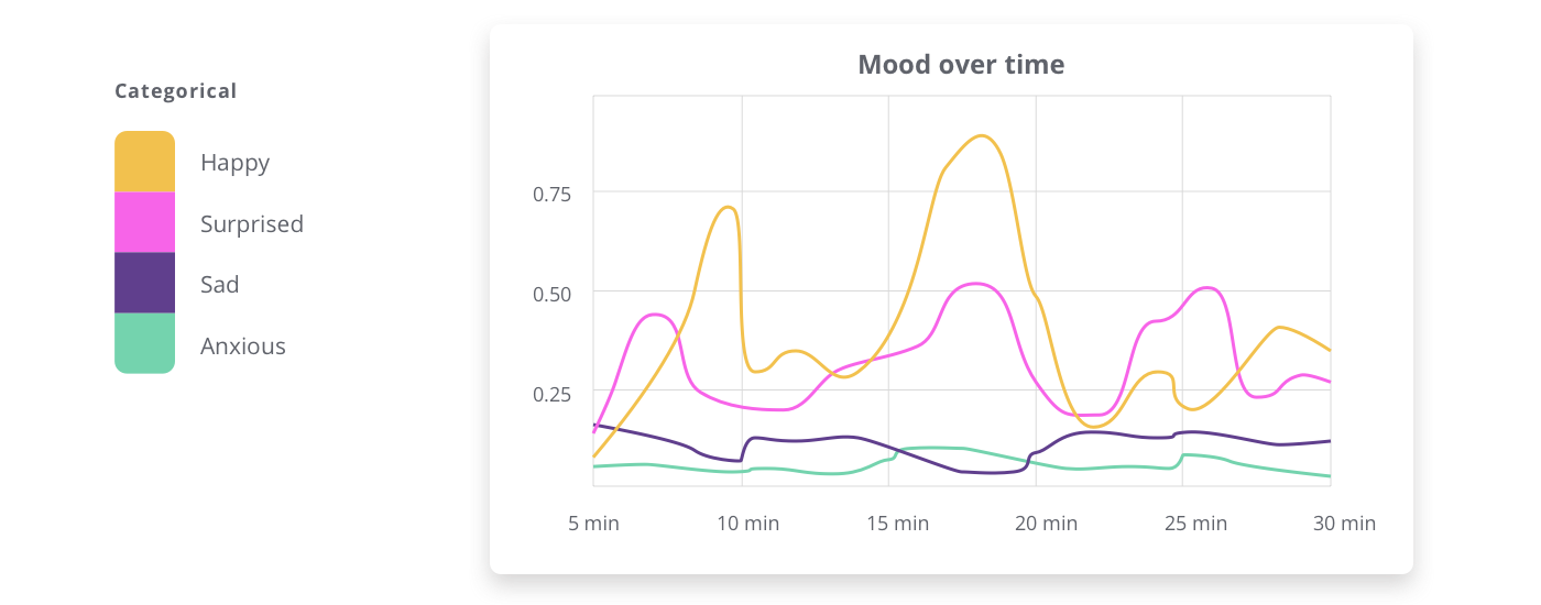
Categorical
Categorical consists of non-numeric categories (country, gender, names). For distinct categories, a color palette with hues spaced apart in the color wheel works best.
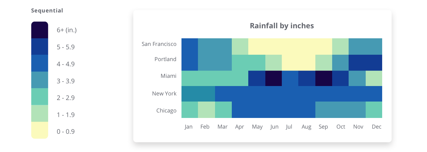
Sequential
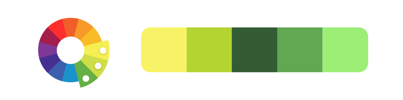
Sequential data has numeric or ordered values. To indicate numeric steps, colors should gradually change hue and lightness. Much like analogous palette, use color hues that sit next to each other. Low values should start light, and high values go dark.
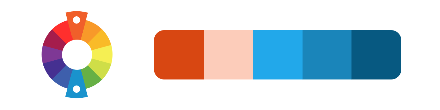
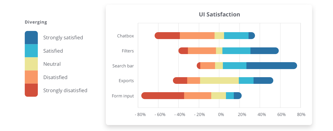
Diverging
Diverging data also contains numeric value. It’s basically two sequential palettes that meet at a central point. Diverging can have negative to positive values, or opposites on a spectrum. Keep the central point light, and allow colors to get darker further from center.
Get visualizing
Let’s look at a few tools that will make it easier to pick your color palette for data visualization.
ColorBrewer: browse through color palettes (sequential, diverging, categorical), and visualize them on a map.
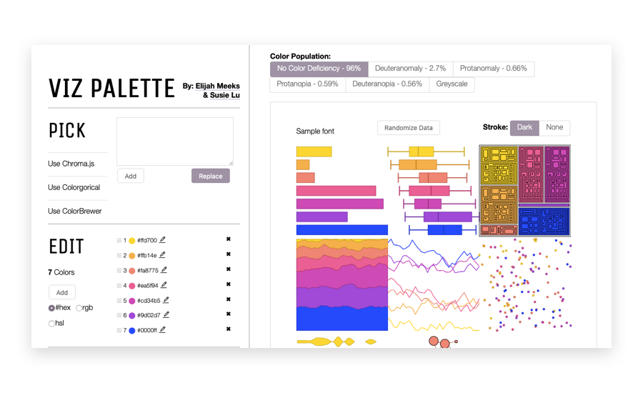
Viz Palette: this tool lets you see color palettes on different data visualization charts.
Test accessibility
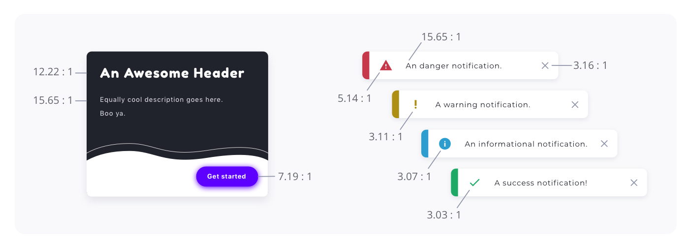
Test your color palette for accessibility, to ensure users with varying visual abilities can see each color. Testing for accessibility is a step towards a more usable and legible product, strengthening its experience. Check early and often that colors follow World Wide Web Consortium (W3C) guidelines.
Contrast
Look for sufficient color contrast of text on background, as well as contrast between colors used together in data visualization. With low contrast, text become harder to read, and data harder to distinguish. W3C recommendsthe following contrast ratios:
- 4.5:1 for text
- 3:1 for large text (14pt bold, 18pt regular)
- 3:1 for icons
Visual cues
Try to use multiple visual cues in addition to color in communicating important states. Using colors alone to convey information may not be as accessible for users with color blindness (Reyna, 2018). For example, you can include an icon as well as color and text for a system notification.
Accessible ranges
Create contrast pairs of different text colors on backgrounds. Then show accessible ranges based on progression of your neutral tints (Curtis, 2016). This helps your team see exactly where pairs become inaccessible.

Get testing
Accessible Color Matrix: from your color palette, this creates a matrix (range) of accessible pairs.

Tanaguru: quickly test a color pair for contrast ratio.
Coolors: Coolors also simulates how your palette will look for different types of color blindness.