We live in a very busy time. Everything is screaming for our attention — our phones, laptops, television and so on. Yet, when we stumble across an App or a digital product something just feels and flows naturally, but we don’t always know why. It’s often the visual composition of elements coming together. When these UI elements are organized and structured properly, users can easily navigate and understand the product. The ability to create a compelling story through fonts and visual hierarchy is something every designer should have in their toolkit as it goes beyond visual aesthetic and has a large impact on user experience. When components are structured wisely, users can navigate and interact with a product without friction and effort, thus having an enjoyable experience.
Creating visual hierarchy is the foundation behind any successful product. It creates an order of importance to elements in order to direct a user’s attention and make information easier to consume. Through the use of colour, contrast, texture, shape, positioning, orientation and size the most important information is easily surfaced. Hierarchy helps to create a focal point, gives the user an entry point to start consuming designs, and guides them to the most important information.
So, what makes a powerful visual hierarchy? Of course, different kinds of products require different methods and you should keep your business goals in mind. Designers and creative teams need to work together to determine which UI elements deserve importance and prioritize them according to their roles and needs. By considering the user needs as well as the business goals, you and your team can effectively prioritize visual content and make a product stand out and easier to use.
Chances are, many of you know this already, but it’s something so important. So important yet, not everyone uses these key elements in their designs. It’s your role to influence where your users will focus on and what they will notice.
The foundation of visual hierarchy
More than a century ago, German thinkers Wolfgang Kohler, Max Wertheimer, and Kurt Koffka began studying how people perceived the world.
“The whole is other than the sum of its parts” — meaning the whole has “an independent existence in the perceptual system,” says Dr. Russ Dewey.
In other words, humans don’t perceive their surroundings individually and equally. Instead, we organize them in specific ways to make sense of them as a whole.
From their research, Kohler, Wertheimer and Koffka created eight laws of perceptual organization — the tenets of Gestalt psychology.
The laws
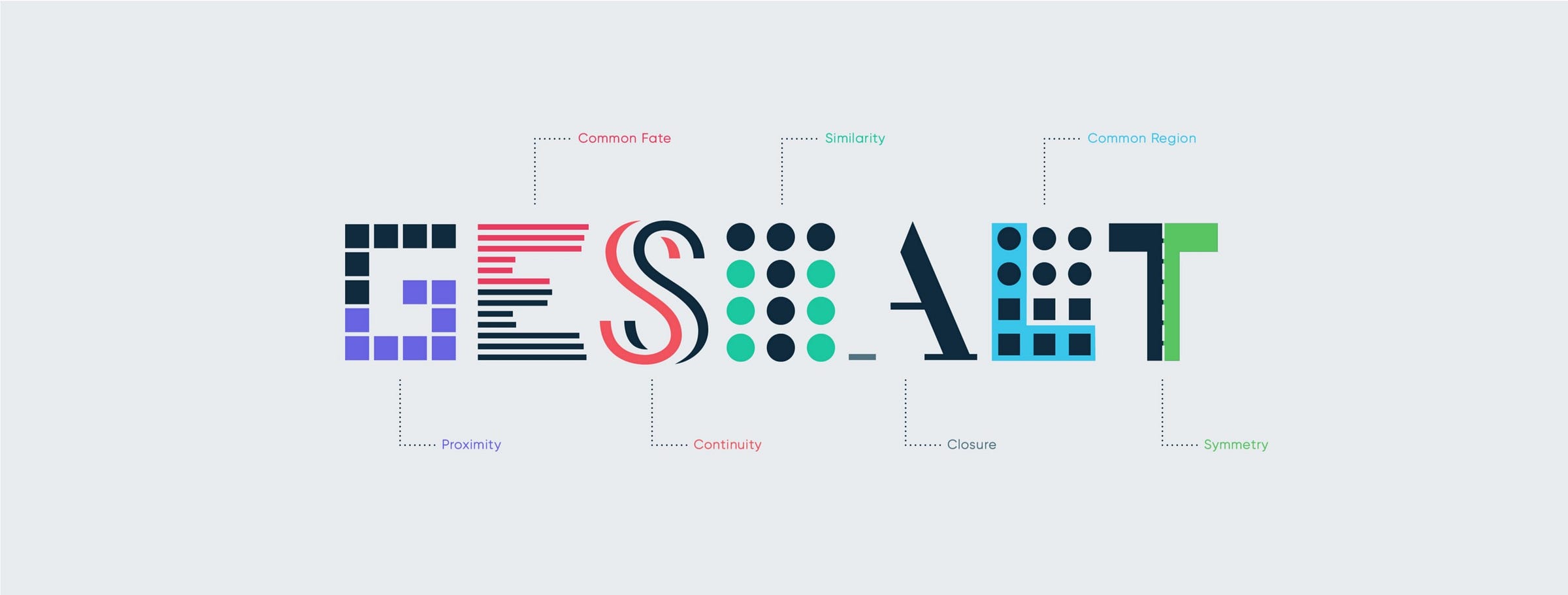
Gestalt principles are a great way to provide maximum impact to your designs. It proposes laws of perceptual organization such as: simplicity, similarity (based on shape, size, colour), proximity, closure, figure and ground, continuity, order and symmetry and synchrony. Our brains tend to naturally group objects together, as a complex systems, instead of focussing on every small individual components.
There are many sites out there that talk about rules, laws, what you should and should not do. I won’t list them all for you but if you don’t know this one yet, I strongly suggest you get familiar with it. Product designer, Jon Yablonski, created an awesome website Laws of UX which is a great reference and collection of the maxims and principles all designers should consider when building their next user interface.
Simplicity: The time to acquire a target is a function of the distance to and size of the target.
Hicks law: The time it takes to make a decision increases with the number and complexity of choices.
Millers law: The average person can only keep 7 (plus or minus 2) items in their working memory.
Aesthetic usability affect: Users often perceive aesthetically pleasing design as design that’s more usable.
Law of common region: Elements tend to be perceived into groups if they are sharing an area with a clearly defined boundary.
Laws of proximity: Objects that are near, or proximate to each other, tend to be grouped together.
Law of similarity: The human eye tends to perceive similar elements in a design as a complete picture, shape, or group, even if those elements are separated.
Designers need to acknowledge these laws as they will affect the effectiveness of their designs. They help create superior and more effective products. Be mindful of the way elements are presented to your users as they may overload their cognitive capacity thus, creating frustration and decision paralysis.
Composition
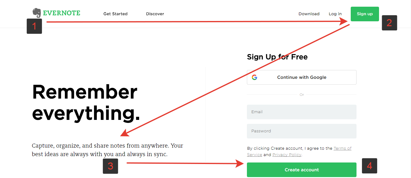
Composition is about laying out your UI elements together, aiming for alignment, consistency and strong unity. It guides users in understanding the relationship between the way things look and how they function.
Consider scanning patterns
This is something most people do without even realizing it. Most cultures tend to read from left to right and from top to bottom. Many studies mentioned that we have a tendency to navigate pages using the “F” and “Z” scanning patterns. These patterns are simply the way our eyes move when we read content online. According to a study by the Nielsen Norman Group, 79% of users scans new pages they come across.
F pattern implies that users will navigate the page using something which resembles a “F”. They will start by glazing the upper part of the content area then, down they move down the page and read across the shorter horizontal line for any elements that stand out. Lastly, users will scan the content’s left side in a vertical movement and look for keywords that might catch their eye.
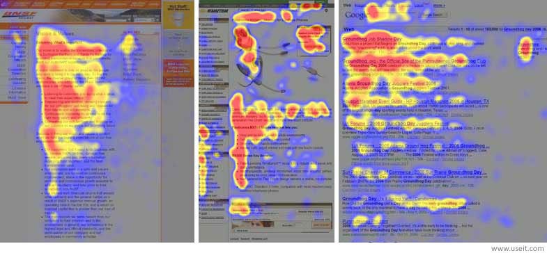
The F-Pattern design helps with creating a more balanced visual hierarchy and an intentional user flow. It helps your users focus on specific elements thus, creating more engagement with them.
Z pattern implies that users will navigate the page using something which resembles a “Z”. First, users start by scanning the upper part of the content area forming an horizontal line. Then, down and to the left side of the visible content creating an imaginary diagonal line. Lastly, they will go back across the right forming a second horizontal line.
Visual hierarchy tools
An effective visual hierarchy with a consistent layout helps users navigate a product and directs their eye on what they should focus on. A clean composition is approachable and helps get into the flow. It removes unnecessary clutter and does not leave users guessing.
Colour & contrast
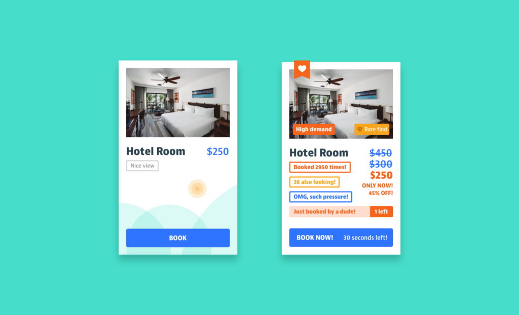
We live in a world of colour. We as humans are visually drawn to it, especially when it’s highlighting important information. Color choices and colour combinations are obviously an essential part in creating visual hierarchy. They bring elements to life and help distinguish the core elements by bringing distinction between what is important and what is not.
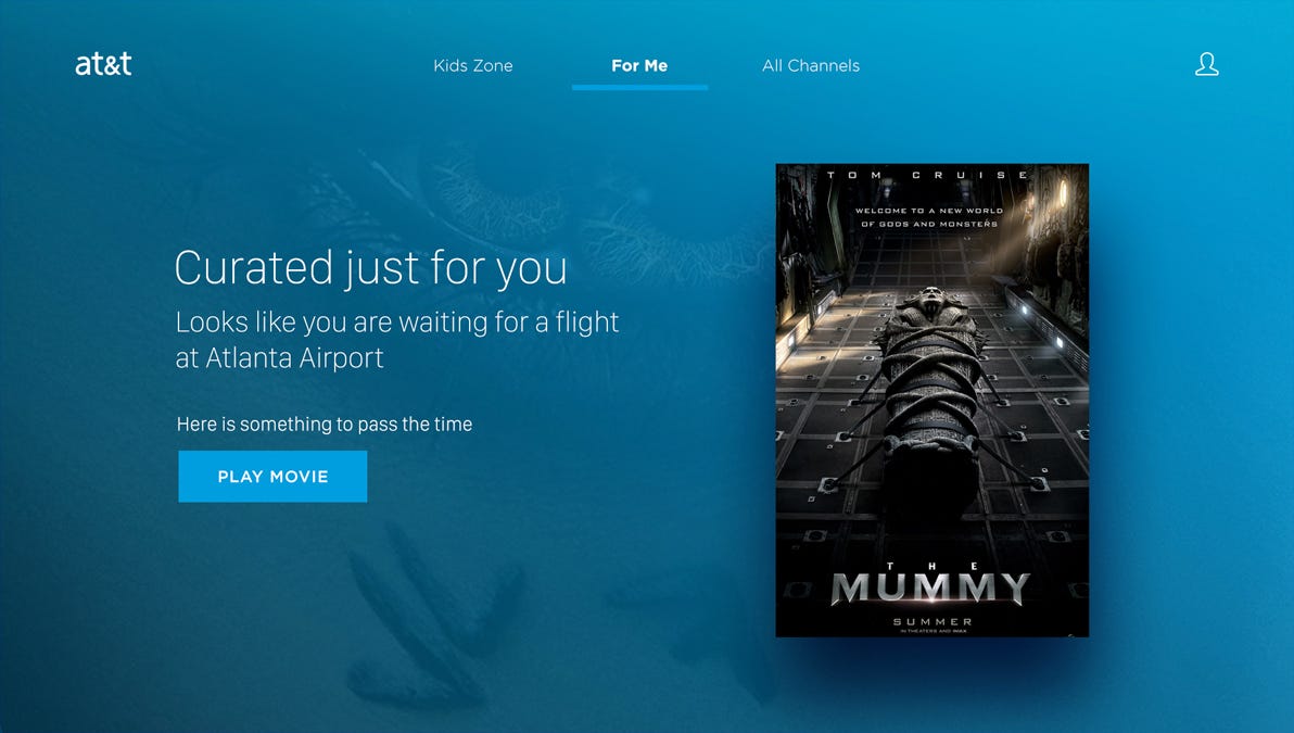
As we can see from the example above we can easily distinguish the elements. Vibrant blue on white won’t have the same impact as a white and cream. This seems really obvious but the important takeaway is in it’s application: use this to draw your user’s attention where you want. Using colours with purpose are key principles. Using bold colours in significant features or design elements will highlight or draw the eye to it, making it the primary component. On top of creating hierarchy, colours have the power to impact and influence a user’s mind. In fact, it can even improve learning by up to 75% and increases comprehension on a subject up to 73%.
You can use similar colours to indicate that they belong together. Color and contrast can be used in many different creative ways to guide and influence users such as suggesting weight and distance in your designs. A great example is a bright red button on a white background. It will immediately stand out by using colour and contrast to make that element the most noticeable element in your design.
Remember, alternating between different sized fonts, colours and shapes will create an instant hierarchy to your interface.
Typography
Typographic hierarchy is often overlooked in interaction design which is a big mistake. It actually plays a large role in communication, directing our users attention towards a desired results. It demonstrates the order of importance in our designs and removes any ambiguity which could leave your user interface harder to scan and actually slow down user interaction.
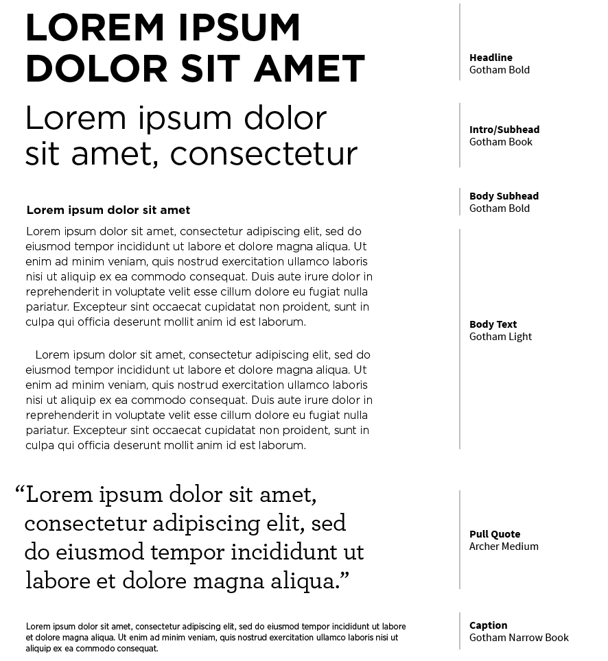
When creating hierarchy through typography, we usually suggest using 3 levels to organize your designs. When properly executed, we will often find a headline, a sub headline and body copy. This rule has been well established, and newspapers from early to mid 20th century loved exaggerating it. :
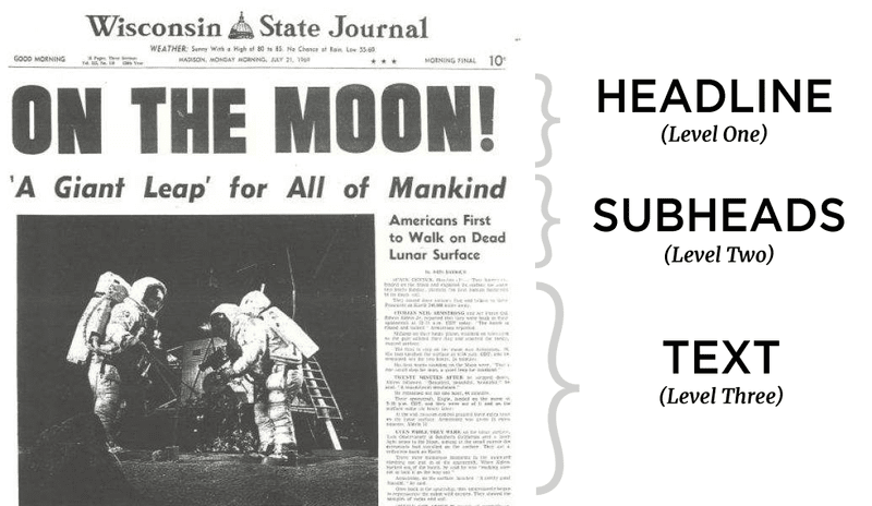
We use typography to bring attention to such elements as headlines, sub headers, body copy, call-to-action elements, and captions. The first level is used to draw users’ attention to the core information on the screen. The second level is used for elements that can easily be scanned and help users navigate through content. The third level is used for body text and additional data.
Let’s see this in action:
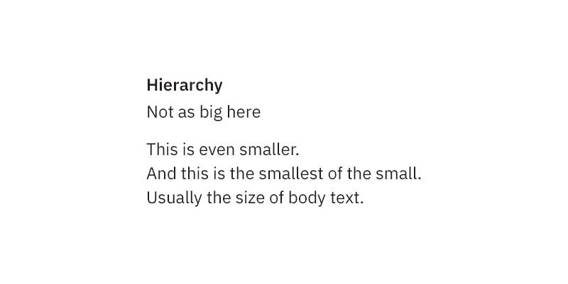
If you read the content above, you can read it and it provides all the information a user needs. Now, if we apply the 3 levels of hierarchy we get this enhanced example:
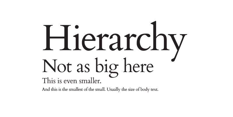
What is the difference? The information is much easier to digest and our eyes easily scan through the information. The important elements stand out and draw a users’ attention. By organizing and formatting typography choices in a way that allows users to clearly see what’s most important, enables them to easily navigate the interface at a glance and to quickly find the information they are looking for.
White space is king
For many, white space is often considered a lost opportunity or lost space. In fact, whitespace is one of the most neglected design principles and one of the most important. From one of my previous blog posts, White space in tv design, I describe whitespace as an unoccupied piece of real estate with zero text or graphics layered on top. That’s important to note because a background graphic image can be considered whitespace as long as there is nothing added above it.
If you fail to plan for some blank space in your layout, you risk ending up with a jammed up and confusing design. Whitespace is actually a real superpower. It acts as a visual separator by guiding a users eye through a design, making sure to amplify only what’s important. It provides relief, breathing room, and an easier way to scan a page. It’s sharp, simple, and it just looks amazing. Consider your door-to-door flyer which is so packed with information you don’t even know what to focus on.
Plan for and embrace whitespace. According to research conducted by Human Factors International, whitespace increases comprehension by almost 20%.
Size
The larger something is, the more chances is has to stand out. It is the first thing the eye will see and thus, by implication, the most important thing to look at. So does size matter?
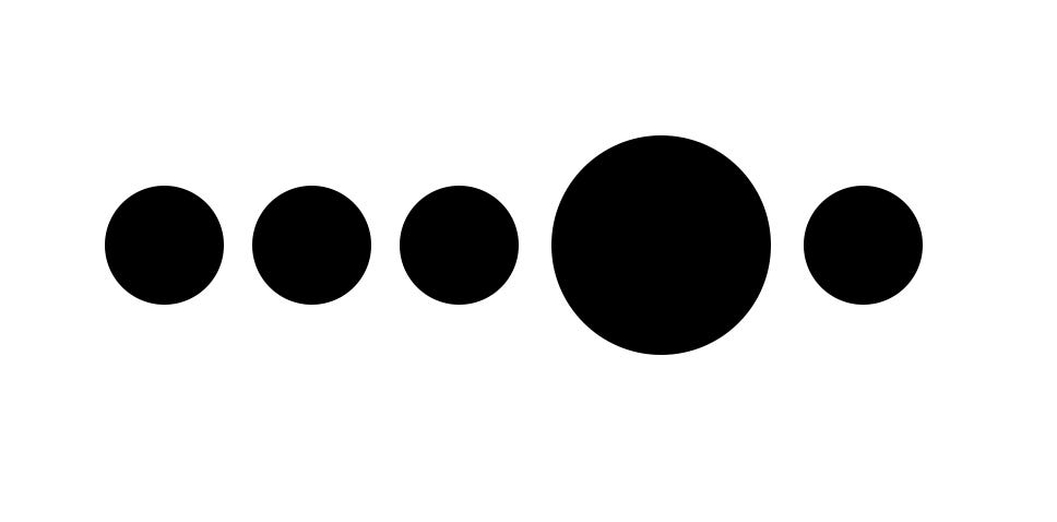
Bigger is more noticeable, but not always better. The simplest way to explain it is that your most important elements should be the biggest, but it’s when we get into the details that it becomes more complicated. Keep in mind that although bigger means important, you should consider the correct and relevant message in order to hook your customers into the proper content. Don’t just make your element bigger, make sure that it’s actually important, relevant and helps in the visual message.
Explore and have fun
Creating an effective visual hierarchy in your user interface is not just about aesthetic, it aims at providing problem-solving solutions. It’s the super powers you use to deliver a better, more engaging user experience. Explore, have fun and test your solutions. Remember you are designing for your users and need to consider the functionality and business goals.