BY Billy Whited
As a UI designer, I do my best work within the bounds of a clear hierarchy of constraints. Because typography is the catalyst for my design work, the most important step I take at the beginning of a project is to select a typeface (or a set of them). Once this choice is made, I can develop a system to aid my decision-making process and, in so doing, avoid the terror of a blank canvas.
To narrow down the vast number of typeface options, I start out by defining the scope of the design problem before me in broad terms. This usually requires that I make a decision about the essential purpose of the project I’m working on. Is it a content-driven website that serves up information to be read at leisure? A task-driven web application oriented towards getting stuff done in a timely way? Or is it a site possessing both content-driven and task-oriented elements (like a CMS)?

The differences between these types of sites have implications for the way we approach the process of choosing type for them. Content-driven websites frequently make extensive use of contiguous, flowing paragraphs of text, whereas primarily task-driven web applications may favor shorter, more linear staccatos of text. Awareness of this functional distinction can help narrow our focus at the outset of a project by providing a set of meaningful constraints which, in turn, can help us make more intelligent decisions about our type.
Today, I’ll examine some of the issues that specifically affect setting type for task-driven web applications (user interfaces), beginning with our own biological constraints for interpreting text and then exploring how this informs type design. My express goal is to provide you with a few hints that will aid your typographic decision-making and help set your future designs apart—both functionally and visually.
The implications of how we read
In user interfaces, it’s common to encounter screens that are nothing more, typographically speaking, than a collection of singular words displayed in isolation from one another. Examples of this abound: web forms, navigation menus, control panels, etc. This is a key difference between primarily content-driven web sites and task-oriented web applications. So, why does it matter?
As it turns out, the efficiency/ease with which we read is a function of the amount of text available to us as we do so. Within a certain perceptual threshold (up to 15–20 letters) there is a linear relationship between reading speed and the number of letters that are visible to the eye. This means an isolated word that is comprised of fewer than 20 characters will be read more slowly than a word that forms part of a longer sentence.
To fully appreciate this phenomenon, it’s helpful to understand one of the basic mechanicals of reading. Instead of moving smoothly across the page when we read, our eyes actually make discrete jumps between words, fixating on one word for a short period of time before making a ballistic movement to another one. We call these movements saccades.

But despite their “ballistic” nature, these rapid eye movements actually improve our reading capabilities. While we process the words immediately within our focus, we use the additional information just outside of it to further guide our reading. As readers, our time to comprehension is aided by the context of adjacent words—to the extent that we are often able to automatically process (and thus skip over) shorter functional words like and, the, of, and but.
This revelation profoundly affects typographic decision-making for user interfaces. By necessity, our task-oriented web applications tend to collect more isolated words and sentence fragments than their content-driven counterparts. Because of this, we cannot rely on the contextualizing effects of saccades to help improve comprehension of the textual elements of our designs, nor can we rely on the sheer presence of additional letters to assuage the unfortunate consequences of a poorly-chosen font. This makes our choice of typeface extremely important on task-driven sites.
The importance of well formed skeletons
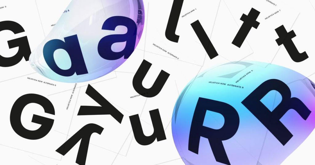
Given that the latest research in the field of cognitive psychology supports the notion that we recognize words by first identifying their constituent letters, it follows that any typeface suitable for UI work should possess an unimpeachable clarity of form.
In 2008, researchers in the University of Victoria’s department of psychology conducted an empirical study that sought to reveal which features readers used to tell the difference between visually similar letters.

The authors of the study concluded that “line terminations (terminals) are the most important features for letter identification,” but I feel that designer Ralf Herrmann’s insightful analysis of the results is more applicable to our discussion:
[Looking at the leftmost column] We can clearly see that we mostly pay attention to the features of a letter skeleton that make them unique…the crossbar of the e, the stroke endings of the c and the existence and shape of ascenders and descenders in general.
Indeed, these skeletal features play a crucial role when it comes time for readers to discriminate between frequently misrecognized letters of the alphabet, such as c/e, a/o, I/l, and O/0.

A well-crafted and legible typeface will counteract these formal conflicts with letters that, while still familiar, are highly discernible from one another. Interestingly, such feature recognizability is a hallmark of monospaced typefaces, which makes sense due to their widespread adoption by computer programmers (whose livelihoods depend on character-level accuracy).

A good screen font will tend toward an aesthetic middle ground: not too delicate or showy, nor too bold or imposing, it will favor recognizable, workmanlike features over those that may be be more visually interesting or unique. Structurally, such typefaces exhibit a subset of features like these:
- A large x-height.
- Open counters and apertures.
- Familiar/recognizable features that follow established design patterns.
- Modest ascenders/descenders.
- Wide proportions.
- Breathing room in-between letters (letter-spacing).
- Low/minimal stroke contrast.
- Sturdy, well-formed or unbracketed serifs, or none at all.
- A rational (vertical) axis (pixel grid-friendly).

Typography enables productivity
Ultimately, learning the distinction between typesetting for web sites and web applications is of lesser importance than mastering the basic principles of good typography. In fact, many of the same guidelines I’ve covered here for choosing type will apply whether you’re setting lengthy paragraphs or shorter, more isolated strings of text. You should understand how people read text, and then choose type that helps them do this as efficiently as possible, given other design constraints.
Good typesetting is an exercise in subtlety, and a demonstration of skill and sensitivity — to context, form, and user needs. As UI designers, it’s important to remember that our goal is not to distract users with superfluous details, but to ease the burden of their work and help them get stuff done.