BY Nick Babich
The best products do two things well: features and details. Features are what draw people to your product. Details are what keep them there. And details are what actually make our app stand out from our competition.
Microinteractions are one of the best techniques for giving delightful feedback.
All roads lead to a human-centered design approach, where the user is the prime focus. Often considered accessory or secondary, microinteractions actually create a feeling of well-being once they are discovered by users. As a designer, recognizing the invisibility of microinteractions is just as important as designing them. You have to create something that feels human and accomplishes a task.
What is a Microinteraction Anyway?
Microinteractions are the contained product moments that do one small task.
As first described in Dan Saffer’s book Microinteractions, these tiny details typically serve these essential functions:
- Communicate feedback or the result of an action.
- Accomplish an individual task.
- Enhance the sense of direct manipulation.
- Help users visualize the results of their actions and prevent errors.
Some examples of specific microinteractions include:
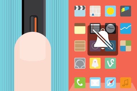
- The vibration notification together with silent mode icon on display when you switch an iPhone to mute.
- Interface animation that either shows ability to click (a button that changes color when hovered over).

Why Microinteractions Work
Microinteractions work because they appeal to the user’s natural desire for acknowledgement. The user instantly knows their action was accepted and she wants be delighted by visual rewards. Also microinteractions can guide users in how to work the system.
Identifying Opportunities
Part of the beauty of microinteractions is that they can be inserted in a variety of places, around any potential action. In general, though, they tend to come up in the following areas:
Show System Status
The first usability heuristic principle by Jakob Nielsen states: keep your user informed about what is going on. And users expect to get responses immediately. But there are situations when an app needs some time before an action is completed.
So, the interface should keep the user enlightened about what is happening.

Or where the user is:
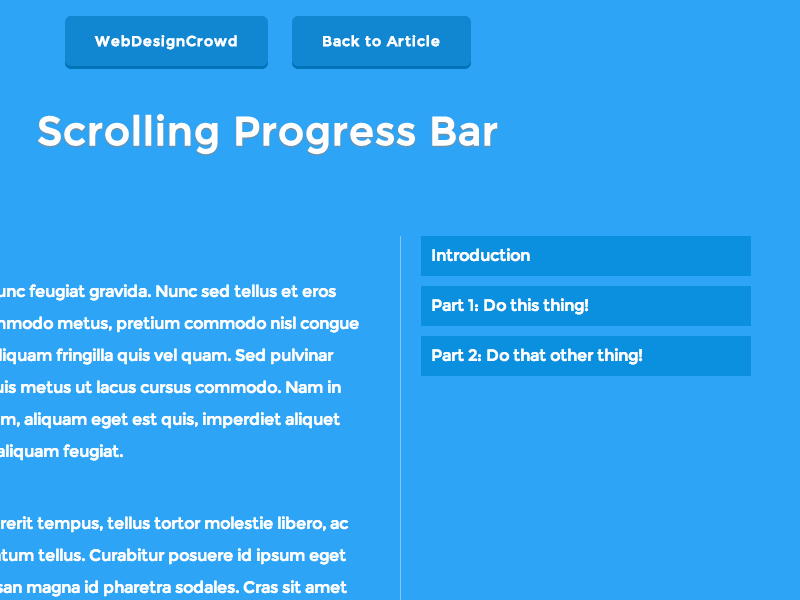
Takeaway: Don’t let your user get bored — keep the user informed and show them progress (e.g. a loading bar engages the user and prevents confusion).
Highlight Changes
Sometimes we have to show notifications to make sure the user sees it. Animation can help. It will attract users attention and not let them overlook what you think is important.

Takeaway: In many cases animation effects are used for attracting user’s attention to important details. You should use KISS principle — microinteraction is supposed to be small and simple.
Keep Context
Use motion to smoothly transport users between navigational contexts, explain changes in the arrangement of elements on a screen. This is especially true for mobile devices and smart watches, because it’s simply impossible to fit a lot of information on one screen.
Takeaway: Keep clear navigation between different pages; so the user understands what appeared from where. Transitioning between two visual states should be clear, smooth, and effortless. Unify in a theme — create a unifying theme to tie together all interactions.
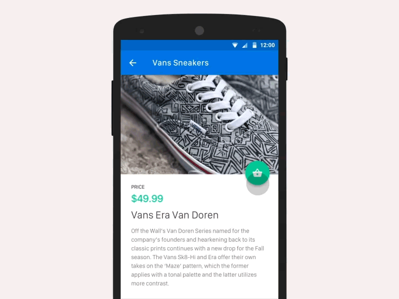
Visualize Input
Data input is one of the most important elements of any application. And micro-interactions turn this process into something special. You can use existing elements to deliver feedback.
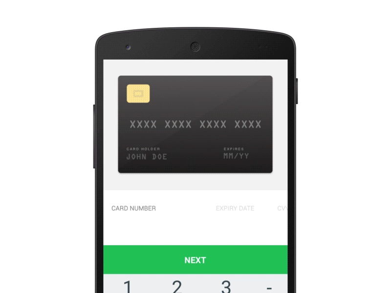
Takeaway: Microinteractions help reveal information and help user to reach their goal.
Call to Action
Microinteractions have the power to encourage users to actually interact. They can bring empathy in user experience. But make sure the visual cues and animations are appropriate for your users. And keep longevity in mind — will the microinteraction get annoying on the 100th use, or is it universally clear and unobtrusive?
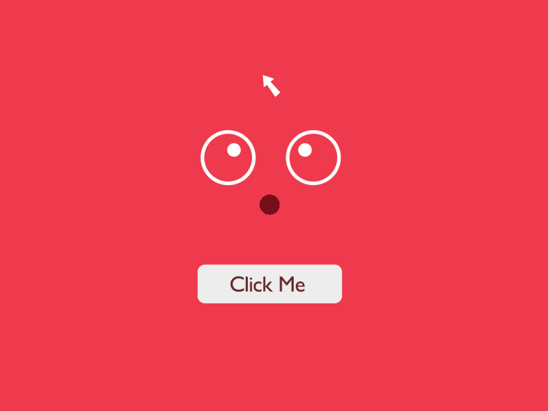
Takeaway: Focus on user emotions because they play a huge role in user interactions. Draw from context & user research and design for repeated use.
Things to Remember
- Microinteractions act as facilitators for interactions, with feedback, notifications and instructions.
- Microinteractions should save time by instantly communicating information in a way that doesn’t bore or distract the user. They should catch the user’s attention like a sly wink.
- Knowing your users and the context behind the microinteractions will make them more precise and effective.
- Microinteractions must survive long-term use. What seems fun the first time might become annoying after the 100th use.
- Add humanity to the microinteraction and focus on visual harmony. The motion should feel fluid to make the microinteraction come to life.