1. Introduction to Content Strategy
Google follows the principle – focus on the user and all else will follow. Focusing on the user starts with the content.
Content strategy is the crafting and development of all product messaging. UX writing is a speciality within this discipline. It focuses on helping users achieve their goals with language.
Language helps the user get where they want to go. By focusing on what the user wants to achieve, content strategy builds loyalty and trust.
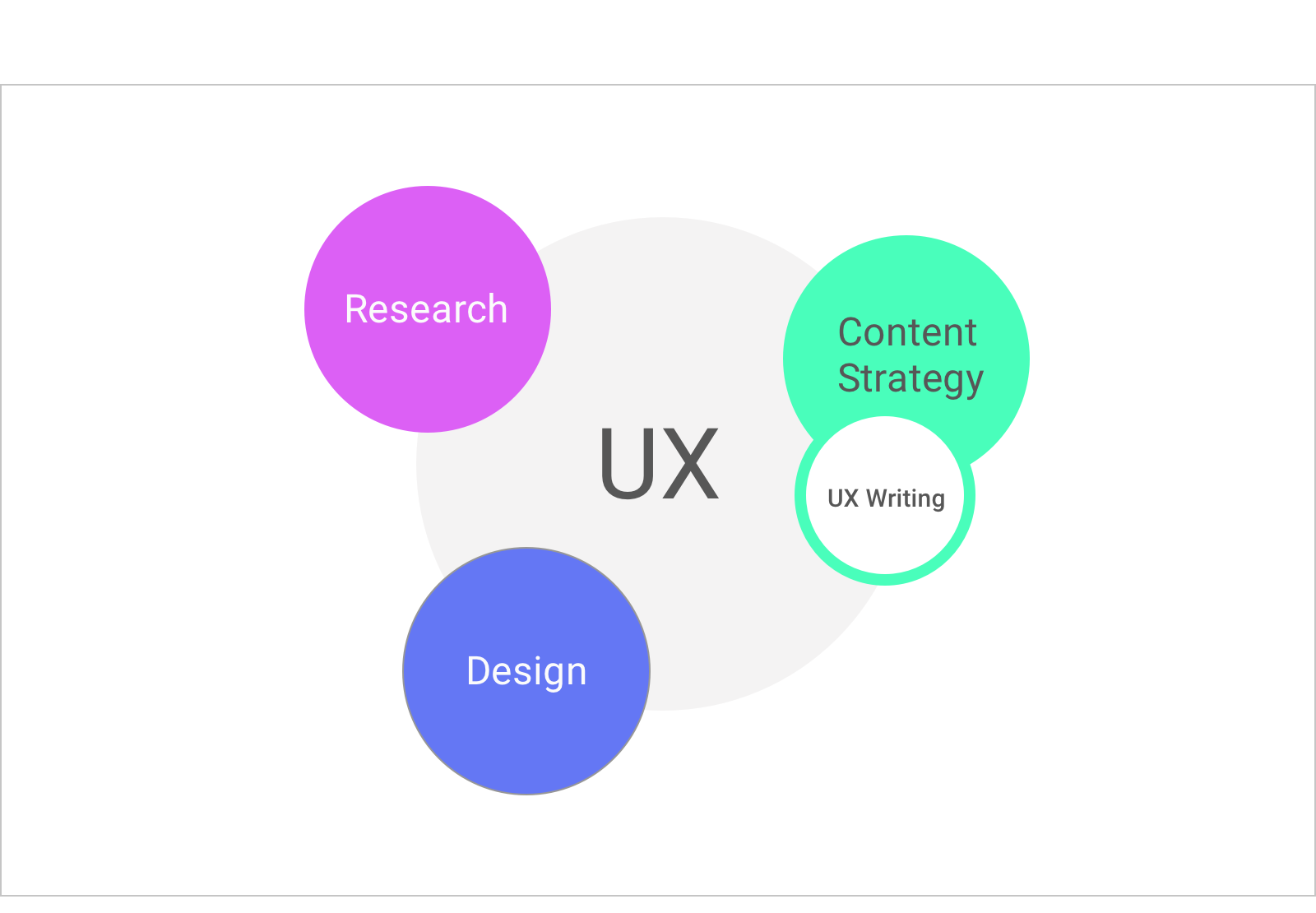
Writers work with designers to think about information hierarchy on the page. This then guides user actions. Writers work with researchers to test hypothesis about language and inform our insights.
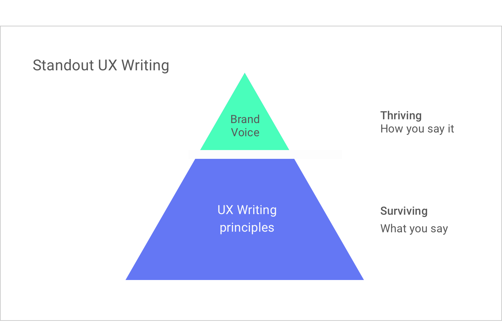
When you have the foundation of UX writing and you add brand voice, something amazing can happen. UX writing can survive with the fundamentals, but it can thrive with brand voice.
Oh don’t use big words. They mean so little.
(Oscar Wilde)
2. Three UX Writing Best Practices
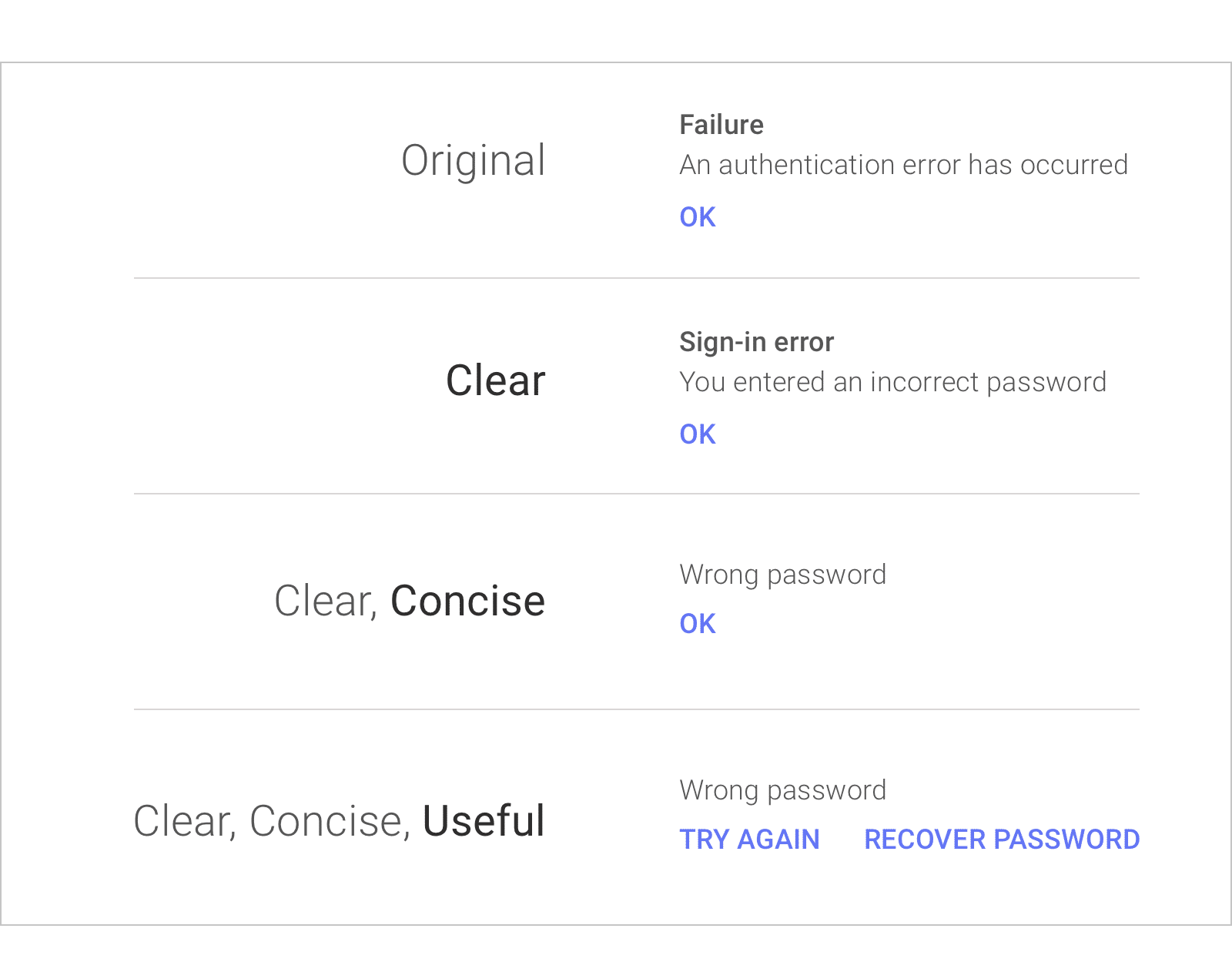
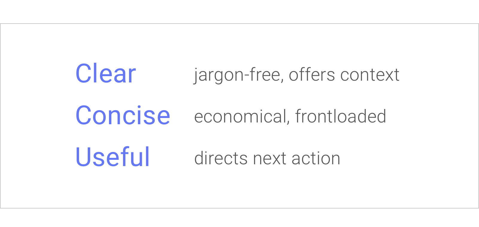
1. Clear
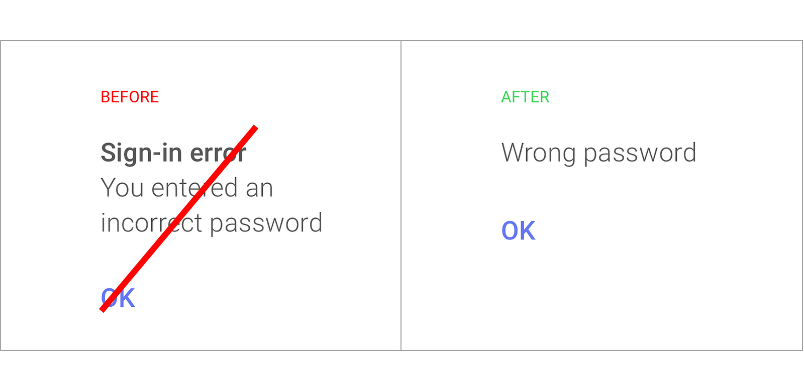
Often, the words used are software problems and not people problems. Pay attention to verbs. A verb is an action word, it tends to be the most powerful part of your sentence. In a perfect world it will relate to some action to the user.
For clarity we remove the technical terms and put the action in the context of the user.
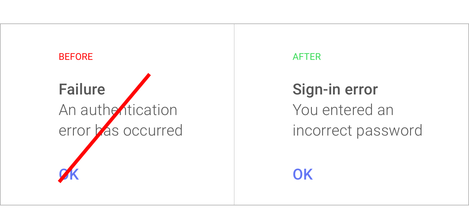

This is important when you’re writing a product announcement or an app update. Currently, the focus is on the technical specs of the new feature you’re releasing. Instead focus on the new action that people can perform. Jargon free messaging offers context.
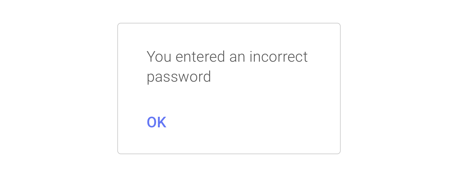
2. Concise
Concise doesn’t only mean short, it means something closer to efficient. When we are writing concisely, we look at our message and make sure every word on the screen has a distinct job.
The above is a common problem in product writing. We don’t need a header here. This is common in interfaces. Because the design field shows some pre-existing text field, we feel we need to fill it in. You should avoid this, when you can instead practice content first design.
Content first design makes sure your visuals are inline with what you’re trying to say. Not the other way around. Try not to jam your message in boxes that weren’t meant for them.
Have your designers work in parallel with writers.
Here we’ve removed the header. As research suggests, most people don’t read every word that’s present on their screens. They tend to scan.
We know that people’s eyes follow an F shaped pattern as they read over the screen. They read the first line, the second line, then start skipping down the page catching only the first or second word of each sentence. For this reason we keep our text not only concise but also frontloaded.
Frontloading is the practice of putting your important concepts first. This is done so people’s eyes catch those important words as they scan through the page
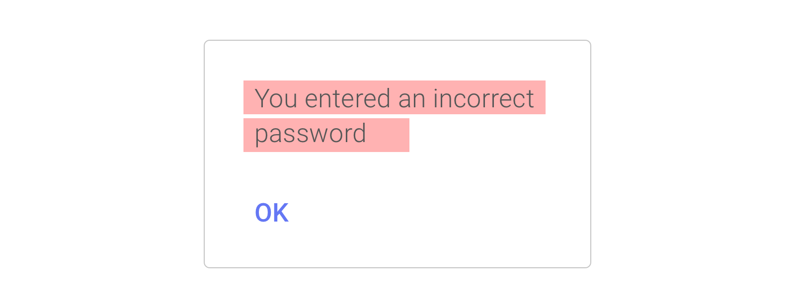
Above, most of the words are at the end of the sentence. We can fix this by flipping it around with the below.
You won’t always be able to do the above. The principle will always hold true and you can use it anywhere you’re writing for screens. Keep the most important text up front and then ruthlessly edit what comes after it.
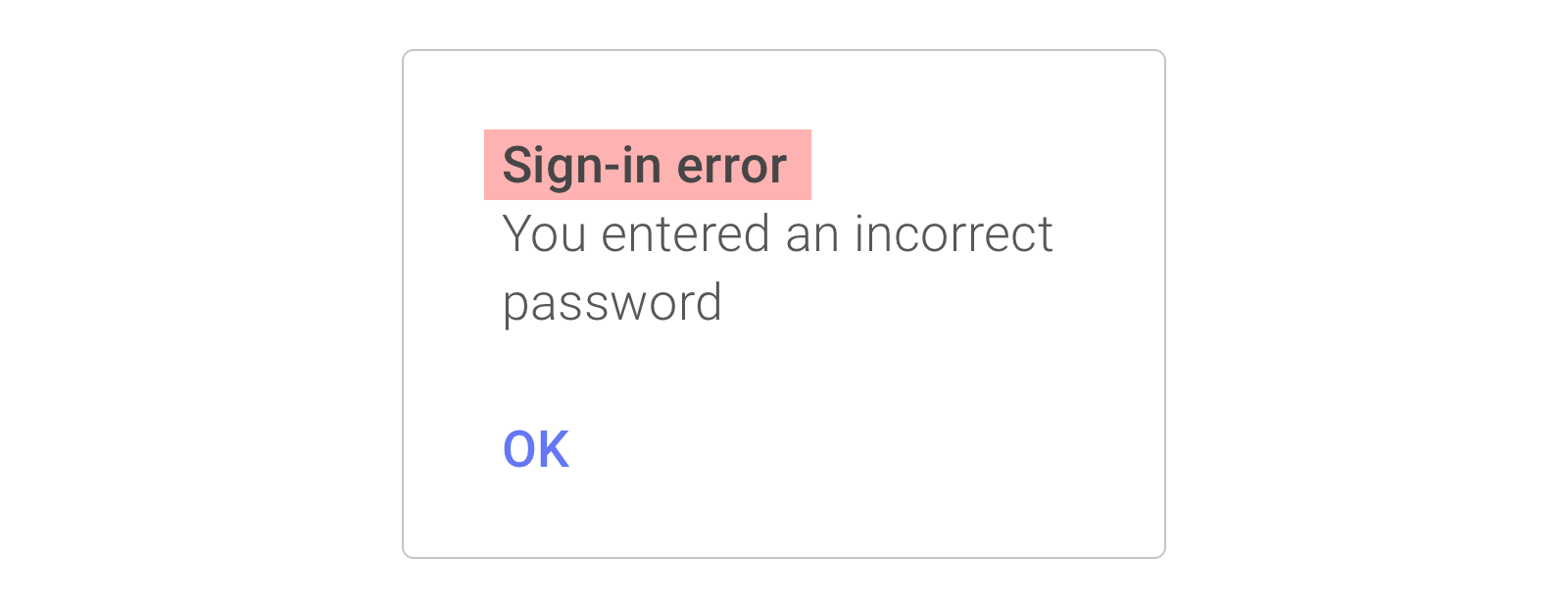
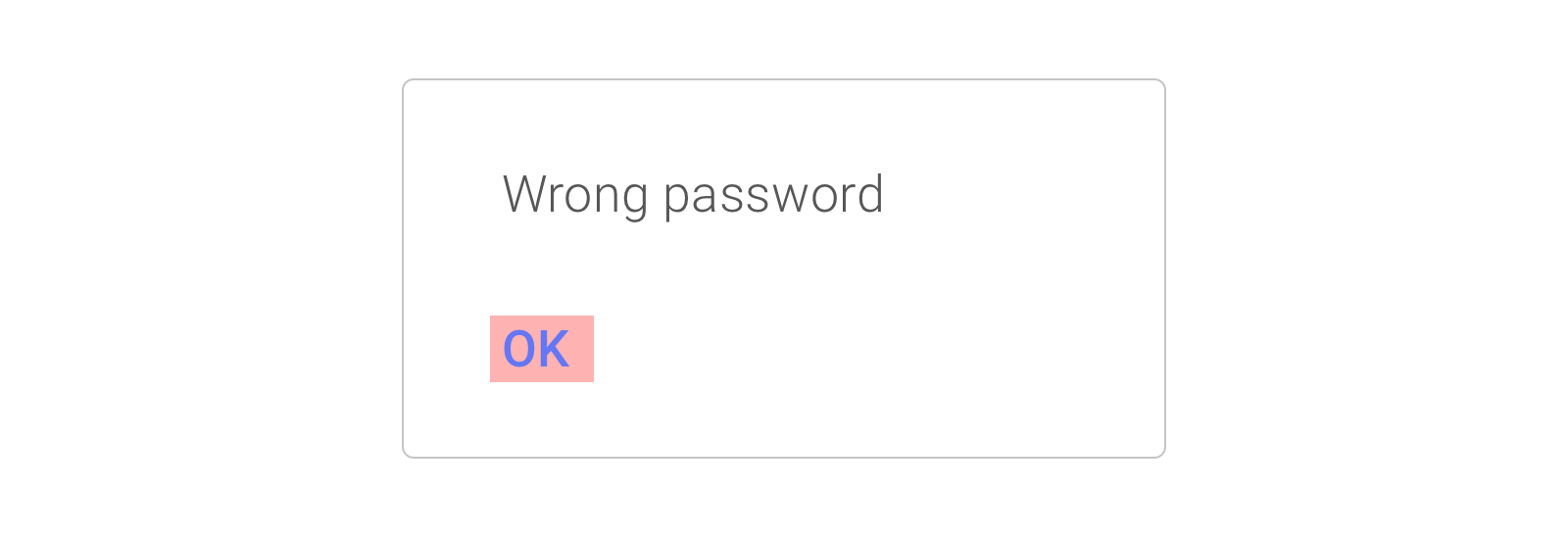
3. Useful
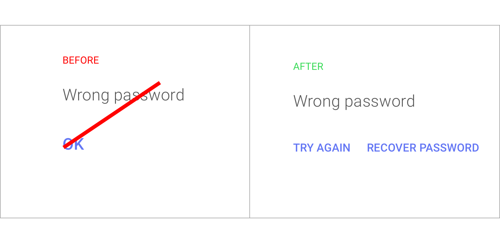
The call to action (CTA) guides people to their next step. You want your text to help people get where they want to go. For this reason the call to action needs to resonate with what people want to do. Here ‘OK’ is not a good call to action.
‘Try again‘ is a good option instead. This isn’t all we need. We need to give them an option if they’ve forgotten their password. If they forget their password and their only option is to ‘try again’, it’s very likely they’ll get frustrated.
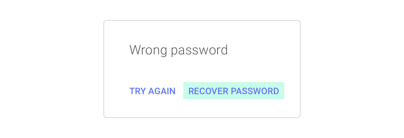
Paying attention to writing and the people you’re writing for is very important. It can uncover some of the basic functions that your app or website needs to offer. If you don’t think of those edges cases and write for them, you might see a drop off in usage.
Best practice wrap up
If you pay attention to these three principles, you’ll connect better with your users.
Good UX writing is not a science.
These three principles are not always in harmony. There’s a kind of tension between them. They’re competing with each other.

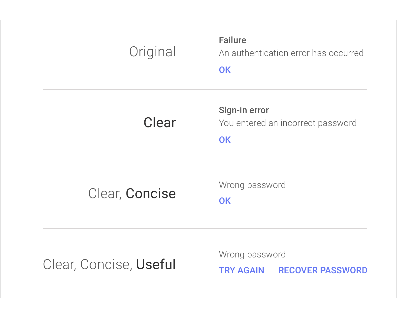
When we made the text clear it’s still pretty long, and not so scannable. When we made the text concise, it made it shorter but at the expense of some clarity. Finally when we made the text useful it became longer and less scannable.
Consider your users context and you’ll find the right balance between these principles. Think about what they want to do in the moment.
You can also look towards your products brand voice. Your brand voice should create the right balance of clear, concise and useful. This should be true to your products character.
Think about your products core function and you’ll begin to find the elements of that character. Then think about what makes it special, how it’s differentiated.
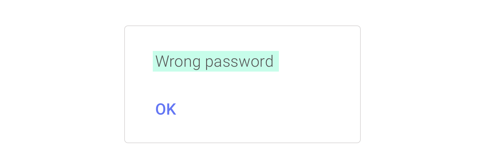
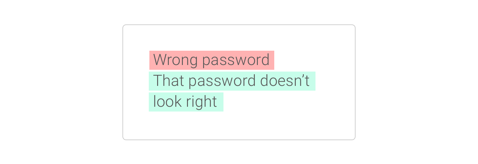
Below is what Google would do inline with their own positive brand voice. They don’t like to lead with negative words like ‘wrong’. They are also okay to have the text a little longer and a little less concise, to be friendly and chatty. The message below sounds like Google. It doesn’t mean it’s right for your brand. It’s up to you to build your own brand voice for your product.
Make the most of your words.
(Claire Savage)
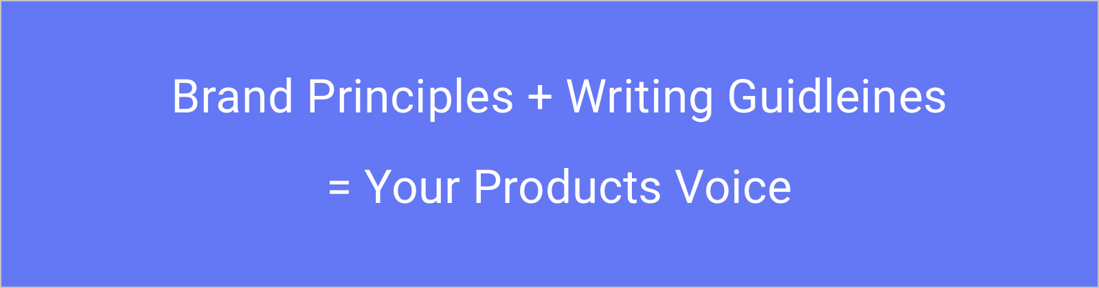
3. Building a brand voice for your new product
Brand principles
Start with a set of brand principles. These can be 3 or 4 adjectives that embody your brand, and how you want people to perceive it. To come up with these adjectives you can do a brainstorming exercise.
Imagine you’re signing up your product to a dating site.
What words or info would you put in your products profile? What is it about your product that make it stand out. What makes it seem most interesting to people?
What would make them want to swipe right and want to learn more?
You can then distill these qualities into descriptive words. These will then become your brand principles.
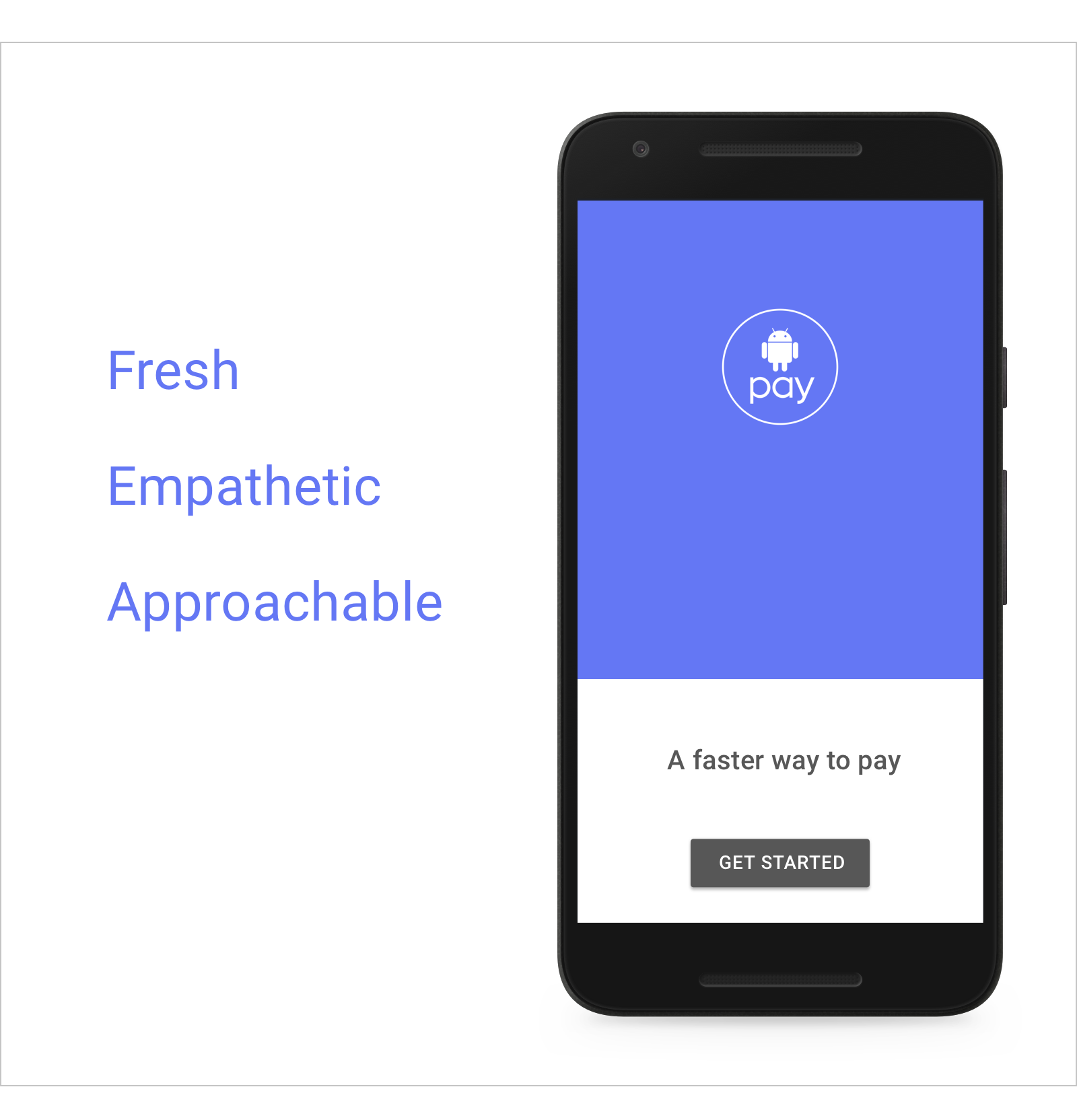
With Google Pay the principles were: fresh, empathetic and approachable.
Now you have your brand principles. The next step is what these principles will sound like when you apply them to your writing. These will then become your writing guidelines.
Tone
You can then take it one step further and think about what your voice will sound like in different contexts. This is tone.
An easy way to remember the difference between voice and tone, is to think about it like a person. A person’s voice stays the same. The tone they talk to you in may change, depending on the situation or what they’re saying.
In an app this might be like talking to users in a different way for different circumstances.
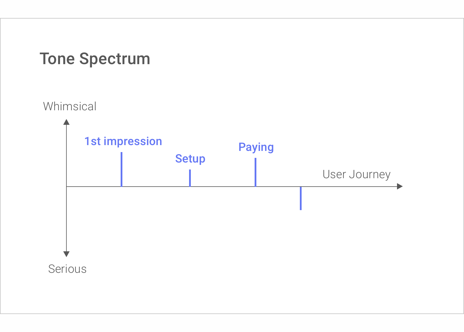
Tone spectrum
For Android Pay they mapped these different moments on a user journey. They did it in a tone spectrum ranging from serious to whimsical. This makes sure that they’re using our voice in a consistent way across the entire user experience.
For your product the two ends of the spectrum might be called something different. Your tone might range from informative to inspiring or direct to humorous. Once you’ve created your two ends, you then need to determine what moments in the user journey you’re going to map.
A good way to do this is to think about the distinct milestones or interactions in your user experience. These can be things like on-boarding, education or troubleshooting.
To help you decide where these will fall on the spectrum, you can then think about:
- What is the user’s goal?
- What might they be feeling in that moment?
- What would you like them to feel?
Now let’s do some UX writing 🤓
So you’ve established your voice and you’ve mapped your tone. Now, apply both of these and do some UX writing.
It’s time to decide what words will go in to your user interface. This ends up being a combination of everything we’ve talked about.
To be successful your interface text needs to:
- Be clear
- Be concise
- Be useful
- Reflect your brand’s natural voice
To show you how Google get there let’s walk through what their UX writing process looks like.
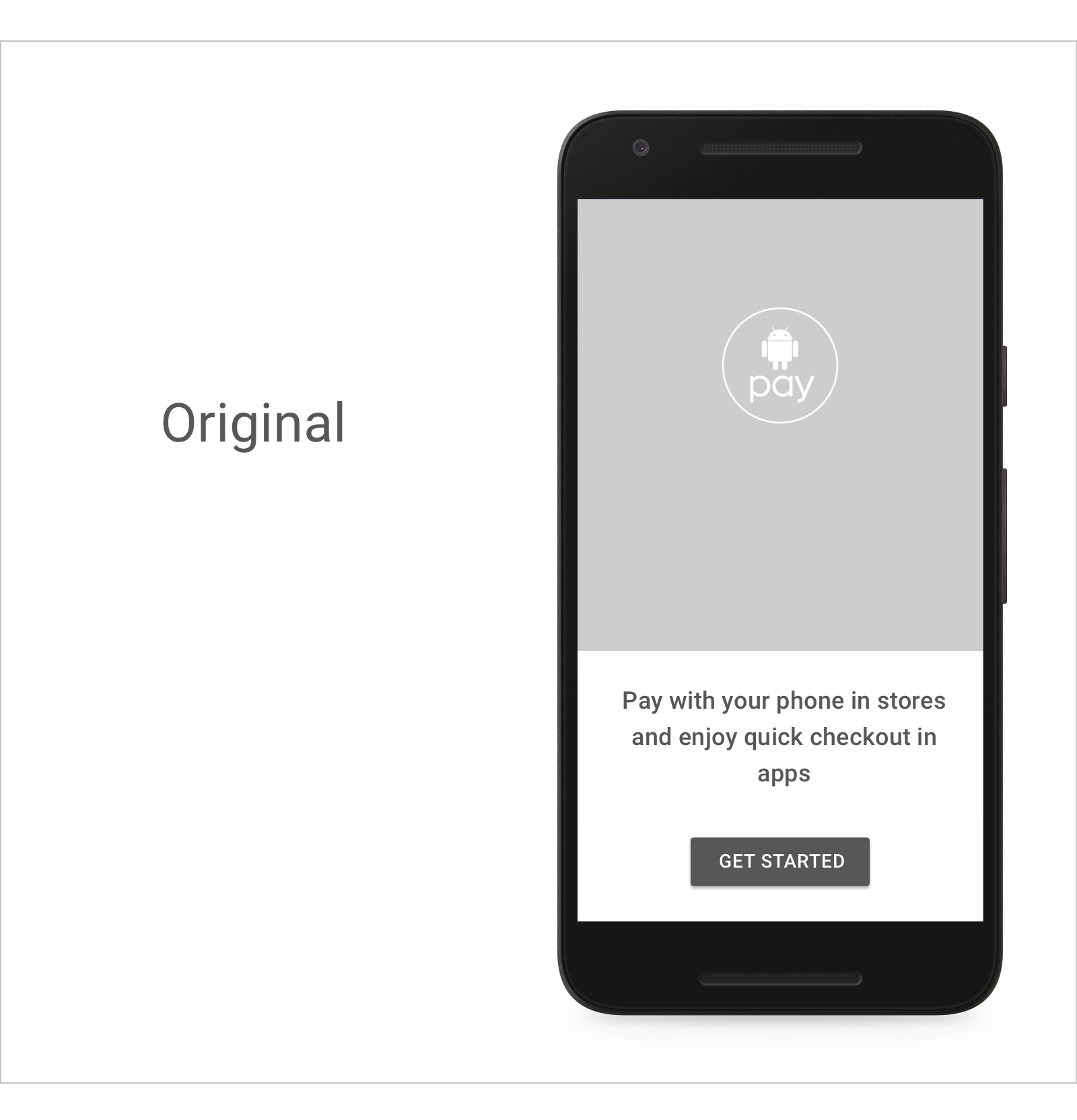
As an example lets try to see what they say to the user the first time they use Android Pay. They can guess that the user is curious. So they want to tell them what they can do with the app, as well as give them a reason to move beyond this screen and set it up.
Step 1
At the beginning of the process they start with something descriptive like the below.
Step 2
They then think about the three principles of good UX Writing. The text is clear and useful, but it’s not concise. They look at what pieces of information are essential. What parts could use visuals instead? They edit it to something like the below.
Step 3
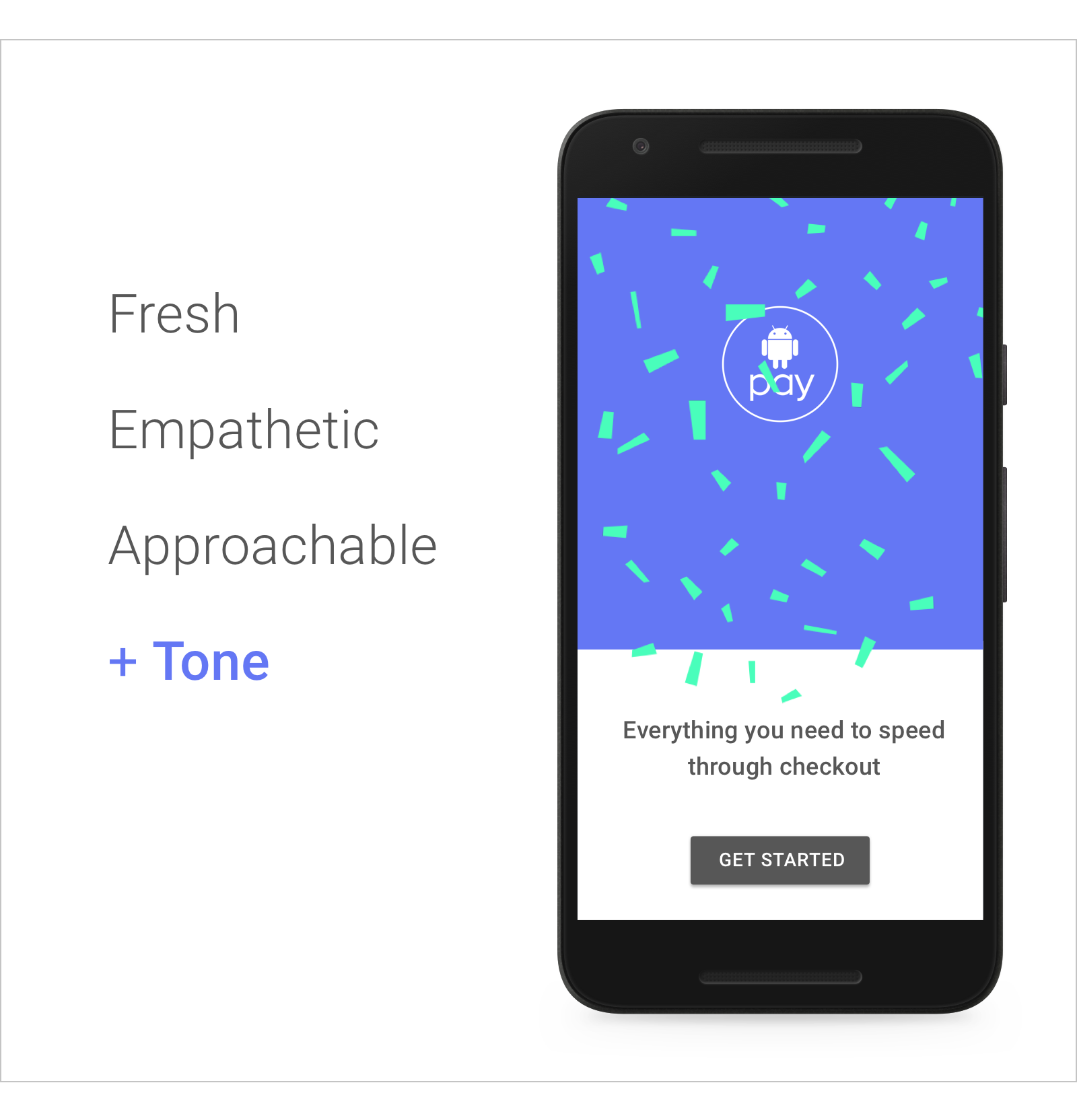
They’ve ticked off clear, concise and useful and now they need to think about tone. They then ask themselves, ‘does this text convey our brand? Not too much, it feels pretty generic’.
So going back to their brand principles they think about how they can make it fresher and more exciting. Even whimsical, as this might be their first impression on the user.
In the final iteration they end up with something like this.
A/B Testing
It’s a little longer than before, but adding a little personality can do this. It’s up to you whether infusing this personality is worth the words. This is not always a clear decision. If you’re not sure whether some words will be more effective than others, then A/B test them.
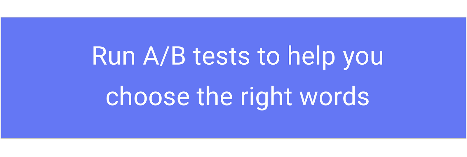
When trying to find the right words for your product never underestimate the power of A/B testing.
They ran an A/B test on the start screen on Android Pay. They changed the button from ‘add card’ to ‘get started’ and it resulted in a 12% increase in click throughs.
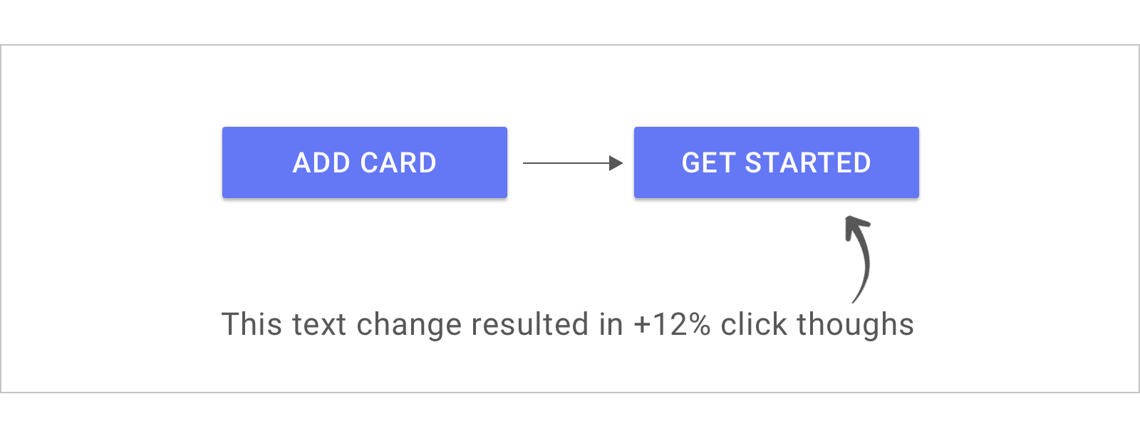
A/B testing is a great way to decide between two versions of text. You can find out which one connects more with your users.
Bad writing slows things down. Good writing speed them up.
(Ken Roman)
4. Your UX Writing Checklist
With this checklist, you’re on your way to make your product stand out with language.
Standout UX Writing Checklist
ALWAYS
- User First: Focus on your users
- Clear: Write in a language free of jargon, and with context
- Concise: Write in a style that’s efficient and scannable
- Useful: Write in a way that directs the next action
- On Brand: Define your brand’s voice and apply an appropriate tone
WHENEVER POSSIBLE
- User First: Choose language that performs, proven by research and A/B testing
Bringing writers in at the end of the creative process, is like trying to put toothpaste in to a tube.
(John Steinbeck)