BY Sparklin
A 3-year old Google study shared that an average user has about 36 apps installed on their device and uses just nine of them on a daily basis. Statistically, only four percent of the apps will be used for over a year.
A more usable app is high on user engagement and has reduced chances of app uninstalls.
It presents a compelling case to design better mobile apps and use basic user experience design (UX) principles to your advantage. A more usable app is high on user engagement and has reduced chances of app uninstalls. Better UX with increased user retention is one of the prime reasons of app evangelism too. After all, there is a 52-percent chance that your app will be discovered via a friend, family or colleague, outside the app store.
Here are the five UX tips to help you design better mobile apps.
1. Usability and user goals
You’re stranded on a street in a fairly new city and it’s raining heavily. You fire a cab hailing app (on a friend’s recommendation). As a user, what is that one thing you’re hoping to get done as soon as the app opens?
Get a cab at the earliest, I hope.
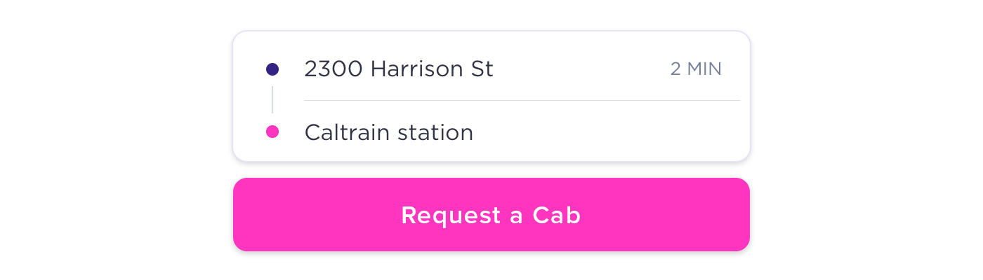
If your users have a possibility of being stuck in such a situation, design your mobile app for such users and their goal. Create a UX flow that allows them to book a cab in minimum time and steps. No gimmicks, no jazz — just pure simplicity in the way the user expectation is met!
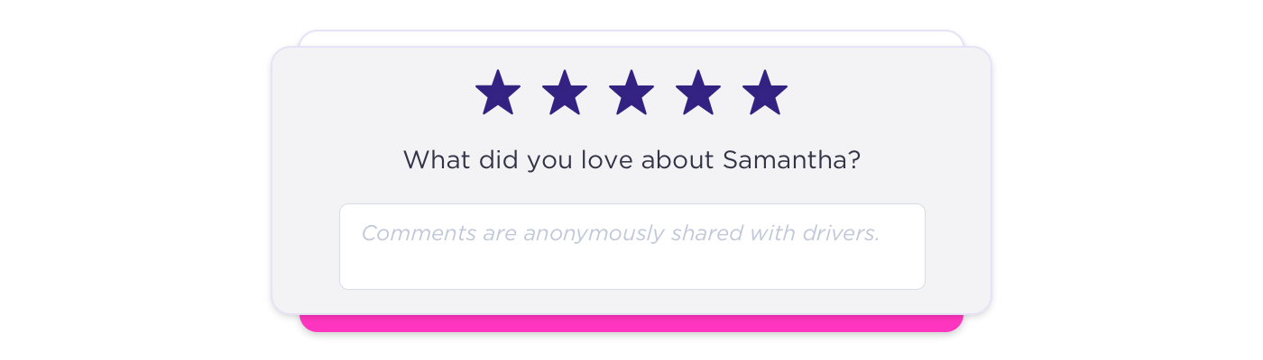
Why does a cab app ask you to rate the previous driver as soon as you open the app to request a cab? Or why does the app remind you of low balance only when it’s supposed to search and find you a nearby cab? The app could have timed these better. Let’s not force the user to act on things as a primary that are not their biggest pain points.
Simple design is easily missed, but really effective, if implemented right. ~ Himanshu Khanna
2. Define a clear action button
Also known as a CTA (call-to-action), this is the button that makes sure that the user, in the example above, gets a cab.
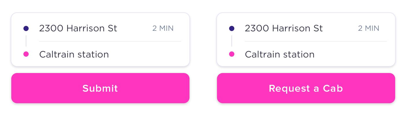
A couple of things to note while defining your action button. One, it must define the action clearly. In the cab app, the action button could be ‘request a cab’ rather than a plain ‘submit’. It will explain the purpose better.
Two, an action button should be easily visible and approachable. It is hard to reach the top-left corner of a mobile screen for a right-handed user without stretching or using both the hands. Hold the mobile in your hand and notice the screen area your thumb can reach easily without a stretch. This could be the area to place your action button.
3. Design for fat thumbs
Look at the following hypothesis — there are two variants of cab a user can request from the app mentioned in the example above. Both the variants are placed horizontally as different action buttons, next to each other at the bottom of mobile screen in a shape of a small circle. And the user browsing this app has really fat thumb. He taps Variant 2, while he meant to actually tap Variant 1. It’s difficult for him to tap & select Variant 1 unless he tries this really precisely. It’s frustrating!
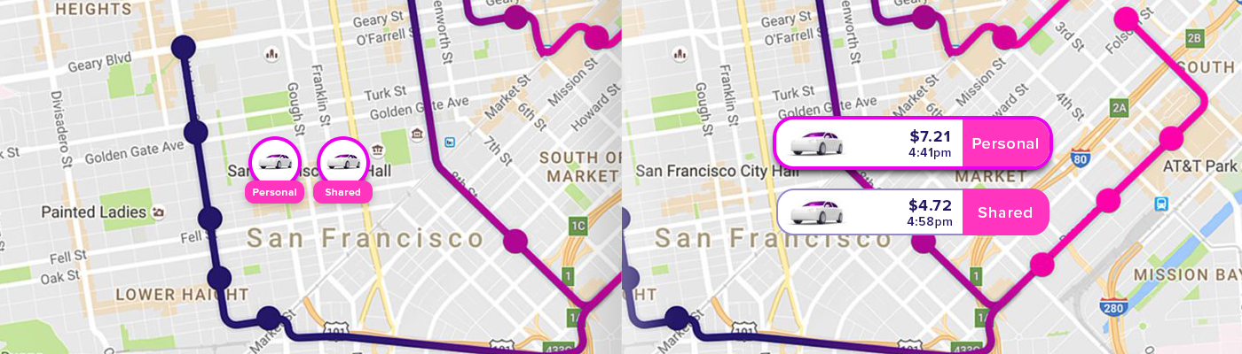
Only if the action buttons were big enough (not gigantic), this error and frustration would have been avoided. Create bigger action buttons and place them at a fair distance to allow easier app navigation.
4. Bandwidth is expensive
Another deterrent in a mobile user experience is high bandwidth consumption. Limit the information to be downloaded on the go. Background services consume a great amount of bandwidth.
Create reusable graphic assets for different tasks within the app, such as a cab icon to indicate moving cabs through the city, on a map. Request user choice beyond a section for further download of information, graphic assets, images and videos.
Optimise fonts, images and video for mobile consumption. Let’s not make requesting a cab more expensive!
5. Don’t drain the battery
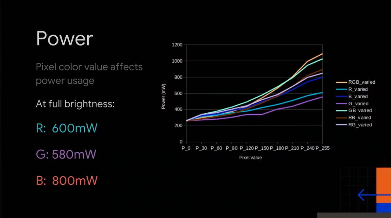
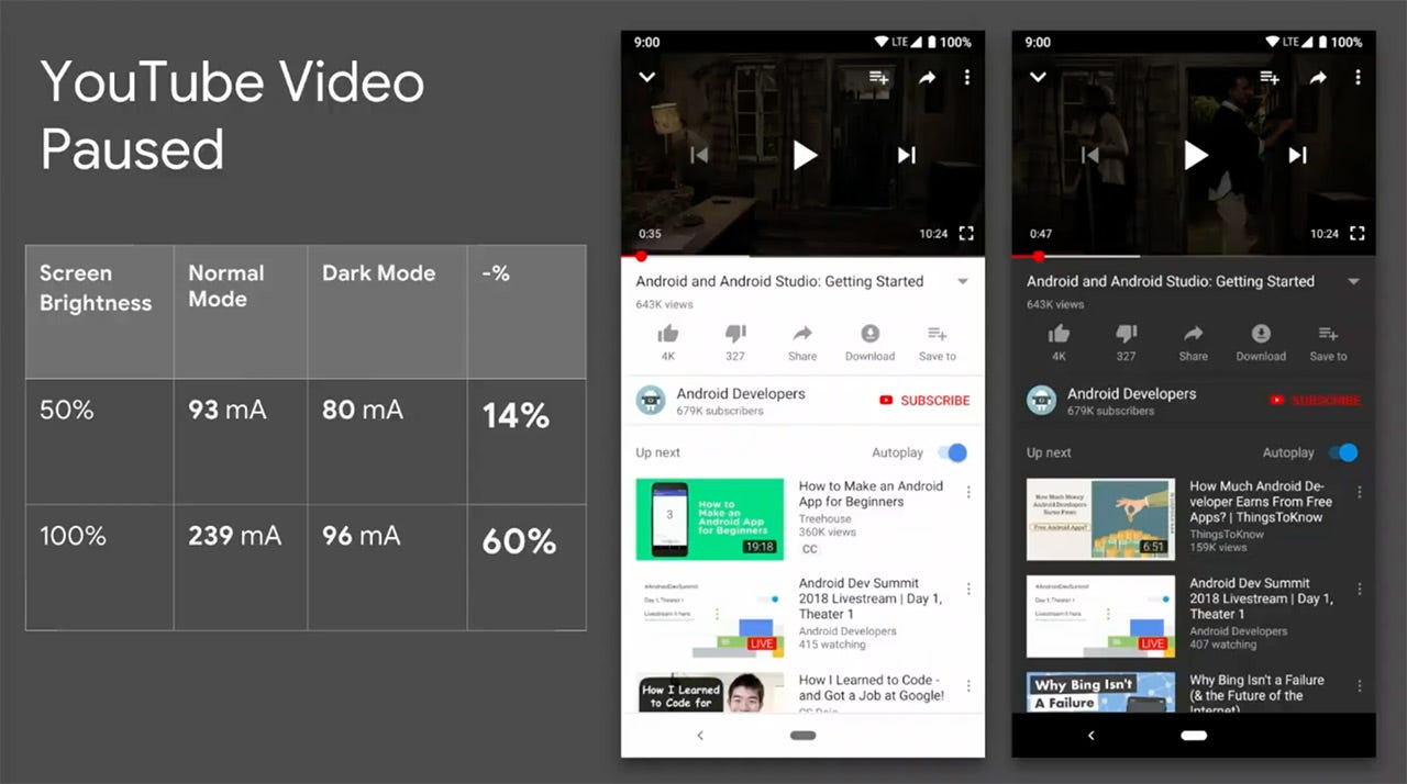
In Nov 2018, Google at Android Dev Summit, revealed on how a smartphone spends its battery life. They shared that the biggest factor in battery consumption are screen brightness and screen colour.
Google admitted that they’d made a bit of a mistake. Since Google’s Material Design initiative started, they’d been encouraging designers to use white as their primary color for all apps and interfaces.
If the app is heavy on calculations or complex navigations, there is a higher chance of mobile battery drain. Background services such as location detection are high on battery consumption as well.
The last thing a user needs in an alien city with heavy rain is their mobile battery running out. Keep the UI simple — lesser, darker colours, shorter navigation and to the limited background services.
Hopefully these tips will help you improve your mobile app UX and increase your user retention.