
BY Bill Chung
Years ago, I wrote about Designing for the Appearance of Speed, outlining some impetus and methods for creating the illusion of short page load times in apps and on the web.
Shortly after that article was published, I had amazing conversations with fellow designers and engineers, largely around a single question — “how do we actually know that skeleton screens work?” A valid question — no definitive studies exist to validate the efficacy of the pattern (which, to us, seemed to make so much sense).
Skeleton screens in different shapes and sizes are seemingly found everywhere across the web and apps — anywhere humans are forced to wait.
But do they actually work?
🔬Research summary (TL;DR)
- Skeleton screens (as splash screens), when used to indicate that a screen is loading, are perceived as being shorter in duration when compared against a blank screen (our control) and a spinner — but not by much
- Skeleton screens should not block gradual content loads (real content should replace skeleton objects immediately when the data is available). The vast majority of skeleton screens in use today are splash screens, and not skeleton screens in the original way described by Luke Wroblewski.
- When designing skeleton screens, I recommend using motion to further decrease perceived duration time
- Skeleton screens that leverage motion that moves from left to right (e.g. a wave or shimmer like animation, much like Facebook or Google uses) are perceived as shorter in duration than skeletons that pulse (opacity fading in and out)
- Skeleton screens using motion that is slow and steady are perceived as shorter in duration than skeleton screens that use fast or rapid motion
- The sample sizes in this study are too small to conclude anything definitively, but they do provide useful hints as to how we could design waiting experiences
Skeleton screens: an overview 💀
Luke Wroblewski first coined the term “skeleton screen” in a blog postadvising that designers eschew the use of spinners (typically a graphical element that is animated rotating on its center point) in favour of visual placeholders. He referenced work he had done on a native mobile app called Polar, specifically around excessive wait times reported by users when loading the app’s web views. Initially, spinners were used to indicate that a web view was loading in. Luke said it best:
“We had made people watch the clock… as a result, time went slower and so did our app. We focused on the indicator and not the progress.”
To mitigate focus on the loading process, versus the actual content that is loading, Wroblewski introduced a novel new design pattern — the skeleton screen. In his own words, they are “essentially a blank version of a page into which information is gradually loaded.” These visual placeholders were shown by Wroblewski to be light grey boxes that appeared instantly in areas where content had not yet completed loading.
Shifting our focus to the content being loaded, and away from the actual loading itself — an almost Dickensian red herring. But what’s the actual impact?
Explicit loading paradigms
Initially, spinners were used in the Polar app to communicate to users when the web view was pulling from a server. Let’s be clear here: in his post, Luke isn’t picking on the common place practice of using spinners — instead he is commenting (perhaps indirectly) on a natural human tendency to detest idle time, and the need to manage human perceptions.
Spinners and progress bars are explicit loading paradigms in that they focus the user on communicating a loading period and, more often than not, are blocking user interaction until a layout has loaded enough to be useful.

Skeleton screens defined
Skeleton screens are blank pages that are progressively populated with content, such as text and images, as they become available (i.e. when network latency allows). Grey or neutral-toned filled shapes, commonly called placeholders, meet the user instantly upon user interaction with calls to action or links. The placeholders (the so-called “bones” of the skeleton) are then replaced with the actual site content, and the illusion is complete. That’s what skeleton screens do: create the illusion of an instant transition.
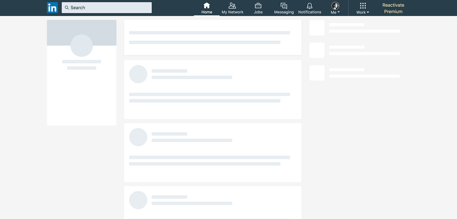
Skeleton screens in the wild

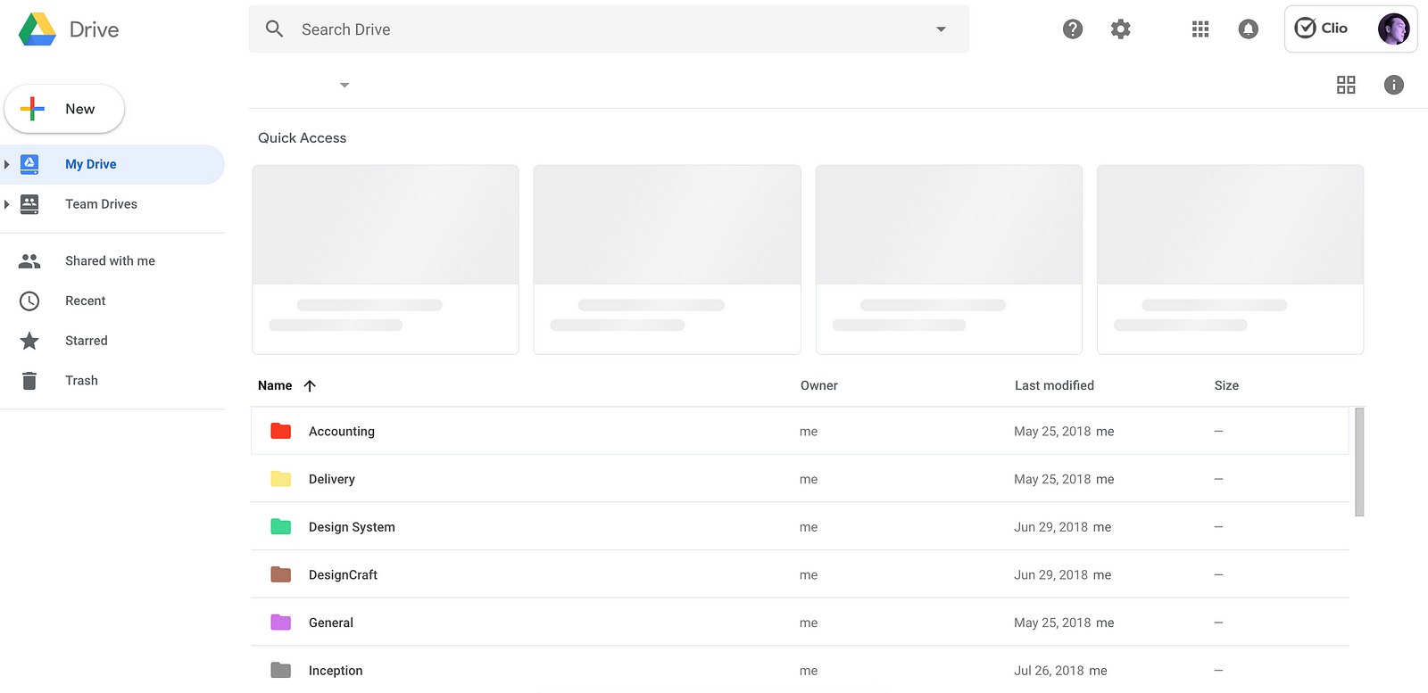
Google Drive
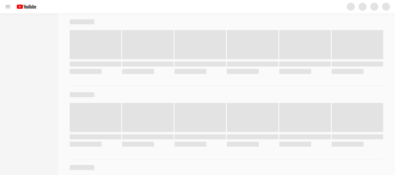
YouTube
Commonalities
All of these examples above employ common visual design approaches:
- Use of motion within the skeleton objects
- Skeleton objects are light grey or neutral in color
- Facebook, Linkedin, and YouTube seem to be using skeletons as splash screens, whereas Google Drive uses a spinner for loading its primary folder structure, and skeleton objects for the Quick Access slots
The study 🕵️
The study is comprised of two primary phases:
The first phase pits a common loading paradigm (a spinner) directly against the skeleton screen approach, and is described in more detail in the section titled “Paradigm vs Paradigm”.
The second phase investigates variations on skeleton screens, gauging the effectiveness of each variation. I planned this study before knowing fully the outcomes of the first phase, as my assumption was that the skeleton trend would continue regardless of its assessed efficacy, and I wanted to see for myself what would be optimal in my own work. See the section titled “Implementation variables” for more on this phase of the study.
Previous studies
Little research has surfaced that shows the effectiveness of skeleton screens at reducing perceived queuing times. Viget released a 2017 study that speaks against the touted value of skeletons when compared to spinners and a blank screen (spoiler alert: skeleton screens performed the worst in terms of perceived duration of time). Yet even with the Viget study in hand with seemingly indicative results, I wanted to take things a bit further.
Testing principles
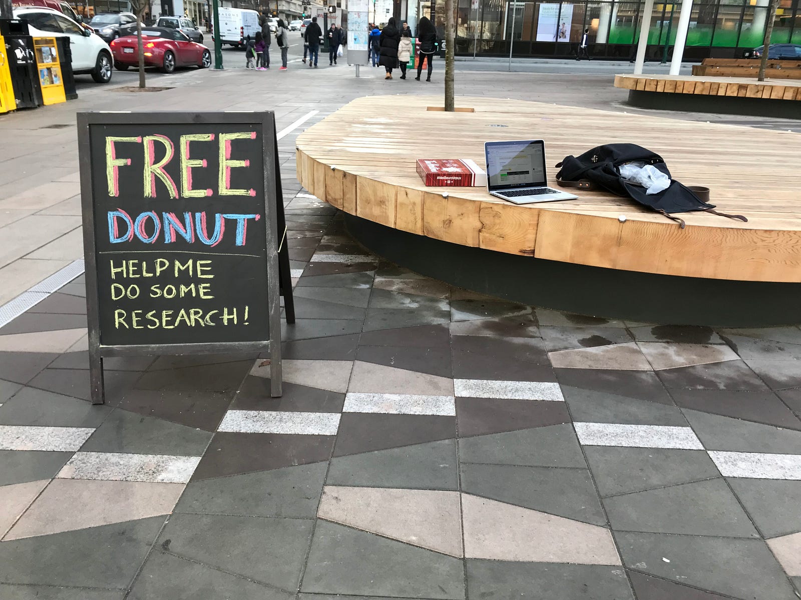
I wanted to test skeleton screens as much as I could on a physical mobile device, as that best represents the “half-focussed” state that most of us are in when we’re on our mobile (half focussed on the device, and half focussed on traversing the streets or eating a bagel). I also wanted test participants that (preferably) did not work in the tech industry. So I took to the streets of downtown Vancouver and got to work talking to locals of all ages, genders, and life situations.
In the second part of this study, I leveraged testers on UserTesting.com (sadly because the weather had turned and it was becoming increasingly unpleasant to sit and wait for research participants outside).
Paradigm vs paradigm
Hypothesis: displaying a skeleton screen will cause humans to perceive a loading period as being shorter in duration.
Methodology
In considering how to best approach participants, I realized that past tests I had attempted against this hypothesis were rife with issues that could be easily mitigated, namely that:
- Interrupting the test participant to collect an assessment by asking questions is disruptive
- The questions I asked tended to be repetitive, as I ran 12 individual tests with each participant and needed to ask questions after each “round”
- The order in which I showed each loading paradigm and duration was manually randomized, which was exhausting to keep up over the course of an entire day of testing
To mitigate some of these issues, I decided that an app on a physical phone, presented to the test participant to complete on their own, was the best solution. Preliminary user testing of the testing app proved positive after several iterations and refinements.
Once I approached a potential test participant on the street, I asked them to complete the tasks as instructed on the device and assured them that they could stop at anytime to ask any questions or rest. Once they completed the test, and offered any open ended comments on which paradigm they preferred, a donut was offered as a reward and my participants were sent on their way, happy in the knowledge that some odd fellow was on top of testing different loading methods with strangers. Hurrah! 🍩
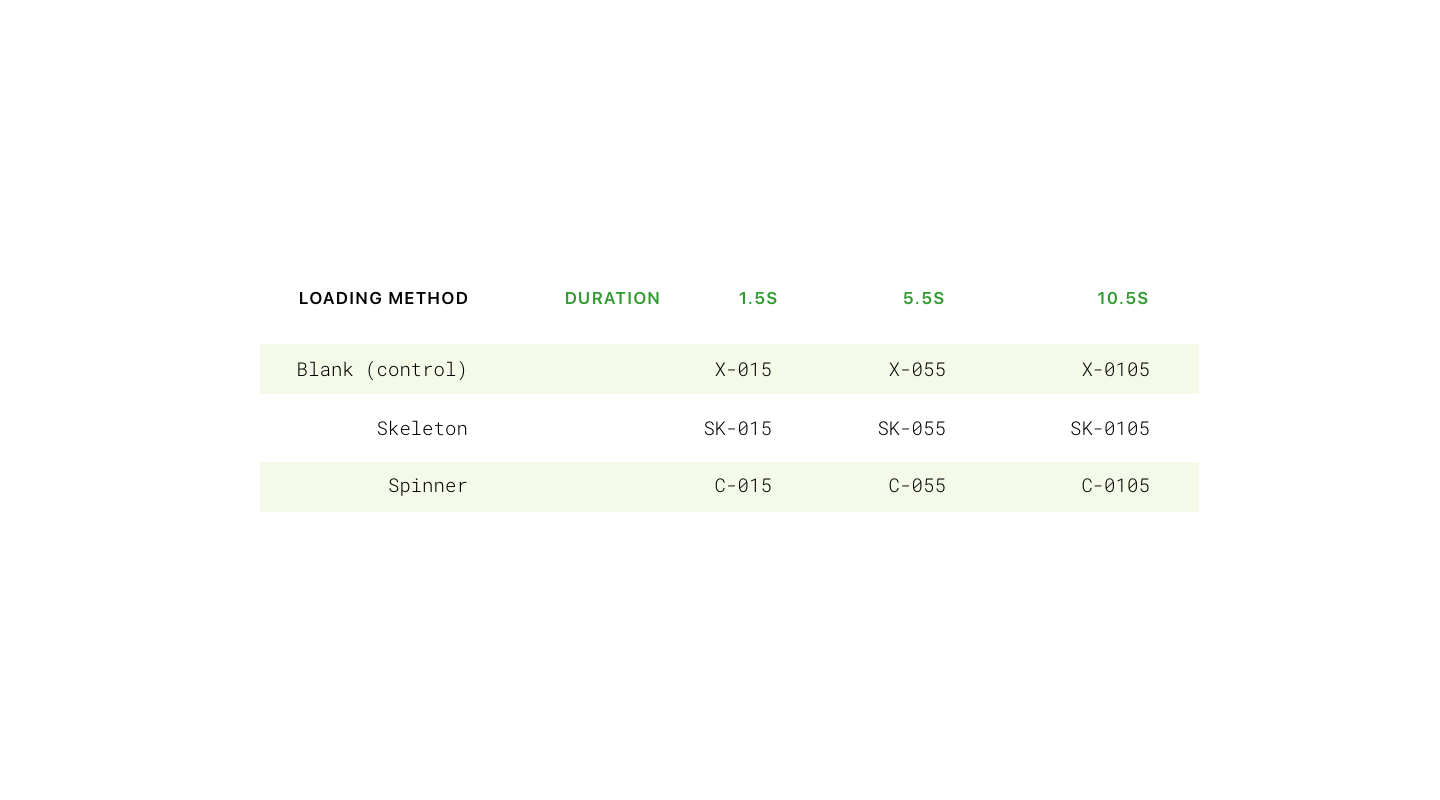
126 total unique individuals were approached on the street from varying backgrounds, primarily from non-technology oriented backgrounds. The sample size was 80 individuals who have all had experience with mobile devices.
The testing app📱
The app was written in the Swift programming language and was loaded onto an iPhone 7 (this is the form factor I felt would feel comfortable in most hands). When the participant completed their test, the results were sent to a Firebase database from where I could pull daily results into a CSV (comma separated values) file for analysis.
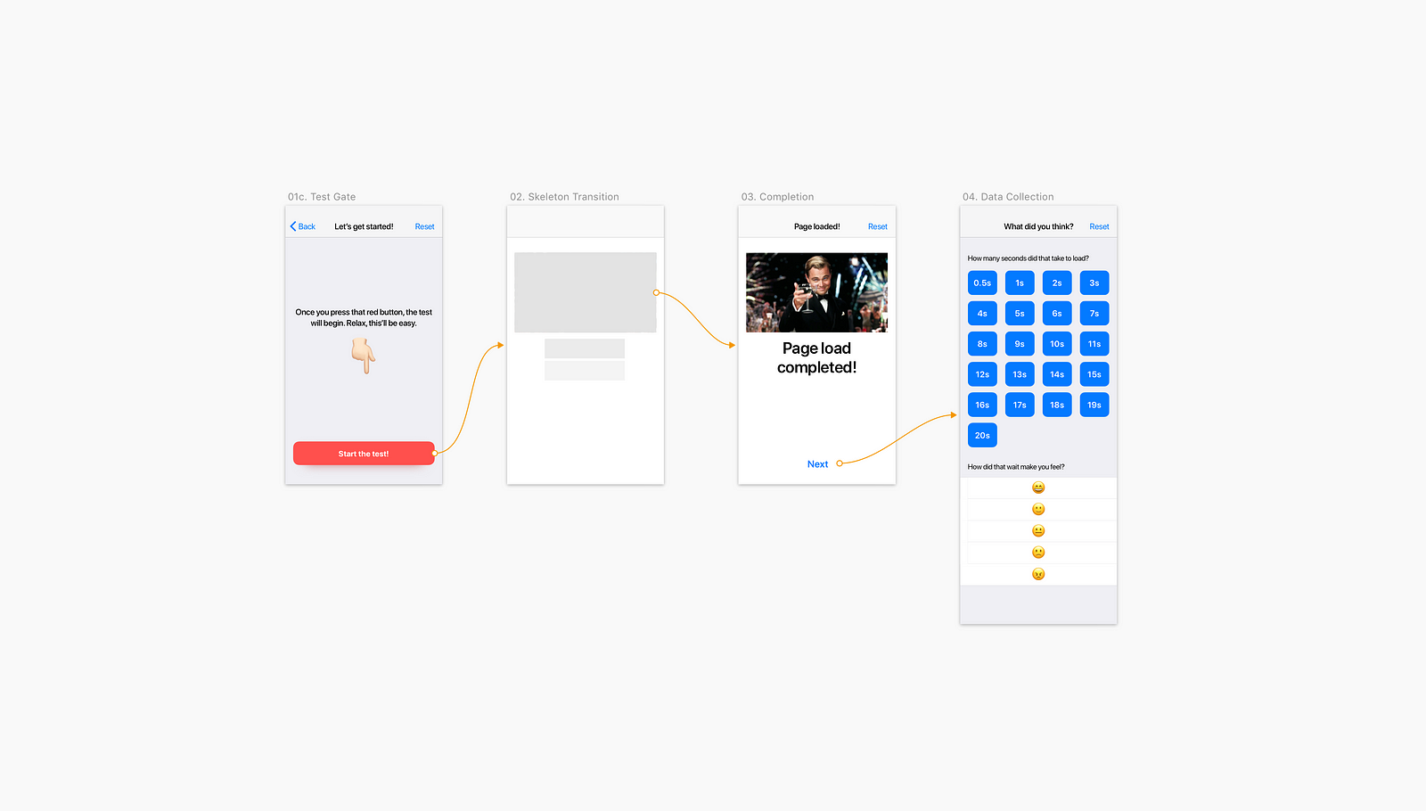
Participants were asked to read the instructions presented in-app, and take their time when completing the presented tasks. Before beginning the tests, I ran the participants through a really quick warm-up, so that they knew what to expect. Here’s what our participants had to do:
- Press a button to begin the test
- Wait while observing a skeleton, a spinner, or a blank screen
- Observe the loaded page state
- Finally, they’re transitioned to a last step, where they answer two questions — how long did they feel the page load took in seconds, and how did waiting for that page load make them feel?
- They would repeat this test, 8 more times (for a total of 9 total tests per session)
- I also asked open-ended questions at the end to collect more qualitative observations. I usually prompted this conversation by asking “of the different ways of loading a mobile page as you saw today, did you have a favourite?”
In order to mitigate any bias, where seeing one pattern before another might skew the perceived duration, the app automatically randomized the order in which the different loading paradigms appeared.
The app also randomized the actual duration presented for each loading paradigm, so the duration didn’t seem as if it was progressively getting longer, or shorter.
Results
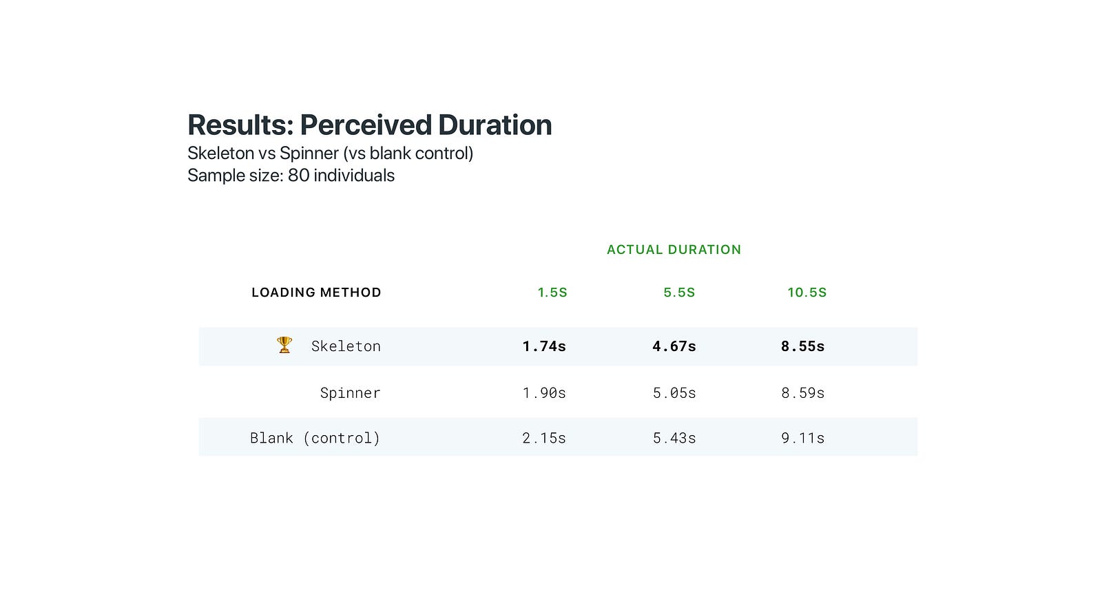
When testing skeletons versus spinners and our blank control in random order, the skeleton performed the best in terms of perceived durationwhen shown to people using mobile devices (see the below table for a summary of the mean test results for a sample size of 80 individuals). Actual durations shown to these participants were randomized to prevent them from interpreting a progressive increase in duration. Our blank control performed worst overall.
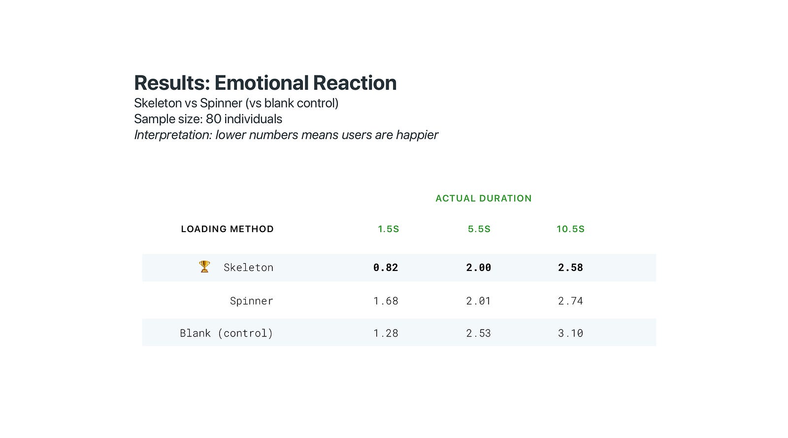
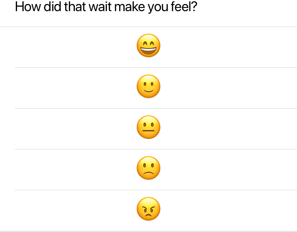
Skeleton screens also performed best on the emotional level, with participants being the most happy with skeleton screen loads, and least happy overall with a blank screen. After viewing each combination of duration and loading method, participants were asked to measure how each viewing made them feel using emoji, with 0 = Very happy, and 4 = Maximum frustration. Here’s what they were shown after each test:
Analysis & interpretation
When skeleton screens are used between page loads on mobile devices, the perceived elapsed time (duration) is shorter when compared to a spinner or a blank screen. In some instances, the skeleton is equivalent to the spinner, such as in our 5.5s duration tests, and indeed the superiority of skeletons over spinners is minor. One might hypothesize that different presentation methods of the spinner might affect results significantly. In our tests, I used a spinner that I thought was generic and looked most native to the platform (iOS in this case).
In both dimensions (perceived performance and emotional impact) using any loading indicator is superior to a blank screen.
Implementation variables
Hypothesis: the visual presentation of skeleton screens will cause humans to perceive a loading time as being shorter in duration.
I began hypothesizing how variations on the skeleton could affect perceived duration early on in this investigation (before I had results on whether skeletons were more performant than spinners).
Early hints that the visual presentation of skeleton screens could affect perceived duration came from sources such as this 2010 study (in this study, progress bars presented with a “ribbing” animation proved superior in terms of perceived wait duration). Further reading can be done on the contrast of objects and how they impact human perception of speed.
Methodology
In order to determine the effectiveness of any particular visual presentation of skeleton screens, I spent time to collect the most popular approaches currently used in the market. Here are some common approaches:
- Static placeholders
- Pulsing placeholders (the opacity of the skeleton objects transitioning in and out slowly)
- A wave (or shimmer) animation (varying between moving from right to left or the opposite) overlaid atop the placeholders
With the weather turning outside (I had done all previous tests outdoors in downtown Vancouver, BC) I turned to 80 unique mobile devices users on UserTesting.com in order to test these implementation variables. Participants were from a largely North American audience and were asked to conduct the tests on mobile devices. To conduct the test, I mocked up a mobile product page for a make-believe footwear brand to make the comparison seem like a real-world example.
Participants were shown one presentation, then another immediately after. The order in which I showed each presentation method was flipped in each “set” presented. For example, if I tested a static versus pulsing skeleton screen, the first 10 participants were shown the static version first, and the last 10 were shown the pulsing version first instead. This was done to mitigate any concerns that a bias may arise from seeing one method before the other.
The participants were not told that the duration of each example they saw were exactly the same duration (all durations were 5 seconds in length). Upon viewing the two presentation methods, the participant was asked, “of the two page transitions you observed, which page transition was faster?”
The tests
I sequentially layered the implementation methods in order to move from macro variables into micro variables. Here’s the order of tests I went through:
- I started by testing static skeletons against skeletons that pulsed, in order to determine if motion (or lack thereof) had an impact
- Then I tested a pulsing animation against a wave (or shimmer) animation
- In the third test, I pitted a quick wave transitions against slow and steady wave animation
- Finally I tested a left to right motion, versus a right to left motion


Results: Static vs animated skeletons
60% of test participants guessed that the animated skeletons represented a shorter duration. Sample size: 20 unique testers
Results: Pulsing animation vs wave animation
65% of test participants guessed that the wave animation represented a shorter duration. Sample size: 20 unique testers
Results: Quick vs Slow and steady wave
60% of test participants guessed that the slow wave animation represented a shorter duration. Sample size: 20 unique testers
Results: Left to right wave animation vs right to left
68% of test participants guessed that the left to right wave animation represented a shorter duration. Sample size: 20 unique testers
Analysis & interpretation
The results from this grouping of tests is indicative but not conclusive by any means. What might throw some flavour into these results is that, when speaking aloud about why they decided the way they did, test participants were fairly indecisive when it came to more nuanced tests (for example the quick versus slow wave test). However, when it came to tests that were more obvious to discern (such as the pulsing versus wave animation test) test participants were decisive and fully convinced that one was shorter in duration than the other (even though the durations were all consistent across the board).
How should we design skeleton screens?
The key role of motion
While further study of the efficacy and effectiveness skeleton screens is needed, this exercise has provided us with a few clues as to how we can make the most of this unique pattern, namely:
Designers should prefer a wave effect (or shimmer, much like Facebook uses) over a pulse
Motion should not be so fast as to draw attention to the skeleton objects (slow and steady, like found in the Google iOS app is optimal)
Designers should prefer animation that moves from left to right (it would be interesting to see if RTL reading cultures would interpret this differently)
Use of dominant colors
The use of dominant color based skeleton objects is a unique method of providing future context to objects that are loading, as if to imply more acutely the future loaded state. Google Photos uses this pattern, as does Pinterest.
Skeleton screens are not splash screens
Before we dove into the details of this study, I mentioned that the vast majority of skeleton screens implemented today act exclusively as splash screens. When designing loading experiences, strive to progressively load content, replacing skeleton placeholder objects with content like real text and images as soon as they are available. Luke Wroblewski (the early pioneer of skeleton screens) speaks about this in detail at the 2018 Conversions at Google. Luke calls this “gradual content loading”. Future studies should compare a true gradually loaded skeleton with other loading indicators, while leveraging a larger sample size.
Afterwards: on time perception
Allow me to be real for several thousand milliseconds here: why would the mere perception of a site or app loading several hundred milliseconds faster, prompt such a deep personal investigation into something seemingly innocuous as skeleton screens?
As part of the generation that inserted 13 floppy disks to install Windows 95, you would think that the LTE and fiber connections we enjoy today might make me nostalgic for simpler times, times when I could head to the fridge for pie while waiting for my favourite Geocities web page to finish loading in all its animated GIF glory.
But alas no.
I am as impatient as teenagers on the bus complaining about the 12mbps load of their Instagram feed. I cringe when the animation of a mobile navigation stutters along at sub-30 frames-per-second. I wonder why the payment terminal at the grocery store takes a full 2 seconds to actually get ready before I can tap my watch to pay. Our world and the society it hosts, now moves faster than large swathes of our species can process. Does it seem to you that our perception of time is accelerating beyond our ability to acclimate? You are not alone.
Delving into how humans perceive time in the context of the pace of technology around us, has been an enlightening experience. But I am also filled with trepidation. As Peter Conrad best put it, “Modernity is about the acceleration of time”. From pure personal observation, the truth of this seems self-evident. Our culture’s patience thins daily, our walking pace has seemingly quickened to near jogging speeds, and our waning tolerance for all things even mildly idle in nature has given way to an entire industry of productivity pundits. This very article grew from my own personal awe as I beheld our collective impatience.
In this human rebuke of slowness will undoubtedly arise new anxieties and irrational impulses. And perhaps new ways to stanch our fear that time is slipping from our grasp — as we sit and quietly contemplate skeleton screens.


1 Comment