BY Shan Shen
Should we swap sharp-cornered buttons with rounded buttons? Do rounded buttons perform a better usability? How do we make wise button decisions?
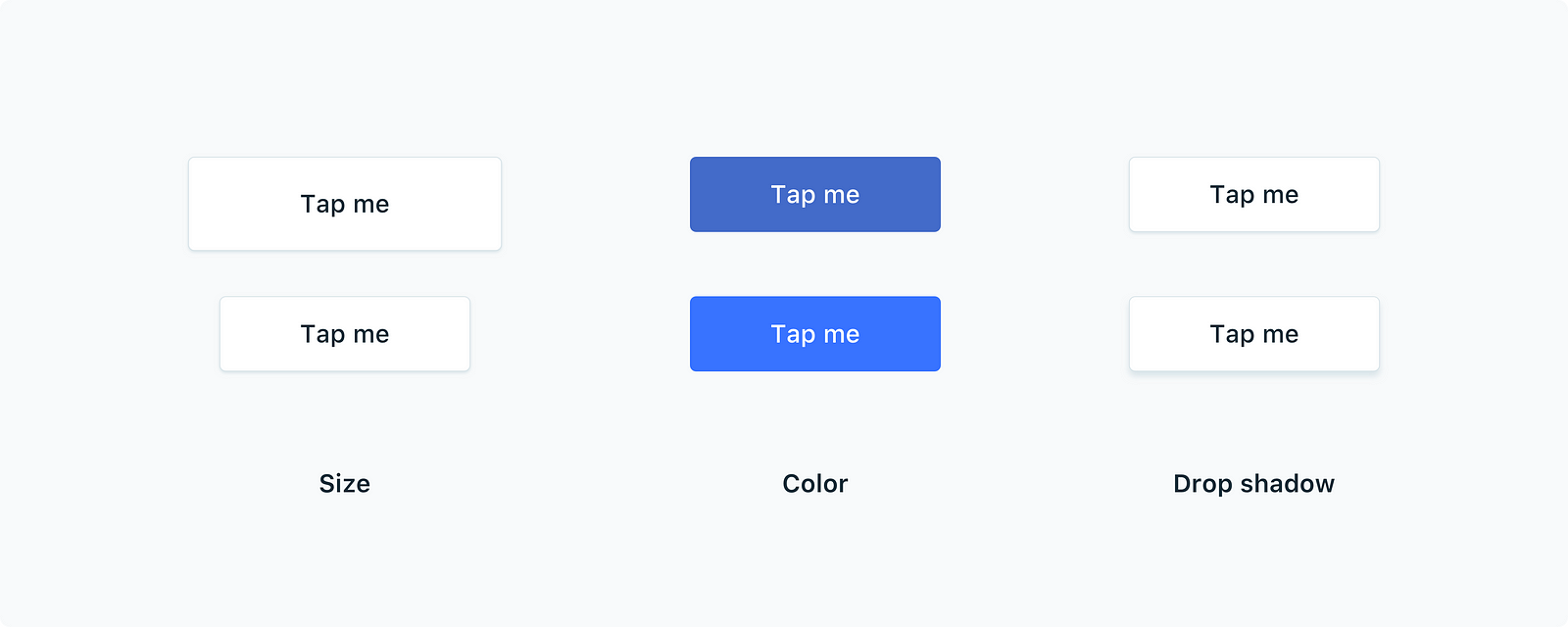
These are the questions you may run into when you dive into the UX behind rounded buttons in apps. We know that a larger button size, a brighter color, and a stronger drop shadow can make buttons more standout, yet it’s challenging to find the right balance between actions buttons and other non-interactive elements.
Are round corners more recognizable?
Rounded corners are easier on the eyes. When we align cards in a row, it’s easier to count the total number of cards when they have rounded corners.
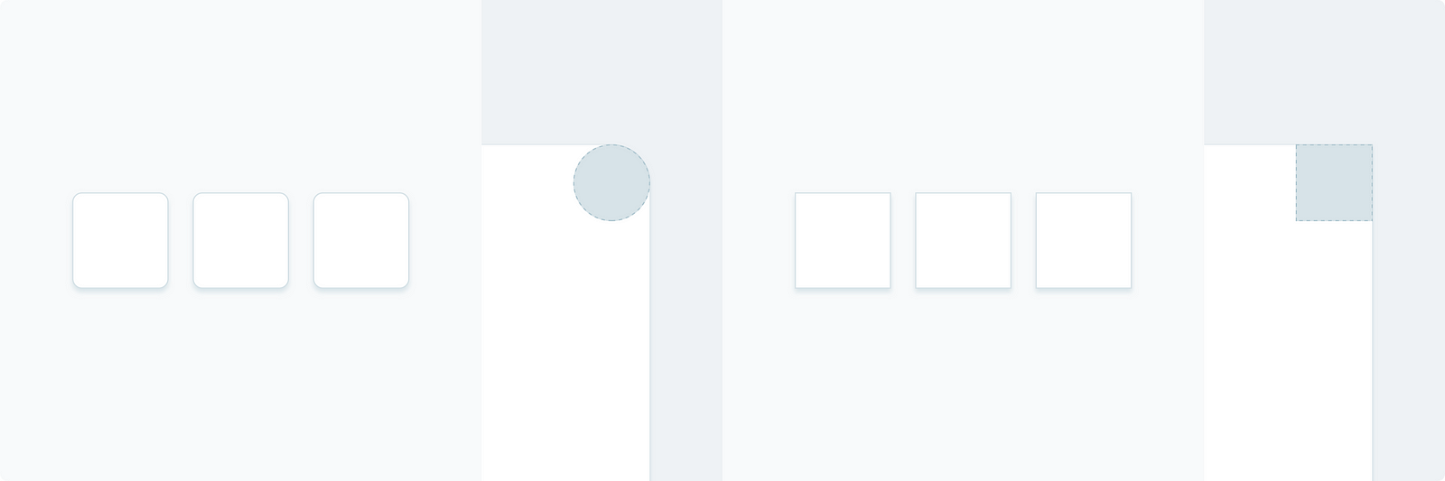
It’s because distinguishable edges on the corners of cards guided our eyes to recognize the visual differences. Conversely, cards with sharp corners look identical and unified from each other, which are less likely to attract our attention.
In a grid layout, rounded corners perform even better.

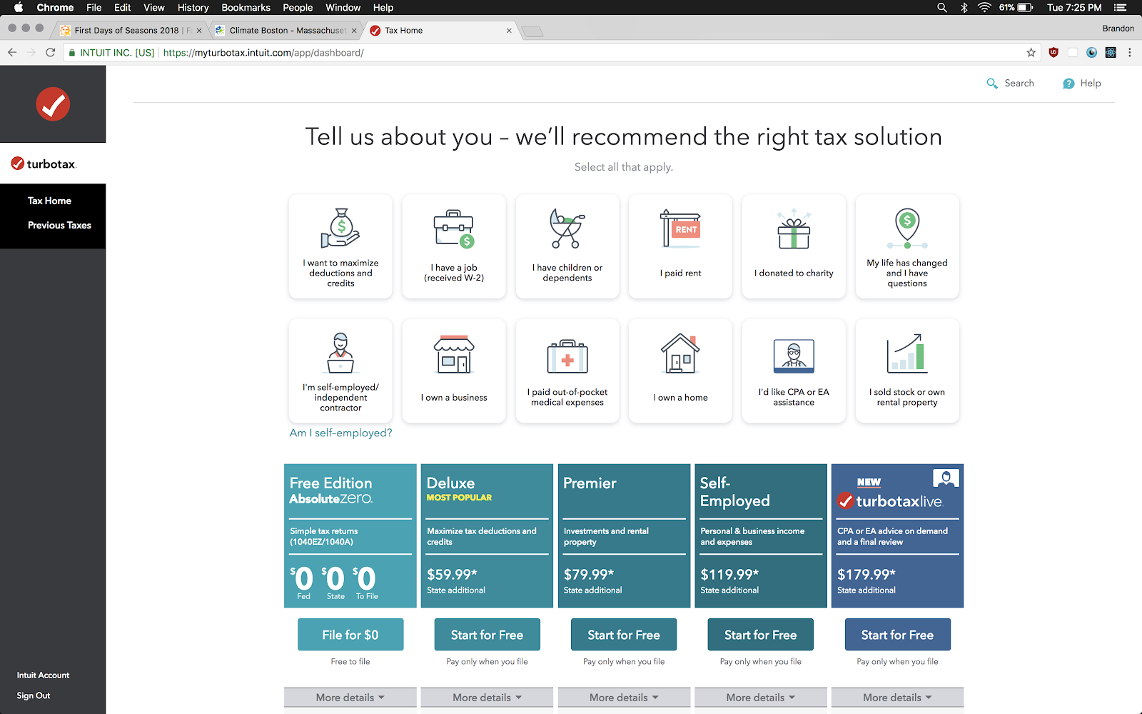
For example, on TurboTax’s Dashboard, the top section that uses rounded cards is very eye-catching, comparing to the middle section that uses sharp-cornered cards.
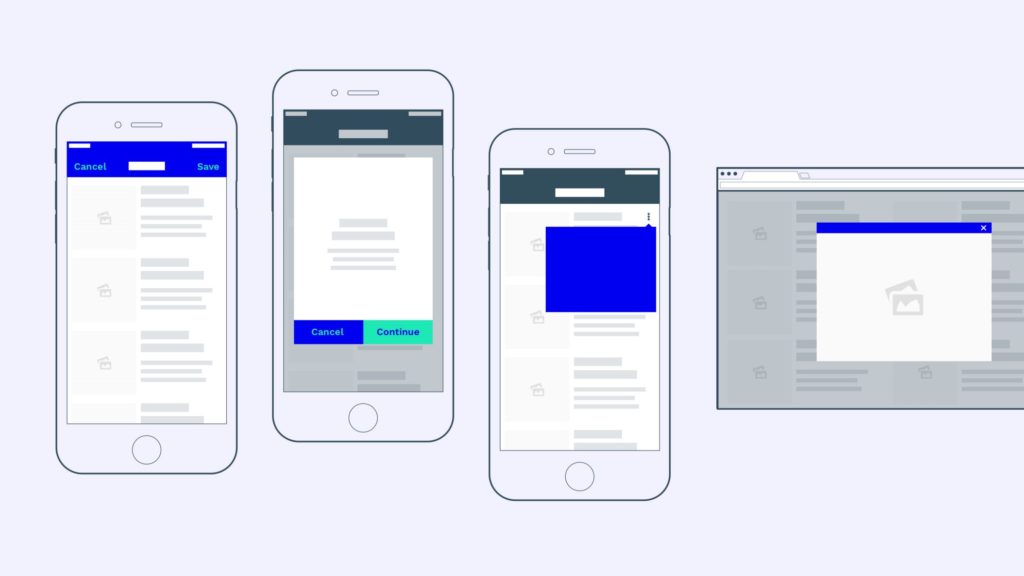
Should I use fully rounded buttons?
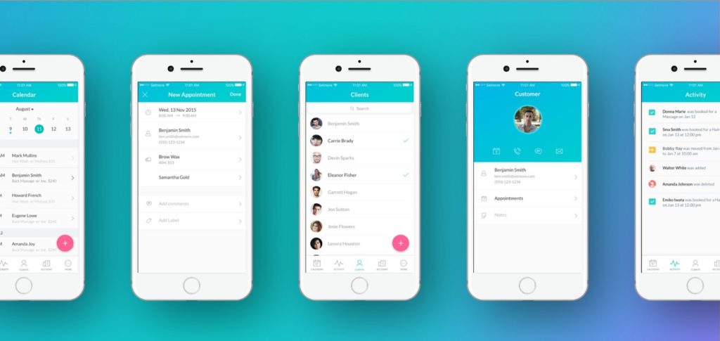
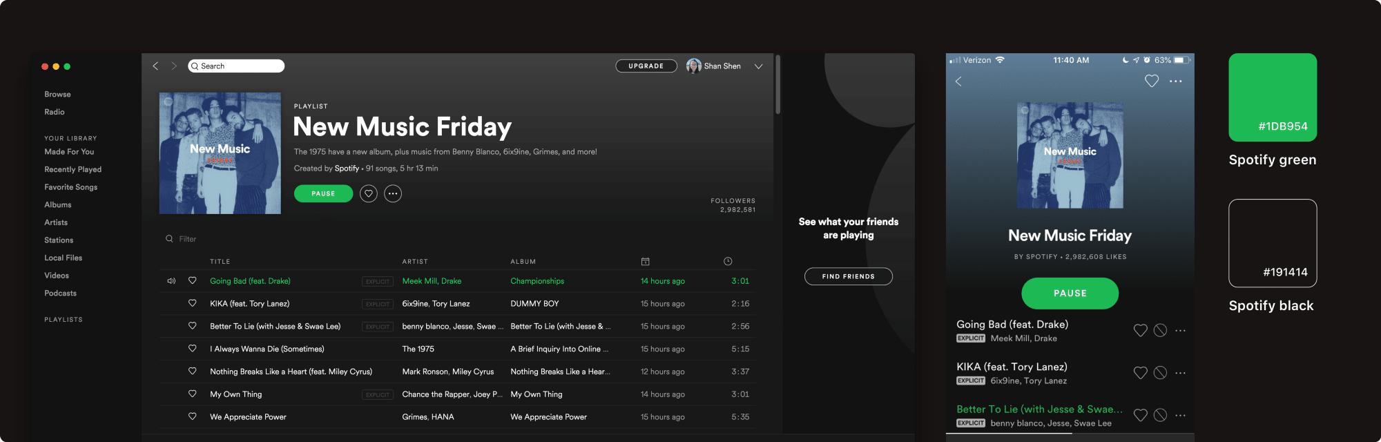
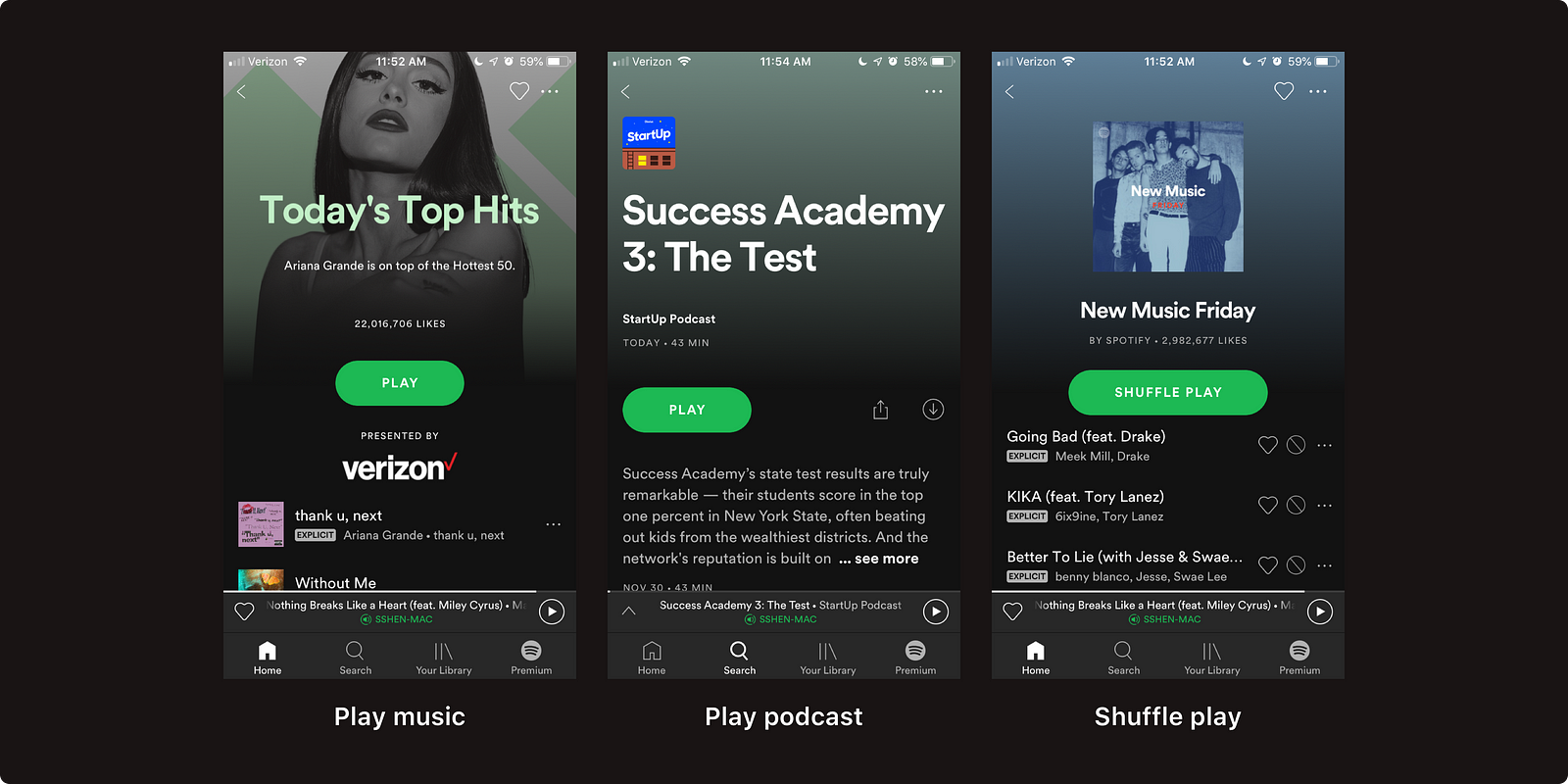
Fully rounded buttons are excellent in interfaces that have adequate space. In Spotify mobile and web apps, the placement of fully rounded green buttons is very successful in directing users’ attention on call-to-action buttons.
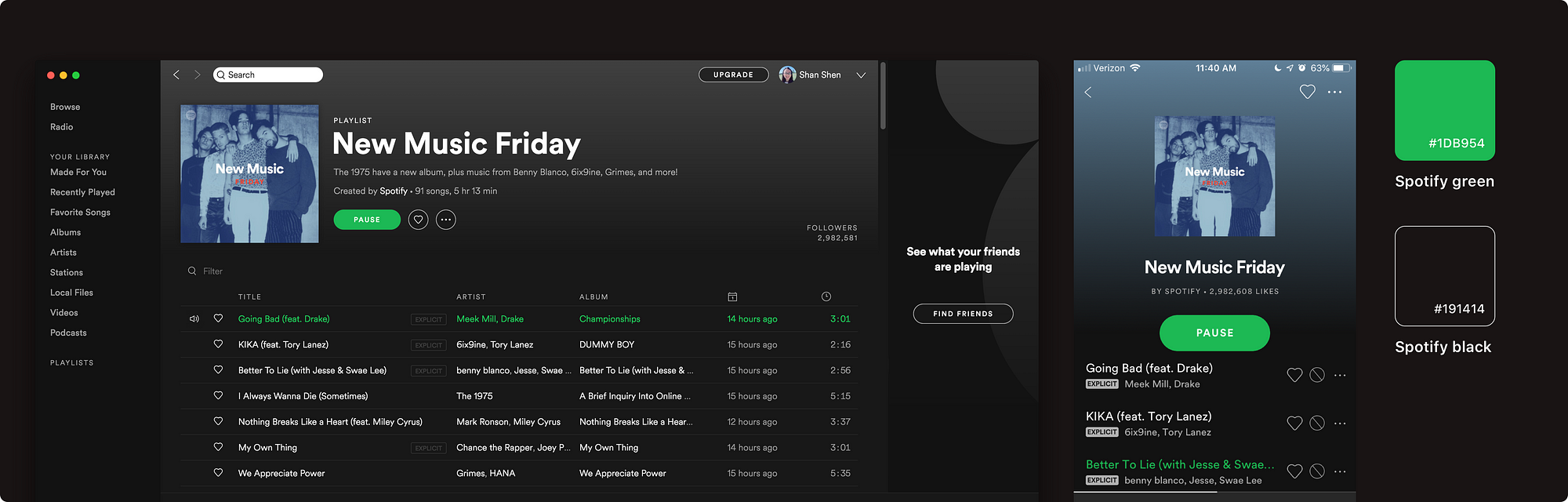
Contextually speaking, since Spotify user experience is all about play: play music, play podcasts, and discover playlists, the primary interaction in the app is straightforward. Full-rounded play buttons are extremely distinguishable from the album and list UIs, which in return encourages users to tap on “play”.
When do fully rounded buttons NOT work?
There is a couple of instances that full rounded buttons can cause usability issues.
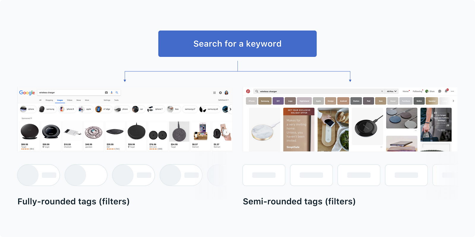
1. Fully rounded buttons look like tags.
When fully rounded buttons look exactly like tags, users get confused: “Am I clicking on a button or a filter?”
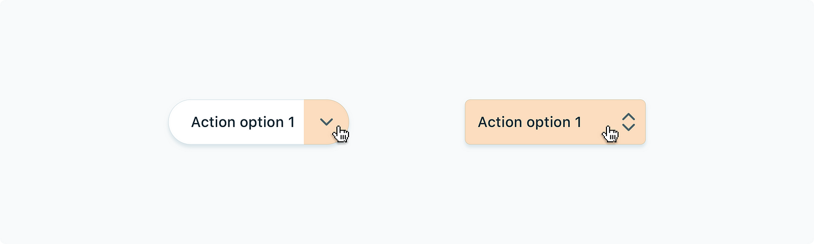
2. Fully rounded buttons fail at displaying nested options.
A fully rounded button usually includes a chevron icon to indicate that there are nested options available. The effective touch area to trigger nested options locks down to the size of the chevron icon(16×16 or 24×24 px).
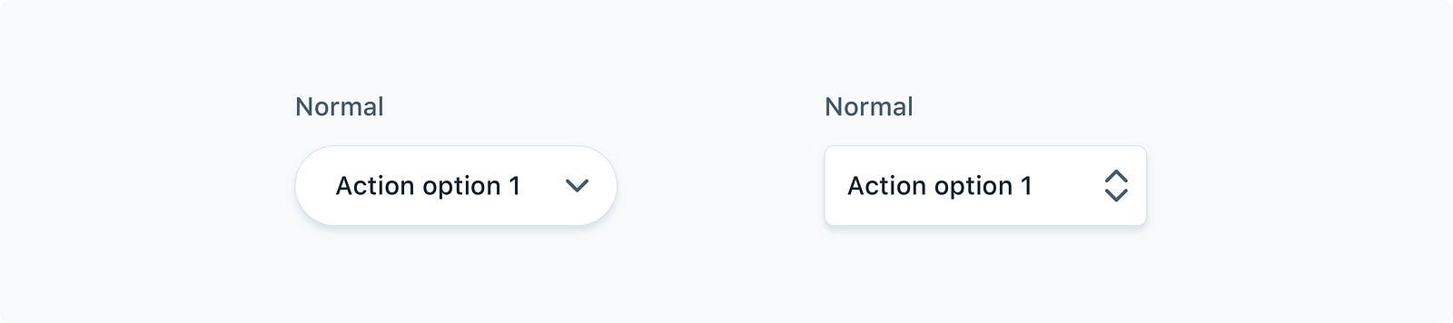
Might be enough? It’s quite a small area to click on.
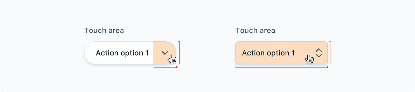
If we use a semi-rounded button instead, we could ditch the chevron so the button acts as a pop-up button. Upon clicking, all available options will be displayed. It is more effective.
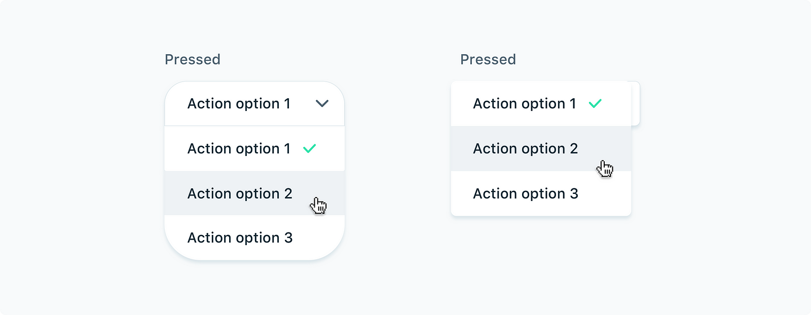
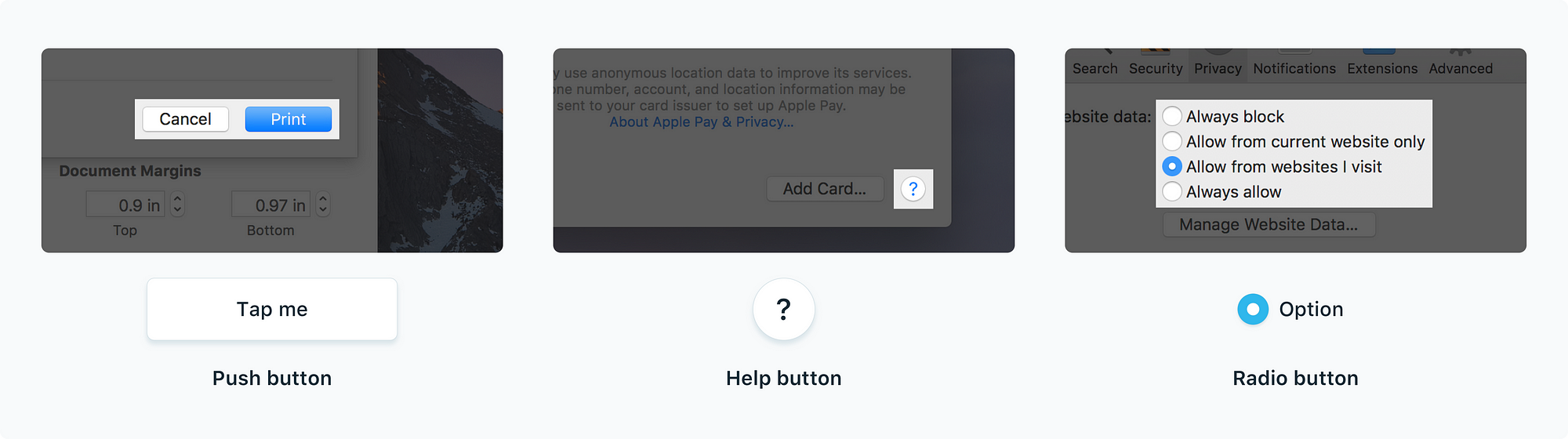
Apple discourages using rounded buttons as action buttons (push buttons). Fully rounded buttons are usually used specifically for “Help” or presenting mutually exclusive choices(radio buttons).
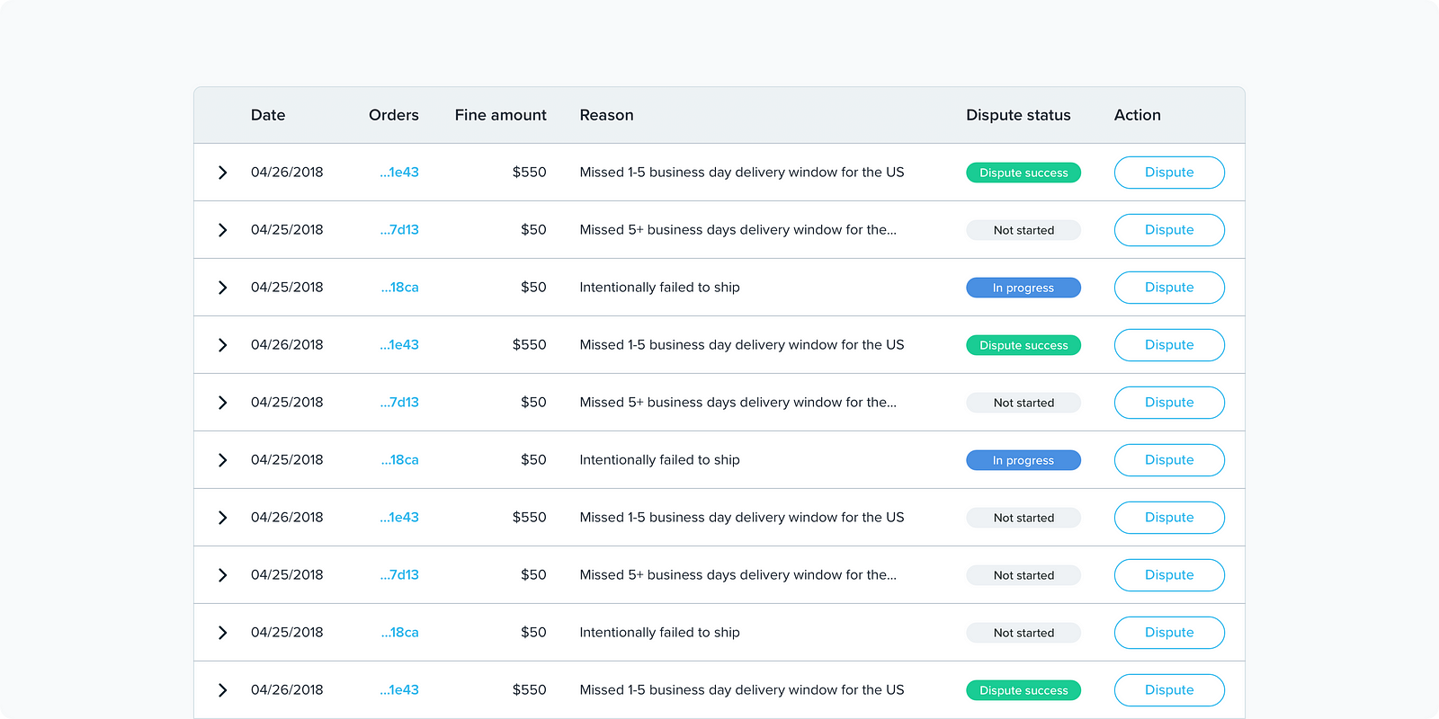
3. Fully rounded buttons are not for stacking.
When we stack fully rounded buttons in tables and cards, they look unsuited. Let’s say if we have a data table that has 10 rows and there’s a button on each row, we’ll end up having 10 rounded buttons that all look like primary action buttons.
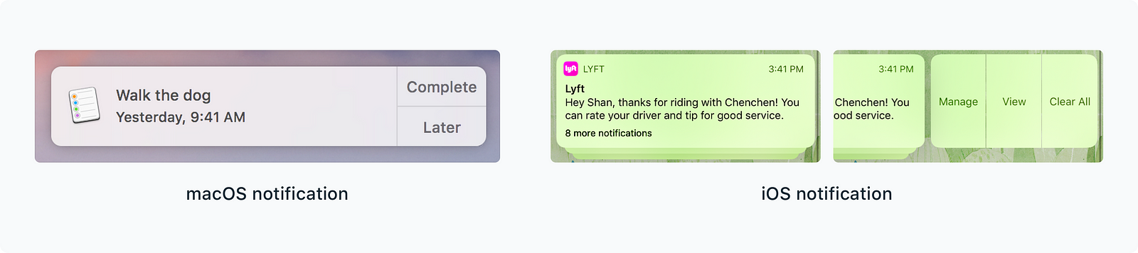
Alternatives are we could either use no-bordered buttons like the ones in new macOS notifications or only show button options upon hovering. By minimizing the presence of buttons, users stay concentrated on the part of the app they’re interacting with.
The aesthetics of rounded corners
Rounded corners look modern. The momentum of applying full rounded corners started from mobile and then expanded to web UIs. Round corners communicate a sense of simplicity, optimism, and openness. It probably explains why many design systems adapted to rounded corners and used them broadly in icons, buttons, and illustrations.
The latest update of Chrome browser started using a fully rounded address bar to indicate its merging functionality of the rounded Google search bar on mobile. Users can get a brief view of the search results during typing before landing on a new page.
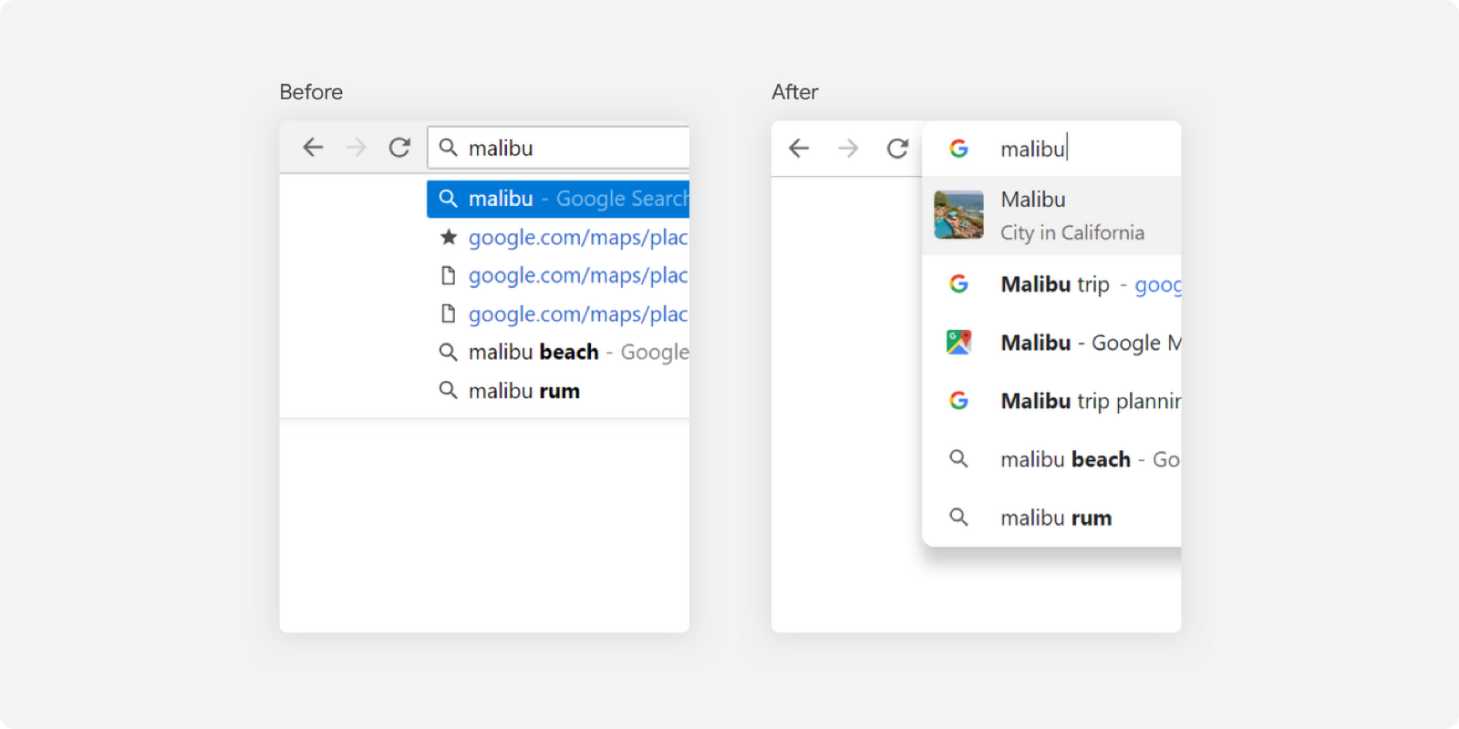
Aligned with the rounded look, other buttons in the toolbar come with circular hover states. Round shapes are easy to find in other updated Google apps like Calendar, Gmail and Drive.