
I couldn’t agree more with one of the world’s most celebrated graphic designers. And, why shouldn’t I? Design is a universal language, and there are many ways to create brilliant and aesthetically pleasing designs. In our previous article where we spoke about the UI Design trends in 2017, we saw how trends and styles come and go, right from skeuomorphism to flat. Recently, however, gradients have been the topic of conversation.
There are three responses to a piece of design — yes, no, and WOW! Wow is the one to aim for. -Milton Glaser
Right from backgrounds to logos, the dual-color (or tri-color, or anything that suits your fancy) effect has gained the spotlight in the world of UI design — we can find it everywhere, from branding, illustrations, typography, and more. What’s really impressive about gradients is the fact that they can be used in a variety of ways, and still end up looking pretty great; they add so much more depth to designs that would otherwise seem flat, don’t they? Some gradients may include more than two colors; some may spread from the center, or fall from a corner; and some may fall horizontally or vertically. They could be created with flat colors, with two tones, or even with a background image — our choices are almost endless.
Gradients are hence a great way to make designs a lot more interesting — they’re simple, yet complex. And so, many-a-time, I find gradients to be just a tad bit confusing. That being said, I’ve created a ‘gradients checklist’ that I refer to whenever I’m using gradients for UI, so I’m able to unleash their full potential. Below, you’ll find the deck of questions I ask myself each time I’m using or plan to use gradients — a list that brings my designs one step closer to receiving the response it yearns for — a “WOW!”
Have I chosen the right colors?
It’s a known fact amongst us designers, that the colors one picks can make or break a gradient, and thereby, our designs. Hence, while picking the colors, I’m usually very careful. After all, the colors used could determine the entire (and I mean, entire) style of the website, or an application.
I like to go back to the basics, i.e. my color palette, when I’m at a roadblock or puzzled about what colors to use for the gradient I’m creating. I love creating the gradients from the same family of colors as they always work out perfect. Another of my favorite things to do, is to experiment with lighter shades, as they can work wonders. Finally, to make sure my gradient actually works, I test it with text, images, and all sorts of other content, to make sure it’s as versatile as it can be.
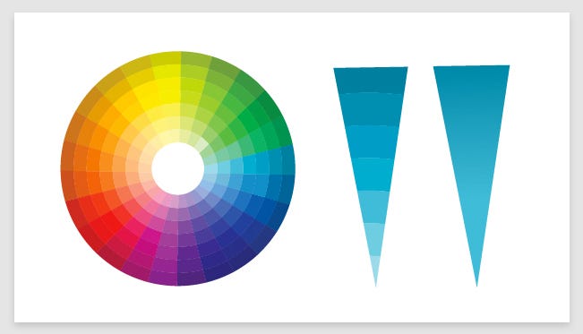
Personally, I don’t enjoy using too many colors when I’m creating a gradient. To me, two or three colors look great. Why? Well, in general, too many colors can be quite harsh to look at if not blended in properly, resulting in the death of design. However, I’m not completely dismissing the idea of using more than three colors in a gradient — they can also look wonderful if used correctly.
Are the color tones smooth enough?
I see Photoshop’s ‘Dither’ button as my angel in disguise here. Quite a few designers aren’t aware of this magical little button on the software, unless banding appears in the gradients they’ve created. Ever noticed those rectangular bands? They aren’t exactly best looking, are they? I use the dither button on Photoshop to fix this, as it smoothens the bands until the change in tone is seamless, and are yet a little visible.
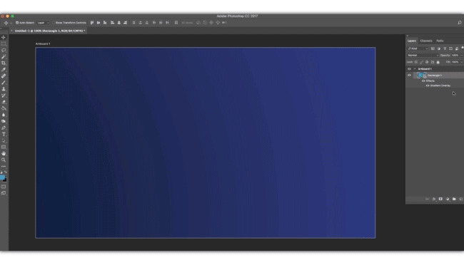
In my previous point, I shared how using two or three tones is a safer option. But, if you’re a free spirited and experimental soul who’s trying to create a gradient with multiple colors, then blending them right is absolutely critical. If not done properly, they can provide an extremely poor experience to your users and even hurt their eyes.
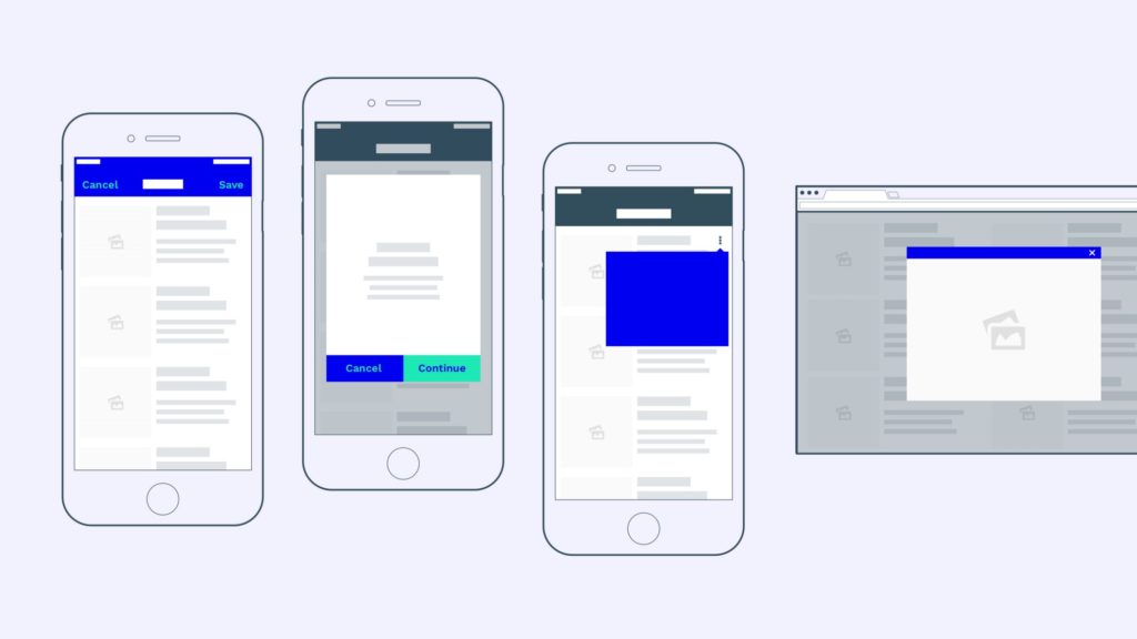
Am I using the gradient in right place?
Sure, gradients look great, but they can’t be used just anywhere. I keep reminding myself that gradients have a pretty bold presence, and so, one should have a good sense of judgment in order to effectively create, and use them. For example, I don’t see a gradient working for the website of a hospital or that of a government. Basically, if the brand’s a serious one, I choose to leave out gradients.
Another important thing to always check is balancing gradients with loads of white space — the design needs to breathe, doesn’t it? When you’ve used a gradient in the background, you need to balance its overpowering effect, with the subtlety of white spaces around it.

Also, ensuring minimal content when using a gradient for the background allows greater readability and makes my design seem clean and pleasing.


5 Comments