Though important to the user experience, empty states are often overlooked. Knowing what they are and how to use them, and applying UX best practices, can yield substantial benefits.
What Is an Empty State?
UX designers have a lot of opportunities to create pleasurable and meaningful experiences. One such opportunity that is often disregarded is the “empty state,” or empty screen. Empty states are moments in a user’s experience with a product where there is nothing to display.
Here are a few examples of common empty state situations:
- A new Dropbox screen where no files or folders have been created.
- The resulting screen after completing all tasks in a to-do list manager.
- Getting an error screen in Slack when a command isn’t supported.
- Starting a new social networking account and there are no connections.
- Searching for something in Gmail and getting no results.
These in-between moments provide opportunities to improve the user experience and consequently amplify business opportunities. For UX designers, taking every opportunity to enhance the user experience and add more value to the business is a good thing.
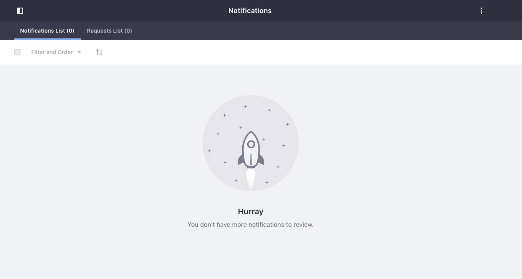
A useful empty state will let the user know what’s happening, why it’s happening, and what to do about it. Here are two examples of good empty state UX designs:


Here are a few examples of empty state designs with missed opportunities:

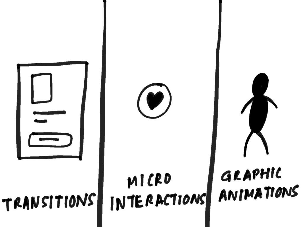
Types of Empty States
Here are four types of frequently encountered empty states:
- First use – Occurs with a new product or service when there is still nothing to show, such as a new Evernote or Dropbox account.
- User cleared – Occurs when users complete actions such as clearing their inbox or task list, and the result is an empty screen.
- Errors – These occur when something goes wrong, or when there are issues such as a mobile phone going offline due to network problems.
- No results/No data – Occurs when there is nothing to show. This can happen if someone performs a search and the query is empty or there isn’t data available to show (when filtering for a date-range that has no data for example).
As empty state design receives more attention, UX designers find that there are beneficial outcomes to utilizing them, both from a business and a user experience perspective.
The Benefits of Using Well-designed Empty States
“Users try out a lot of apps but decide which ones they want to ‘stop using’ within the first 3-7 days. For ‘decent’ apps, the majority of users retained for 7 days stick around much longer. The key to success is to get the users hooked during that critical first 3-7 day period.” – Ankit Jain
Designing well-thought-out and useful empty state screens can help drive product engagement, delight users, and reduce churn. This decreases the chances of losing users to competitor products, thus leaving them frustrated or lost.
In his book, What Customers Really Want, Scott McKain lays out six guiding principles of great customer experience.
He writes that customers want:
- A compelling experience
- A personal focus
- Reciprocal loyalty
- Differentiation
- Coordination
- Innovation
When applied to empty state design, these principles can be of great benefit to a business—for example, an increase in product satisfaction, and the lowering of abandonment rates.
Here are three additional areas that can also benefit from good empty state design:
- User onboarding – Provides an opportunity to build trust and continued use of the product in addition to an elevated user experience.
- Brand building – Generates awareness and promotes the company in order to build increased brand equity.
- Personalization – Can be playful, fun, serious, or dynamic in various states of use; creates a sense of a personal touch.
The benefits of well-designed empty states cannot be underestimated. They not only contribute to a compelling customer experience, but as windows of opportunity to keep customers happy and engaged get shorter and shorter, they are just plain good business.
Shunned: The Forgotten Screens of UX Design
Since there are apparent positive outcomes to well-designed empty states, why are they ignored in the first place?
First, there are very few empty state situations that occur when compared to the total number of screens in an app or product or website, so they are often neglected because they aren’t seen as a priority, and designerstend to focus their efforts on the more visible parts of a design.
Second, with only an estimated 2-5% of users seeing an empty state, it isn’t always an economical or practical use of a designer’s time.
Lastly, empty states weren’t always well understood in terms of where they occur and what do to with them, so they took a back seat in favor of the more popular screens and pages.
What happens when empty states are disregarded?
Blank screens with no guidance can lead to confusion, uncertainty, and disappointment. This can result in higher abandonment rates and lower overall satisfaction with the product.
Luckily, things are starting to change as the benefits and opportunities of designing good empty state screens becomes a more important, high-priority part of the UX design process.
How to Fill an Empty Screen with Purpose
Here are some UX best practices for making sure empty screens are designed to be useful, helpful, and informative.
Empathy. Adding surprise and delight, emotion, and personality are all ways UX designers have created better experiences in even the darkest corners of a product. For empty screens, empathic messaging adds variety and creates a more engaging, personalized experience.

Imagery. There is a design principle called the biophilia effect. This is a state of reduced stress and improved concentration that results from nature views. Adding some scenic imagery (the background of an empty state error screen, for example) can result in a more pleasurable user experience.
Helpful Guidance. Depending on the type of product, empty states can be used to guide the user. A good example of this is a project management application. With a new account, there are no projects yet in play, offering a potentially great opportunity to help the user get started quickly, thereby reducing the chance for abandonment. Here is an example:

Starter Content. There are plenty of screens that sit blank long enough for the user to get frustrated and leave. For certain products, providing good starter content helps them visualize what is going on and what they can do next.
Here’s an example of an empty state screen with starter content:

Providing an Action Step. With some products, we don’t need to provide guidance or fill the screen with any content because it wouldn’t make any sense. In these cases, designers could simply provide an action step.
However, it’s best to keep actions to a minimum. Hick’s Law states that “the time it takes to make a decision increases with the number and complexity of choices.” Thus, users will likely be quicker to act when calls to action are kept to one or two at most. Here’s a great example:

Another good example is Instagram. When people are new to the platform, they aren’t following anyone yet (and no one is following them). It would be easy to focus on all of Instagram’s great features, but a good empty state screen, for example, could give them the option to “add people to follow.”

Empty State UX Best Practices – From the Field
Toptal has top-tier global freelance talent in all areas of design. Here’s what a couple of Toptal UX designers had to say about their experiences designing empty state screens.
Toptal Designer: Tamara Olson
Design Discipline: UX Design

What are some good empty state designs you have worked on or have seen?
Good, modern empty state designs I’ve observed are typically two parts instruction, one part delight. If a UI is empty, it’s the UX designer’s job to help users understand what will go in the space when it’s populated. If it’s the user’s job to populate it, the messaging should include instructions about how. (For example, an empty “Classes” table in an edtech product might include copy informing teachers how to create their first class.)
I’m also seeing many apps use empty states’ generous real estate as an opportunity to inject some delight and playful brand personality. You might say it’s the web app version of a website’s 404 page.
Have you ever overlooked empty states, and if so, why?
Of course, it’s an easy trap. When we’re being visionary, we picture apps and products when they’re in full flight, populated with content and users. When I worked at Google, a VP of product made a comment that products are like airplane flights; most problems happen during takeoffs and landings.
When a user first enters your product, empty states are inevitable, and we don’t want them hitting dead ends before they even get started. I’d encourage junior designers to design a separate set of linear designs showing the user’s onboarding flow.
Have you seen client success with using empty states? If so, in what ways?
I recently worked with National Novel Writing Month on their platform redesign, which allows users to set and track goals around their writing progress. Our product team had an absolute ball with the empty states; it was a wonderful way to introduce and tease the platform’s functionality and personality, and inspire users to get started logging their progress.
What is the most successful use of an empty state you have experienced?
As a “zero inboxer,” I am constantly delighted by the Gmail app’s empty inbox illustration: a person under an umbrella, reading a book under the sunshine, with the caption “You’re all done!” It technically breaks the rule I mentioned about empty states needing a call to action, and yet, it doesn’t, because the subliminal CTA is “Get off your email and go enjoy your life.” I love that.
Toptal Designer: Michael Clingerman
Design Discipline: SaaS Product Design

If you have designed for empty states, what types do you see most frequently?
The empty states I’m most familiar with are 404/error states and user cleared states.
Have you seen client success with using empty states? If so, in what ways?
Yes. I have seen cases where empty state screens became part of an engaging and delightful content and communications strategy. There are other cases where clients have used them to build their brand personality.
What is the most successful use of an empty state you have experienced?
I have always loved Dropbox’s use of simple and monochromatic illustrative styles to establish personality, tone, and character of the corporate brand.
Conclusion
It’s easy to overlook empty states (or empty screens) in UX design because they occur infrequently and aren’t always well understood. However, the benefits to their inclusion are understated because they enhance the user experience and help create a more cohesive product.