The Wheel
We probably think that doing a simple similar task in repeat manually doesn’t really matter. For instance, as designer we get a ticket to change the app bar color of an Android project in order to follow a company brand guideline. In the manual way, we could just multiple select the layers and then change the color or play around with the all time “copy-paste” method and it’s done.
However, what if it’s only the beginning of the task? Which means that changing the app bar color is only a small piece of the whole design work. We have another tickets to change the color scheme of the status bar, tab indicator and all the material elements of — let’s say an Android project that has multiple artboards.
In fact, it doesn’t end in the Android UI work because fortunately we have to design the user interface for other platforms such as iOS and Web. Thus, multiple select and copy paste method will never get the things done quickly and properly. On the other hand, we as the designer are not supposed to slow down the project development cycle tho (instead of considering the human interface guidelines standard of each platform).
Use Case: A Whitelabelled WhatsApp-like App
I take a real use case as an example of developing custom design library for the project team. The company provides an end-to-end solutions named Qisme. Qisme is simply a whitelabelled Whatsapp-like app with a Facebook-like newsfeed feature for your own business or organizations.
Of course, the “white-label” phrase refers to a product or service produced by one company (the producer) that other companies (the marketers) rebrandto make it appear as if they had made it. It means that we the producer provide “your-own-brand” real-time messaging app without leaving user’s brand guidelines for sure. This product is available for Android, iOS and Web. TL;DR, it’s a cuztomizable “your-own-brand” multi-platform messaging app.
Long story short, this is basically my UI design-related pain points. First, I have to define the new color scheme and apply it to each element of each artboard in each platform for each of the clients without leaving the brand guidelines. Second, I have to apply the new font style to all text attributes. Third, I have to create a easy-to-customize components doc, so that everytime there’s a change to its style I can easily navigate to the doc and modify the master directly. It’s a matter of time for a single-fighter UI/UX designer who has also other to-do tickets in a fast-paced start-up company to do such things.
Until I finally chose to spend my two working days to build a design library.
Design Library
In computer science, a library is a collection of non-volatile resources used by computer programs, often for software development. In the same sense, design library is basically a reusable collection of styles and components used by designer for software development. The aim of making design library is nothing but to improve efficiency of user interface design works (in term of task time) and effectiveness (in term of consistency) by achieving the following objectives:
- To produce reusable and cuztomizable styles and components
- To keep text and layer attributes consistent across all the documents
- To create well-organized interface design documentation
Following the principle of Atomic Design methodology and using Figma as the design tool, let’s get into the kitchen!
1. Defining Styles
This awesome modular approach allowing you to apply text, fill, layout grid, effect and stroke styles separately. Styles will simplify the workflow and keep text and layer attributes consistent across all the documents. First, I started to define local styles for the required styles:
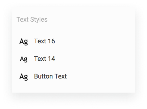
- Text Styles
There’re mostly two font sizes for body/label: 16px (1 rem) for normal text and 14px for smaller text. I also created a style for button label with uppercase transform. Text Styles will be the master text style for its user. Everytime there’s a change to font family, we can easily change it from Text Styles and any text included in a component or a stand-alone text that use Text Styles will systematically reflect.
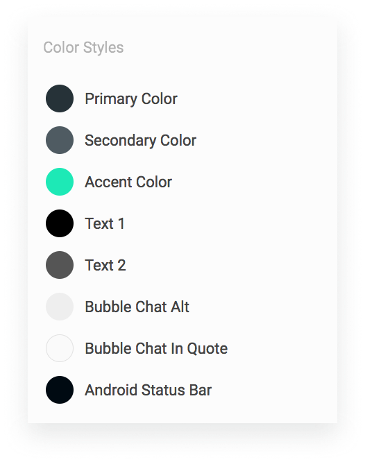
- Color Styles
Following the same behaviour of Text Styles, but it’s for color. We can also create gradient color sytles if it’s necessary. The followings are some of the required styles:
- Effect Styles
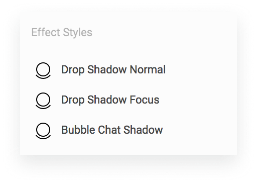
Figma has basically three types of layer effects: Drop Shadow, Background Blur and Layer Blur. For this case, I created drop shadow effect styles. Drop Shadow Normal will be applied to text field or button on its normal state. Drop Shadow Focus will be applied to text field or button when they’re clicked/focus. On the one hand, as its name Bubble Chat Shadow will be applied to bubble chat container.
2. Creating Components
Component in Figma is adapted from the engineering concepts of composition, inheritance and override. The same component can be used in many places at once, each at a different size with local modifications and differences. In other words, component is reusable and customizable. There’re several components required for each platform for this case:
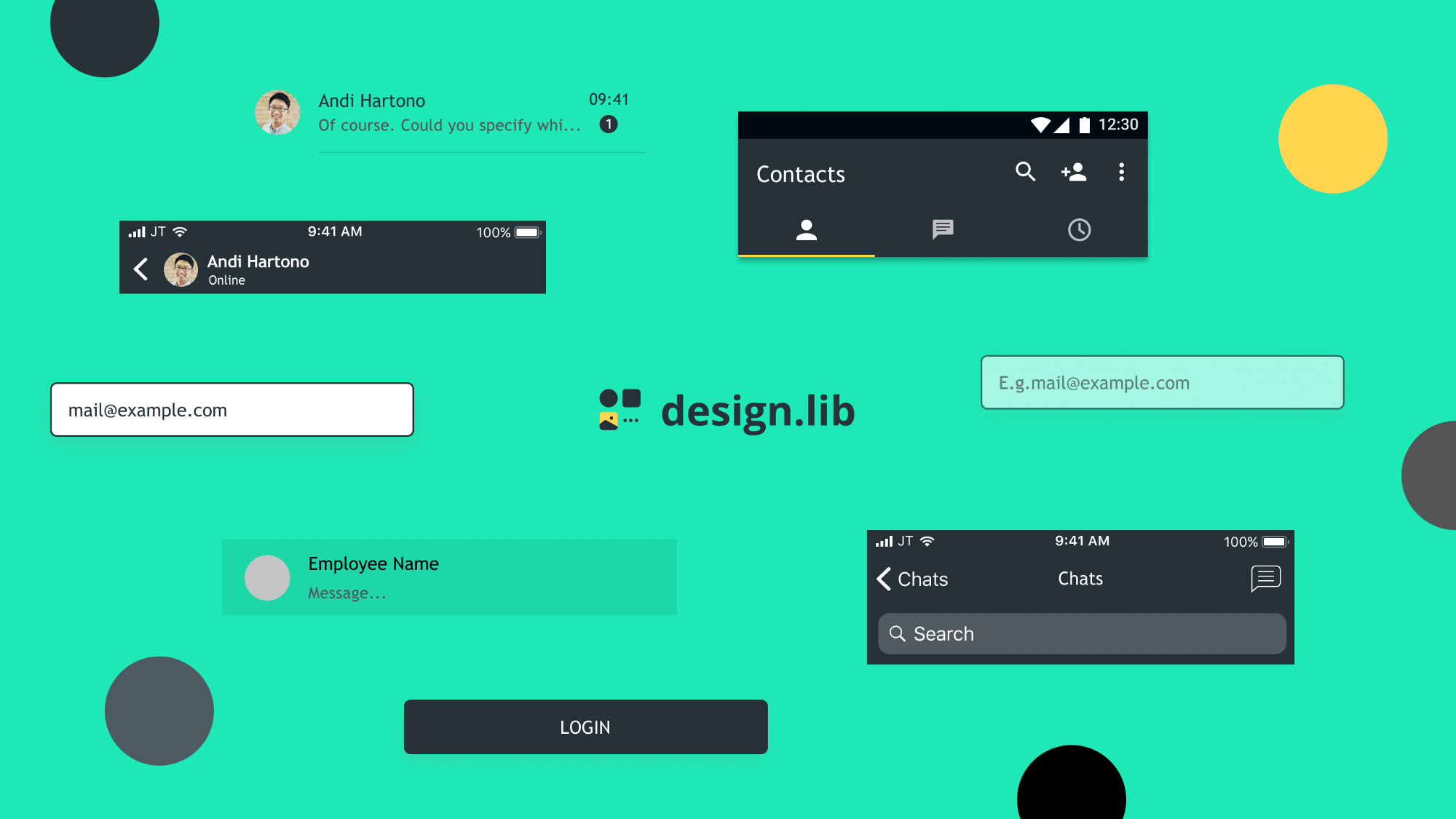
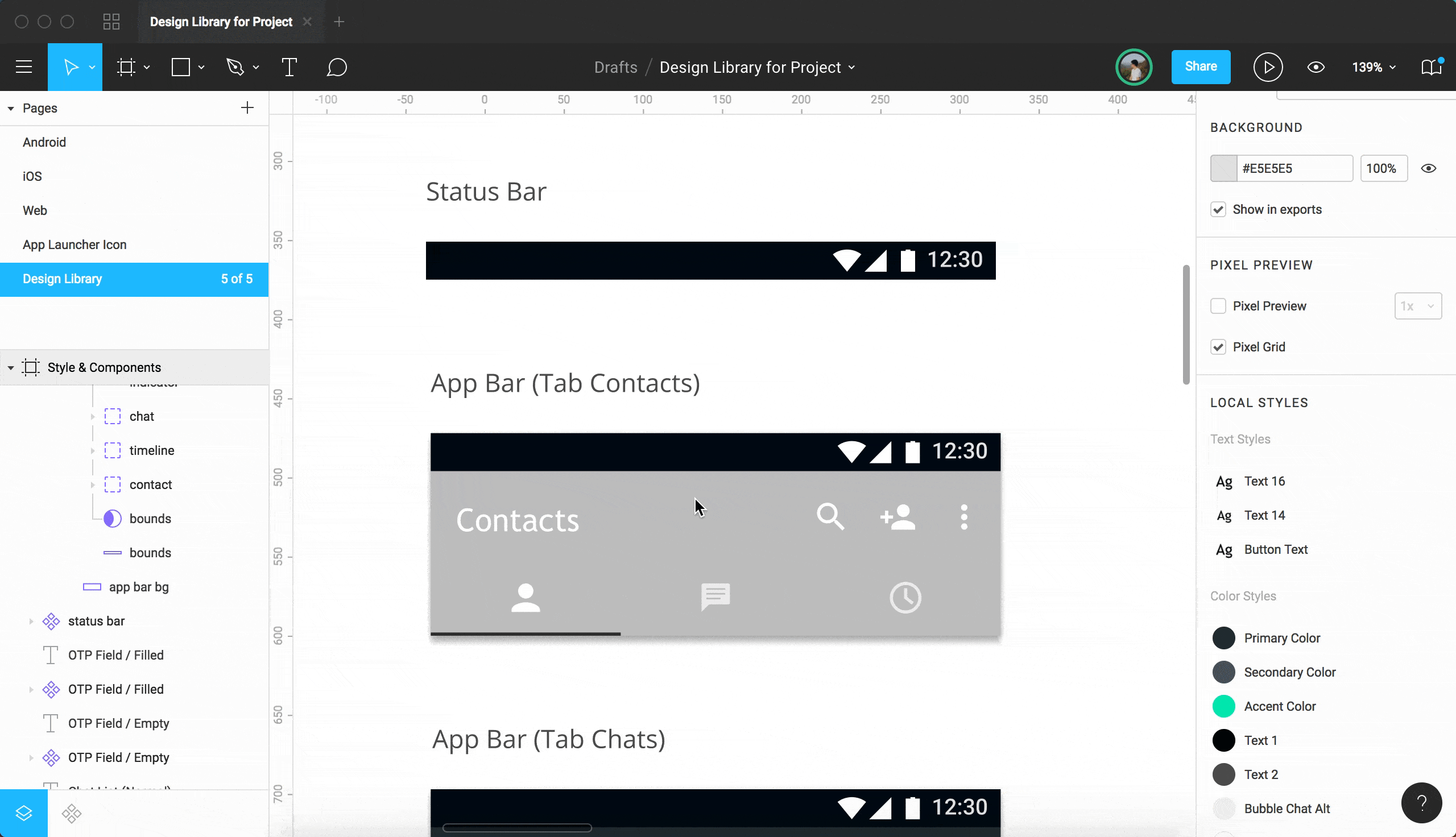
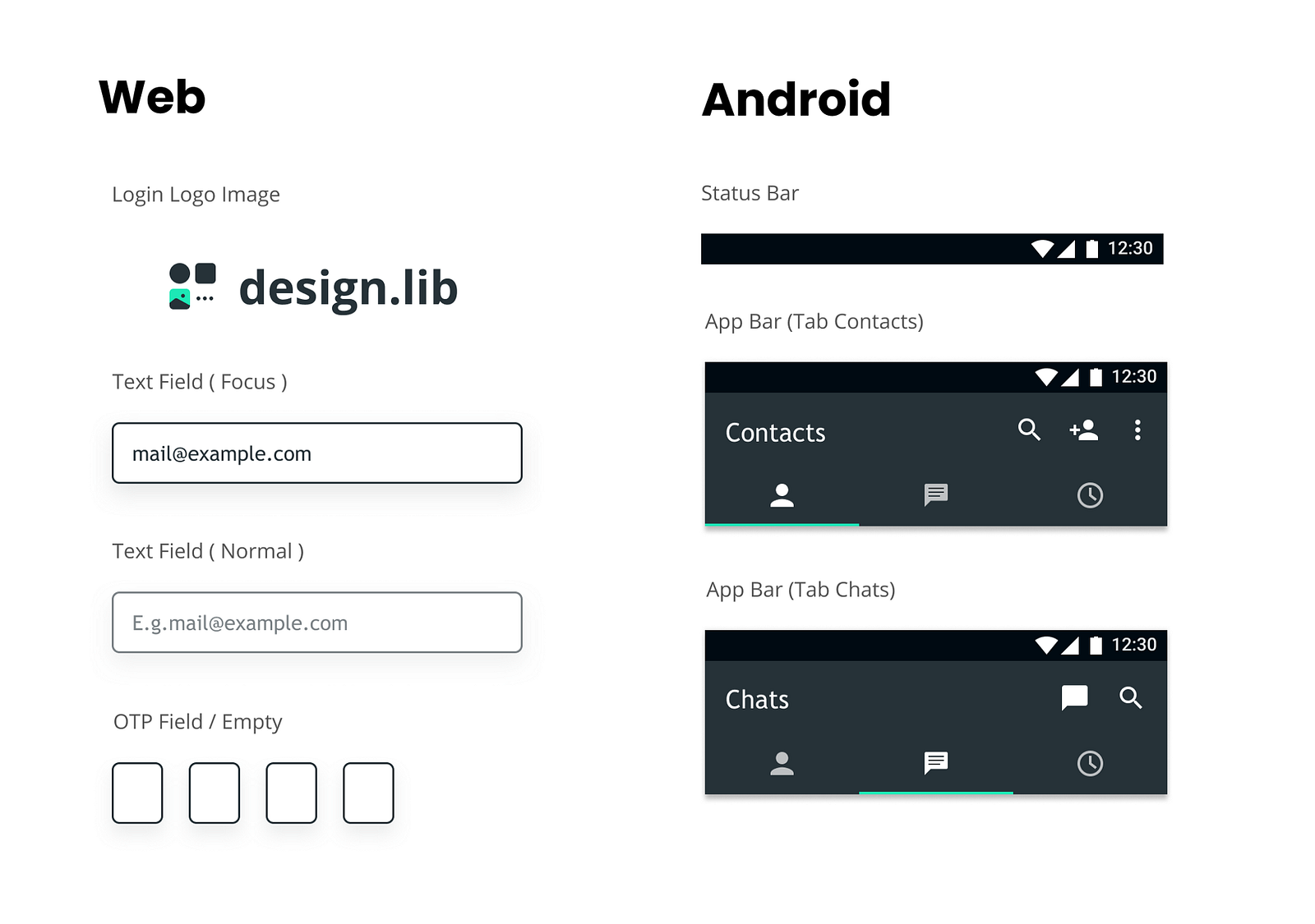
- Android Components: Login Logo Image, Status Bar, App Bar, Tab Bar, Tab Indicator, Button, Text Field, Label, List
- iOS Components: Login Logo Image, Navigation Bar, Button, Text Field, Label, List
- Web Components: Login Logo Image, Text Field, Label, Button, List, Search Bar, Header Content
Then, we apply the styles to the each of them. For instance, an Android App Bar that contains background and tab indicator. We can easily apply the Primary Color style to the background and Accent Color style to the tab indicator.
3. Categorizing Components
In order to keep the material design (Android) and human interface (iOS) guidelines exist, we also have to keep some native-based components exist. For instance, I just need to change the color scheme of some native components like App Bar on Android and Navigation Bar on iOS without making full customization. If we decide to use native-based components, it’s better to keep following their interface guidelines such as Material Design for Android and Human Interface Guidelines for iOS.
On the one hand, we are able to do customization for components such as logo image container, text field, label and button. This components would be reused in other platforms. In other words, it’s kinda a custom component that can be reused in other platforms. So now I have two type of components: native-based component and custom multiplatform component.
4. Collect & Organize
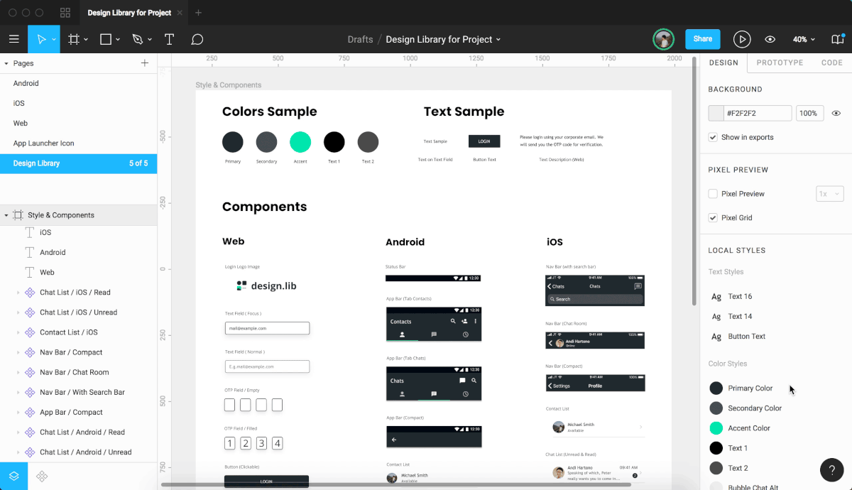
After having all the required styles and components, we collect and organize all the components in a single page so that we can navigate to each of them easily. A design library should contain platform sample page and design documentation. Design documentation contains color sample, text sample, master components, etc. Thanks to Figma for letting live embed happens in Medium. Here’s how documentation looks like:
Quick Demo: Change color scheme from color styles


1 Comment